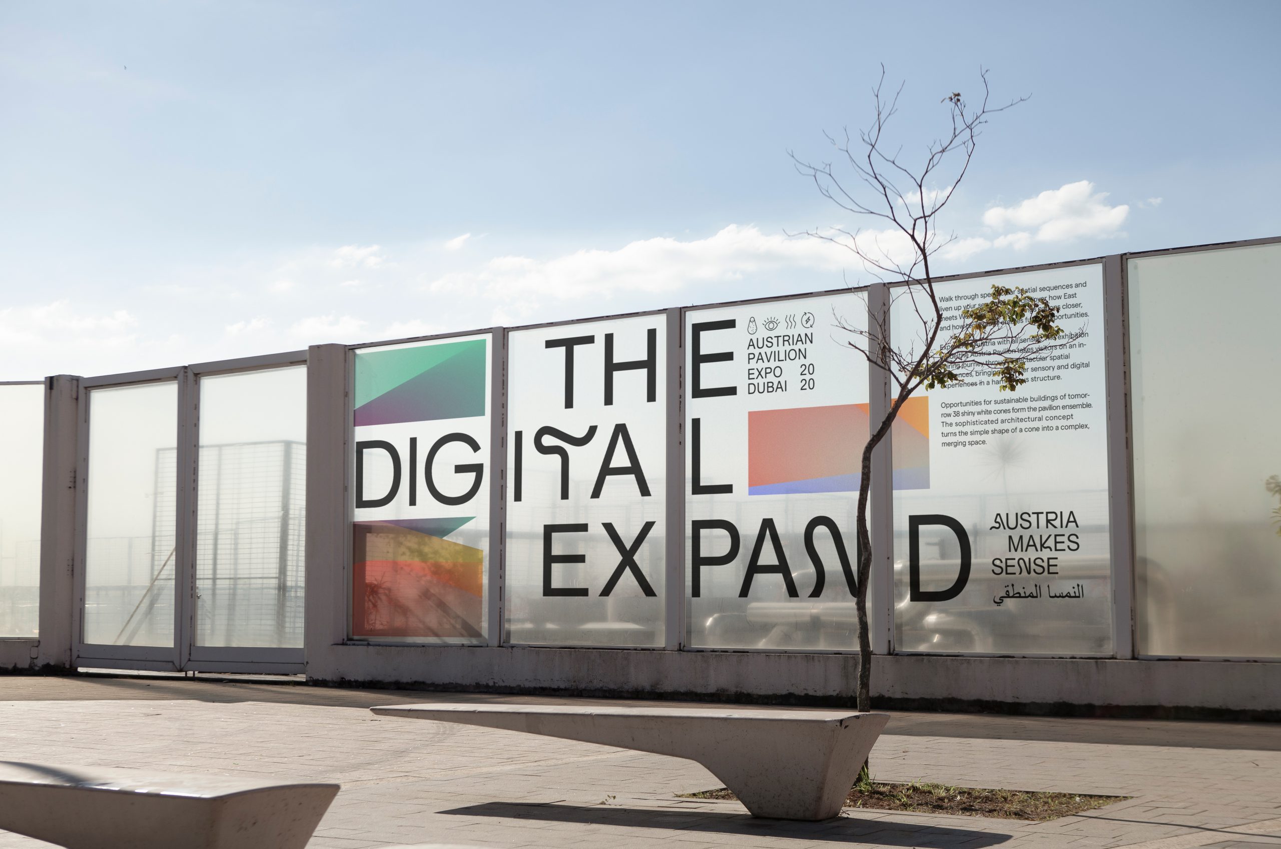
Expand your senses
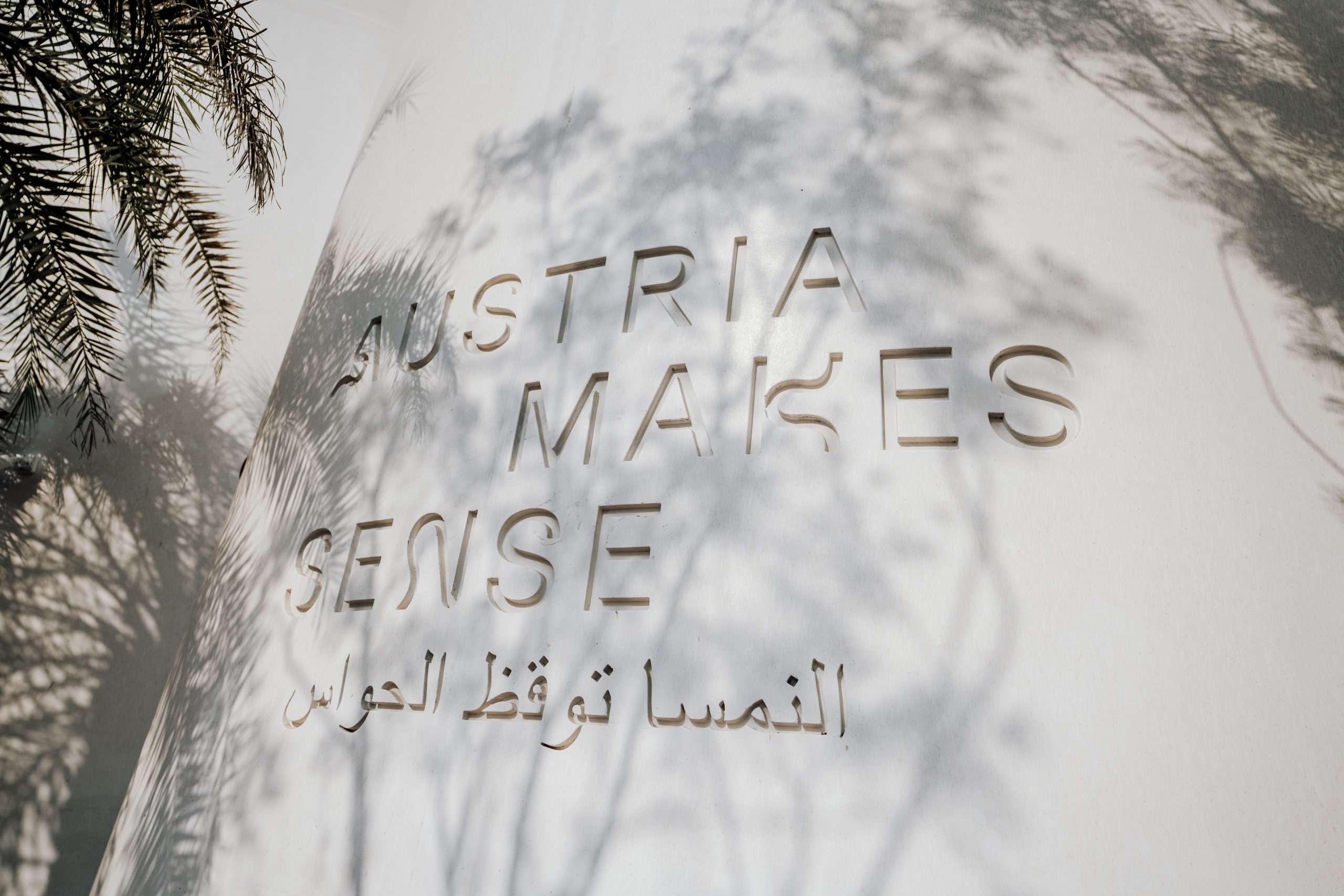
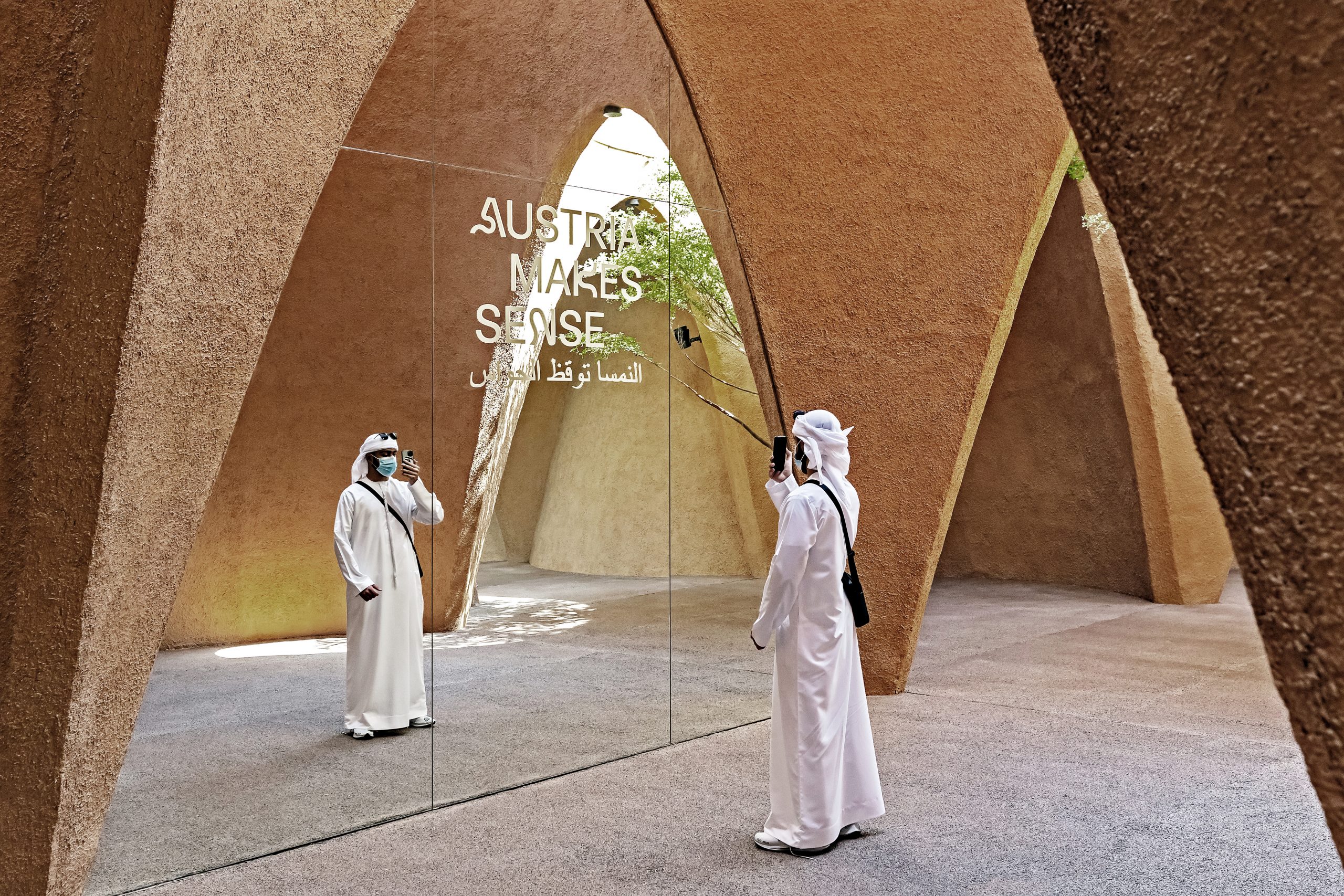
Since the first world fair in 1851, the world turns its eyes to its spectacular show, displaying the potential of future architecture and innovation. 2020’s edition of the EXPO—shifted to 2021—took place in Dubai on the theme »Connecting Minds, Creating the Future«. Austria presents itself to the 25 million visitors with a striking pavilion under the anthem »Austria makes sense«. Bleed developed the visual identity and exhibition graphics for the Austrian pavilion.
Category→
Culture, Business
Work→
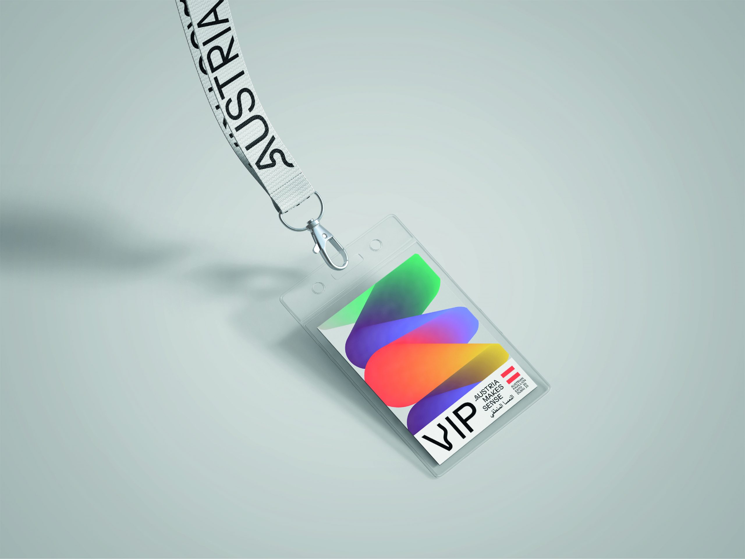
Visual identity, Exhibition design
Awards→
Red Dot 2022, CCA 2022
Client→
Wirtschaftskammer, Querkraft Architects
Background
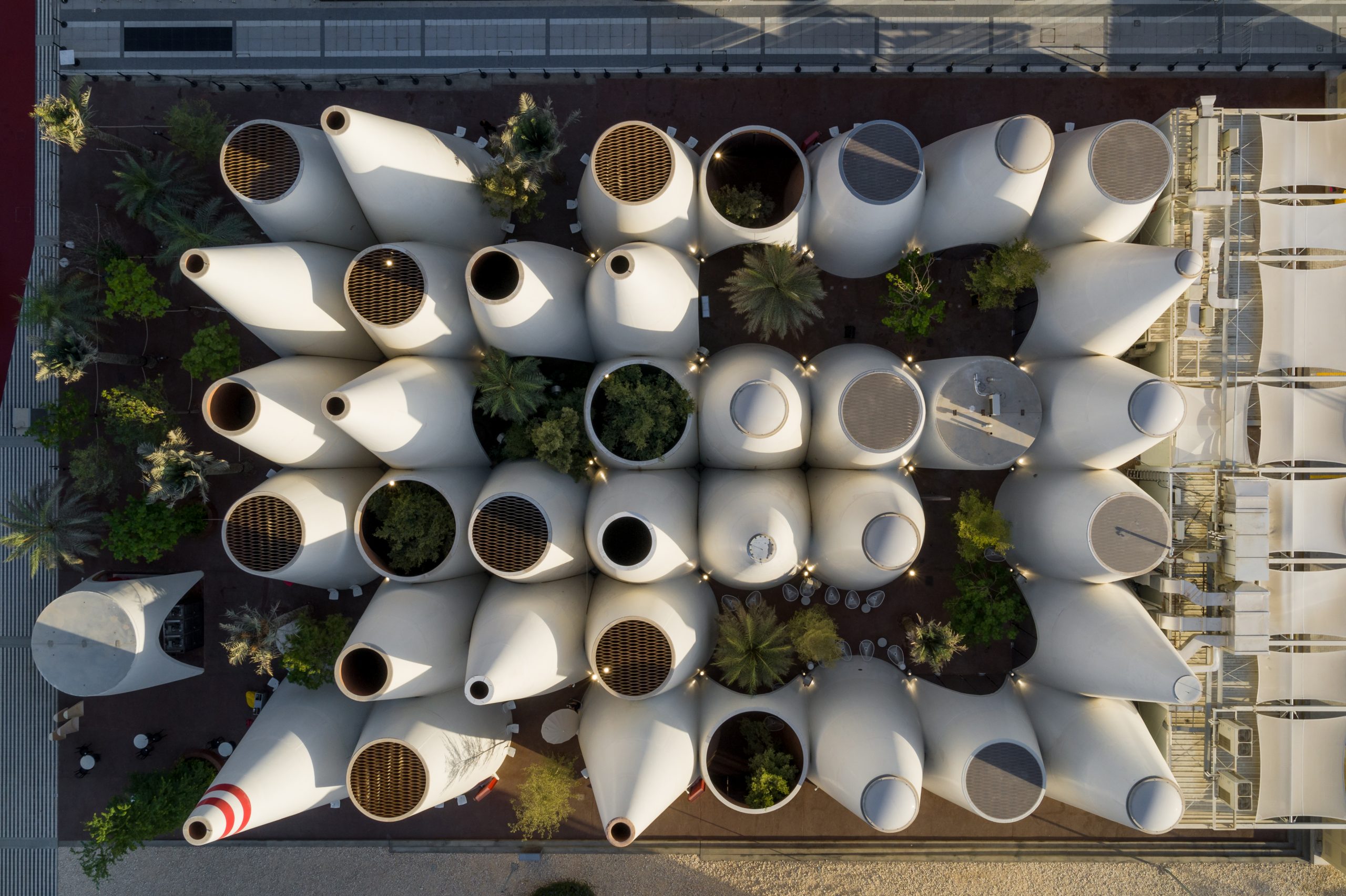
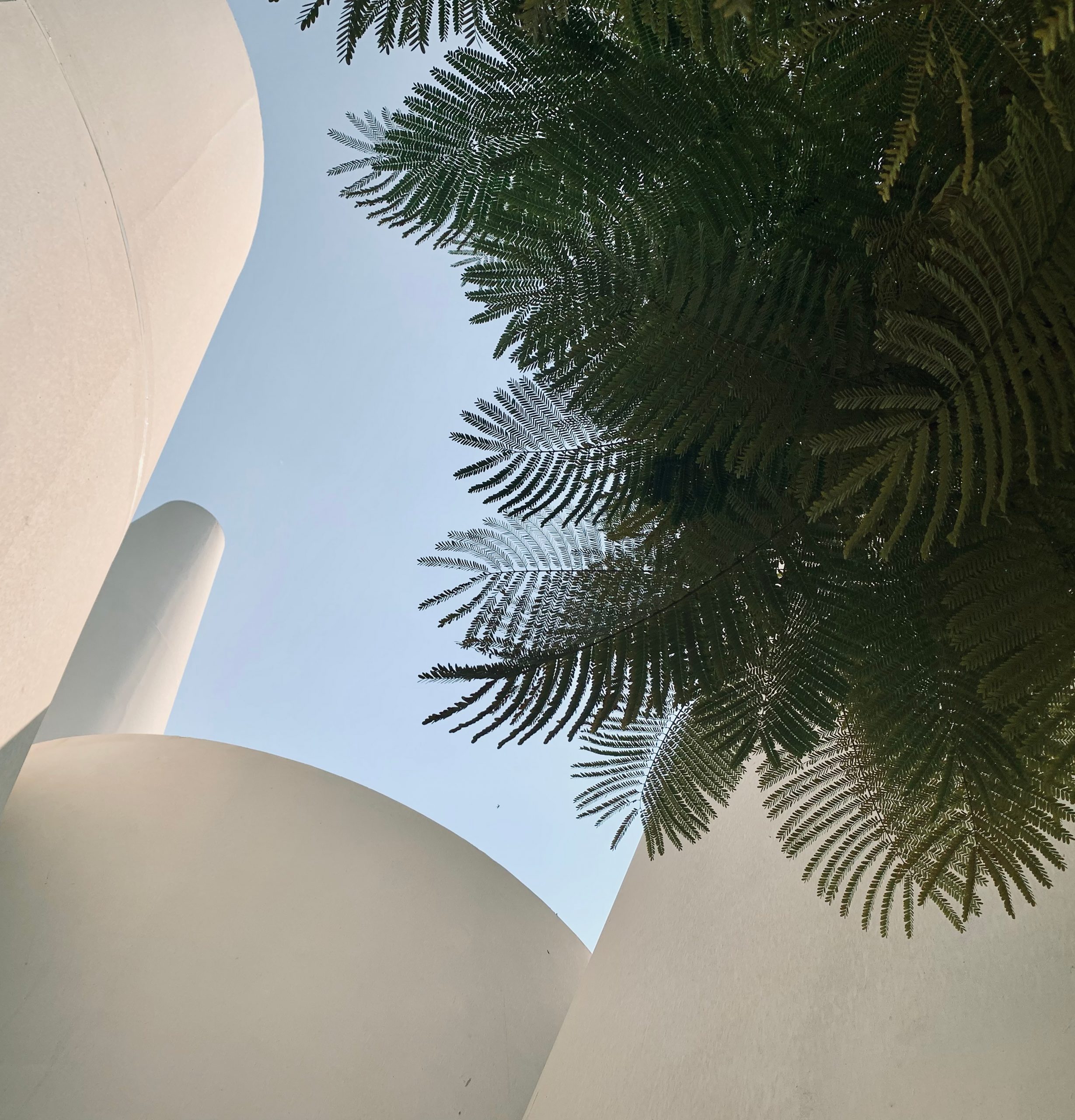
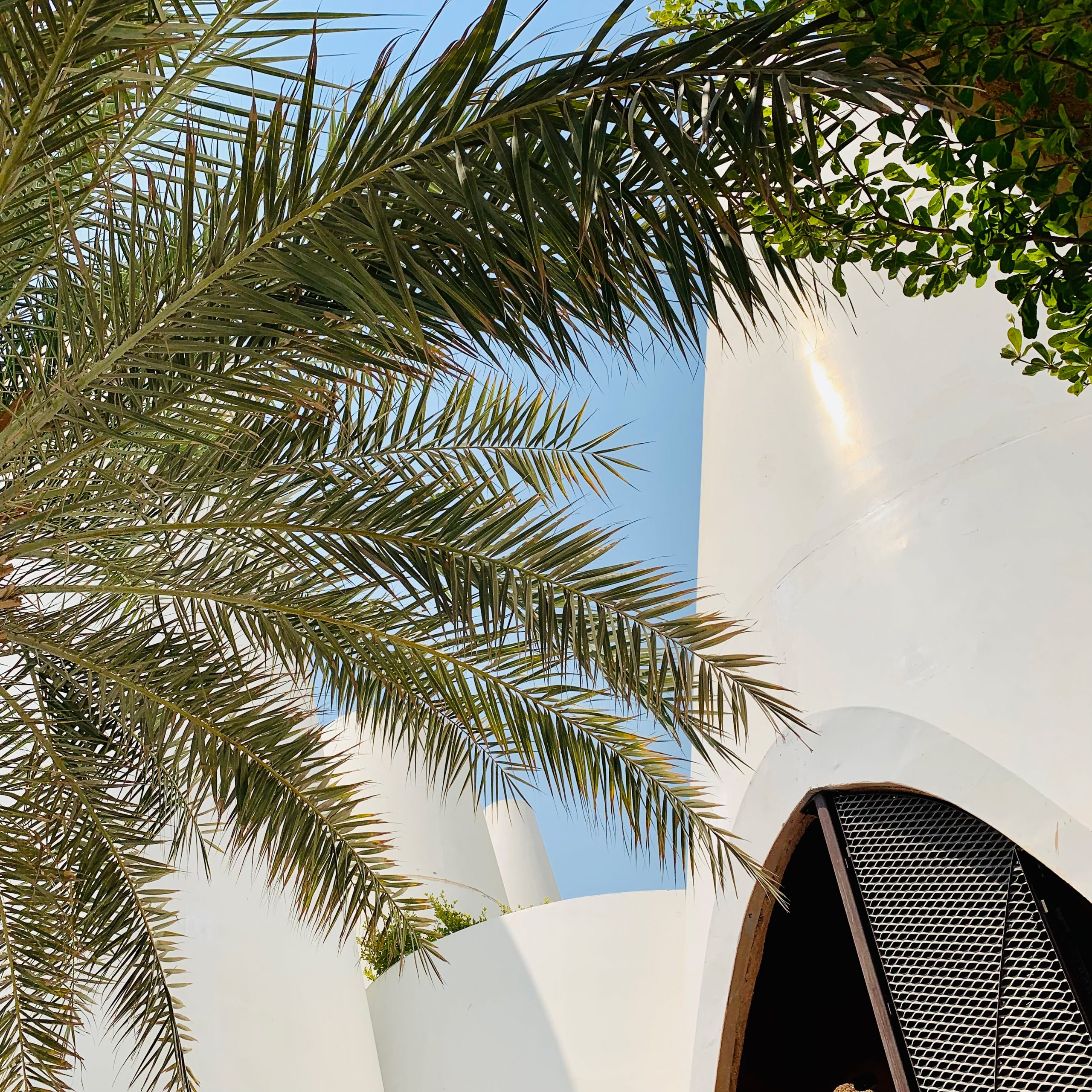
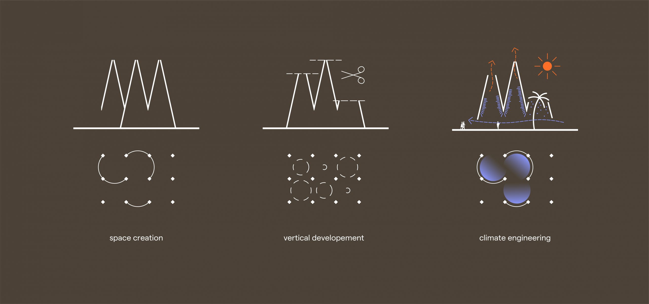
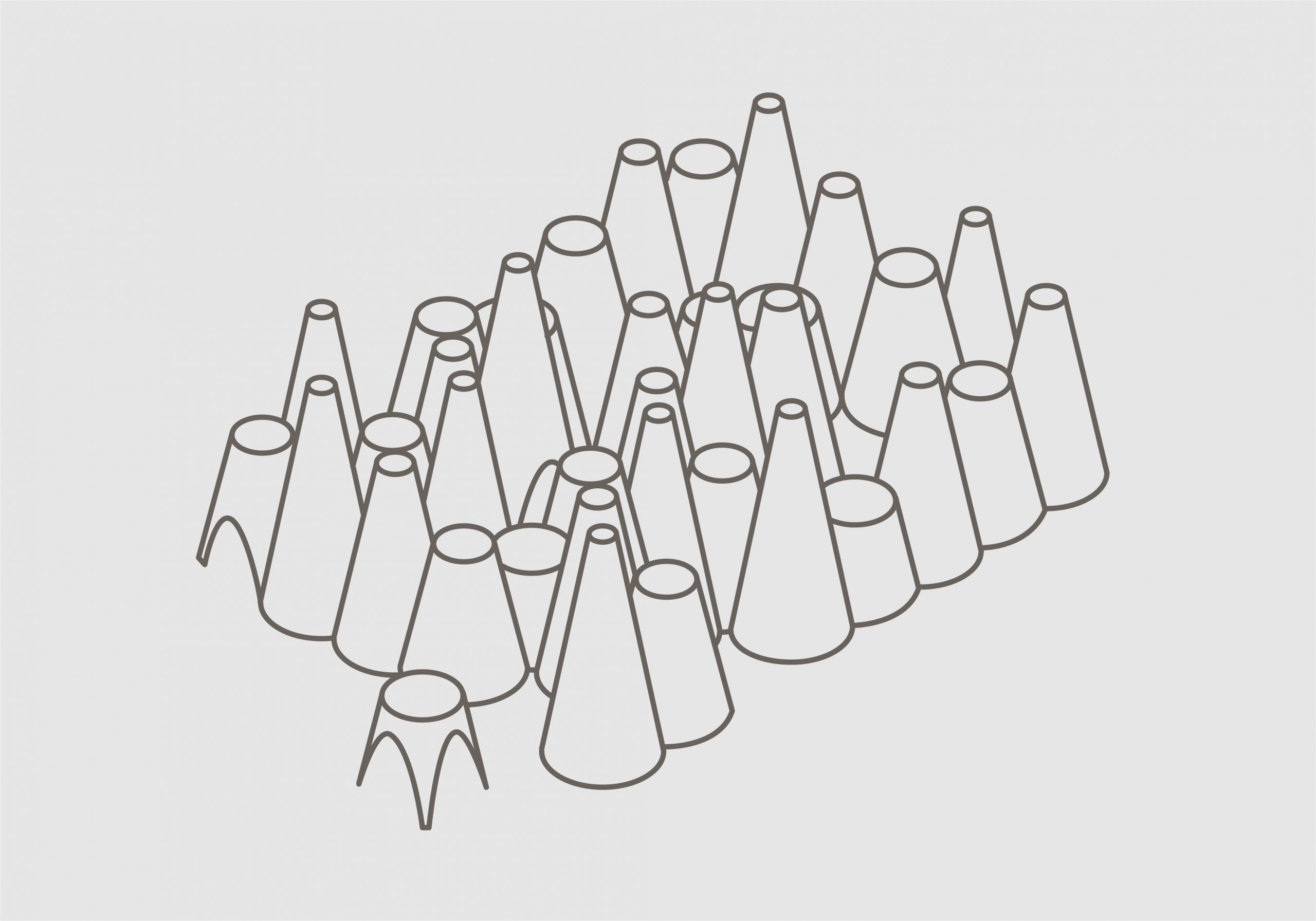
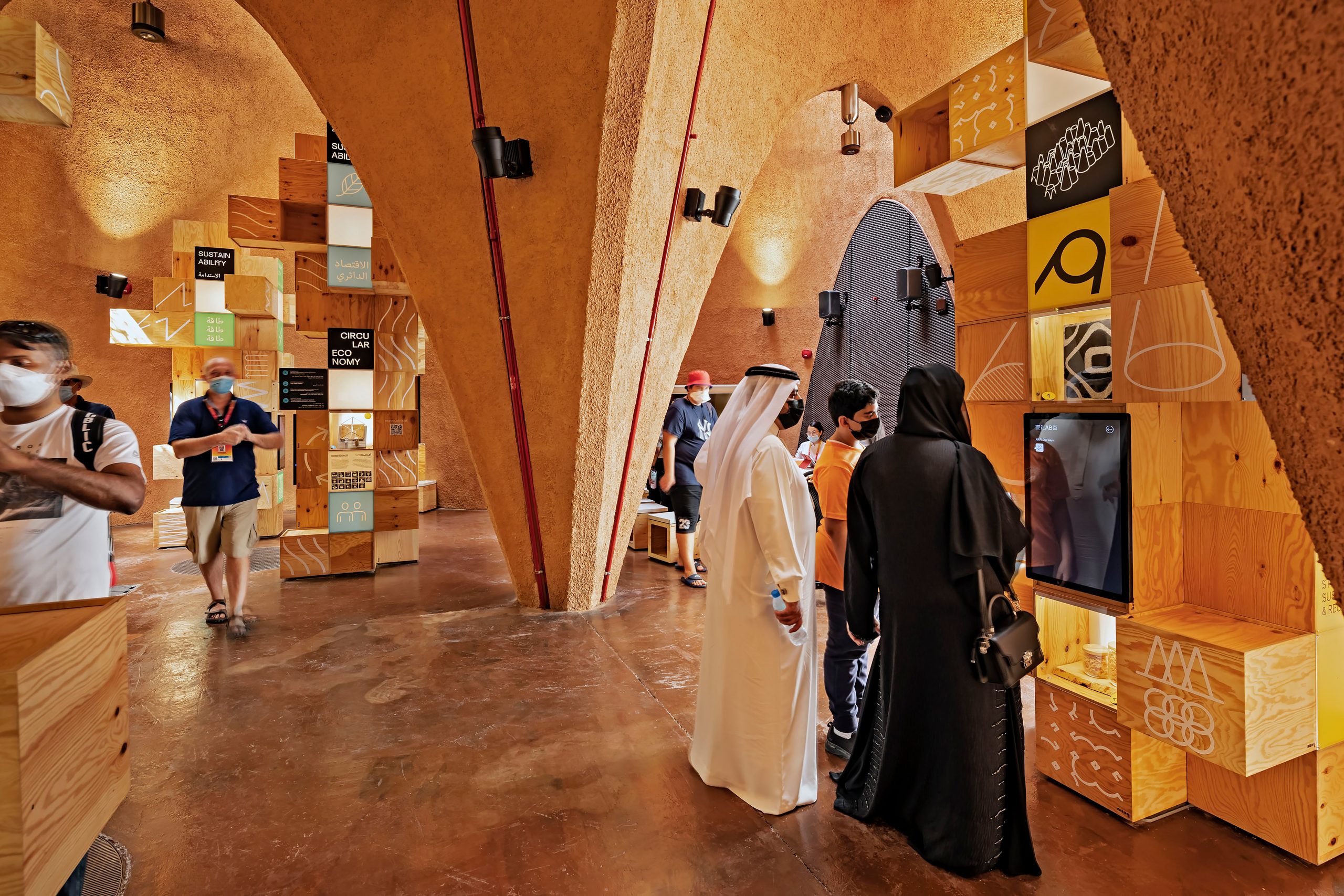
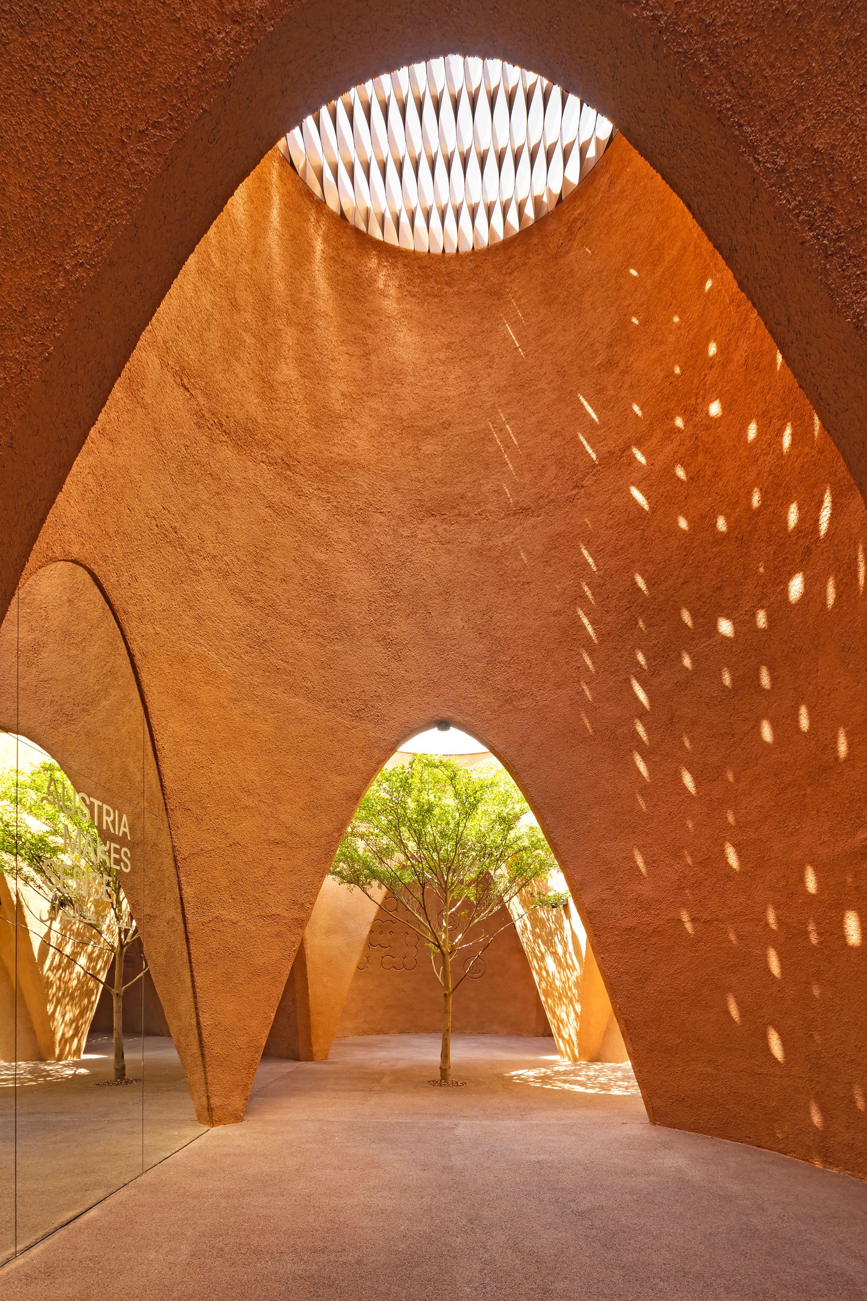
The pavilion —planned and engineered by the renown architects querkraft—combines an old oriental building technique with innovative Austrian craftsmanship. A network of 38 intersecting cones provide a unique space for the visitors. Inspired by Arabian wind towers the architecture features an intelligent climate concept that allows the pavilion to cool itself with a constant airflow circulation. The onsite exhibition was executed by the fabulous ArsElectronica Solutions team in collaboration with buerowien. In this setting we developed an airy visual identity and sensuous exhibition for an international audience.
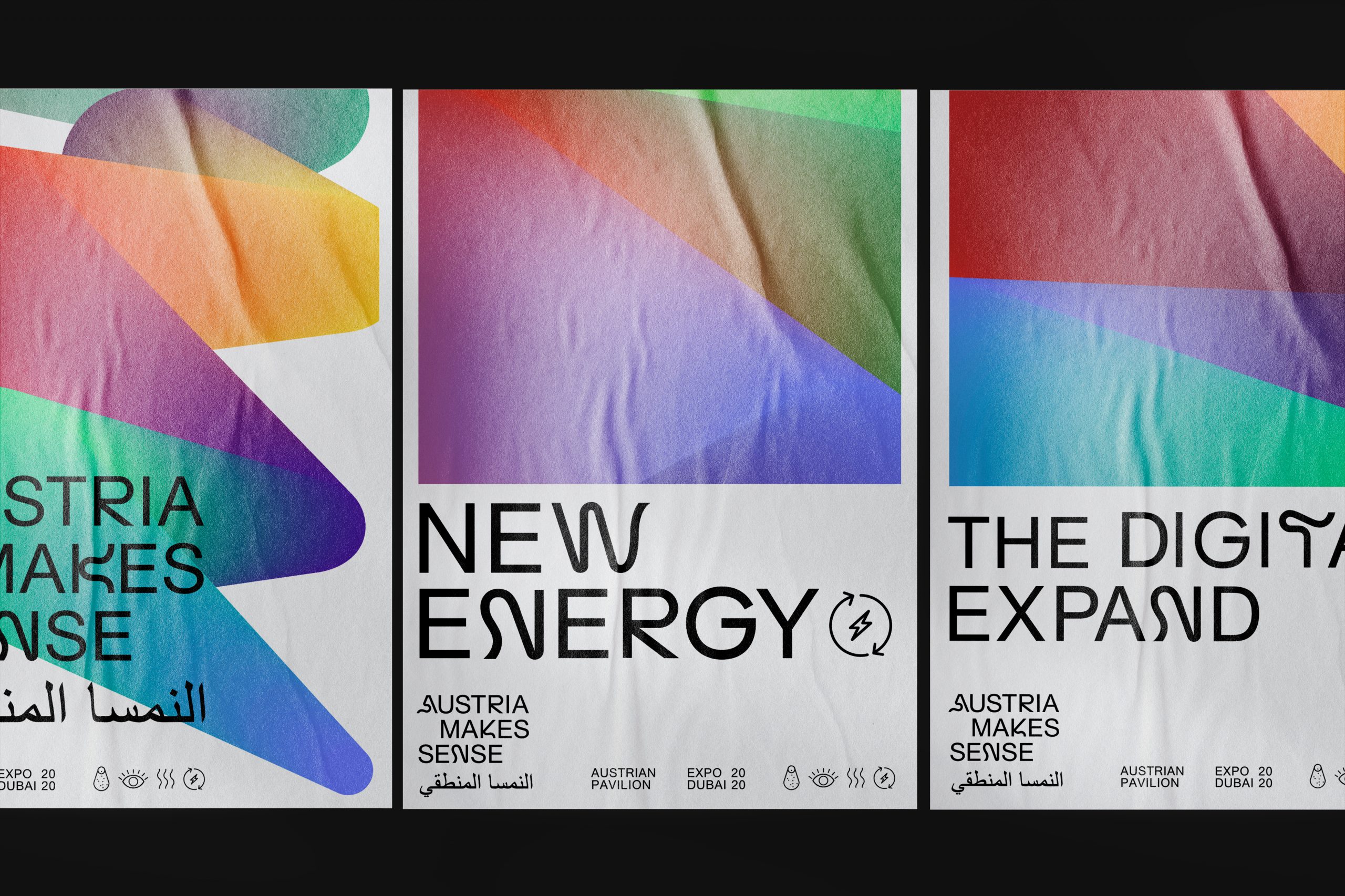
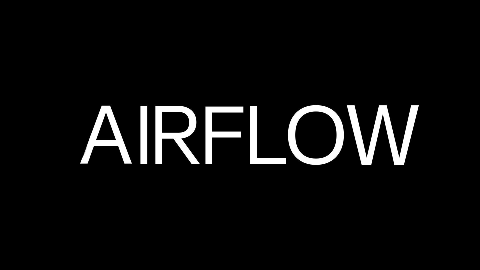
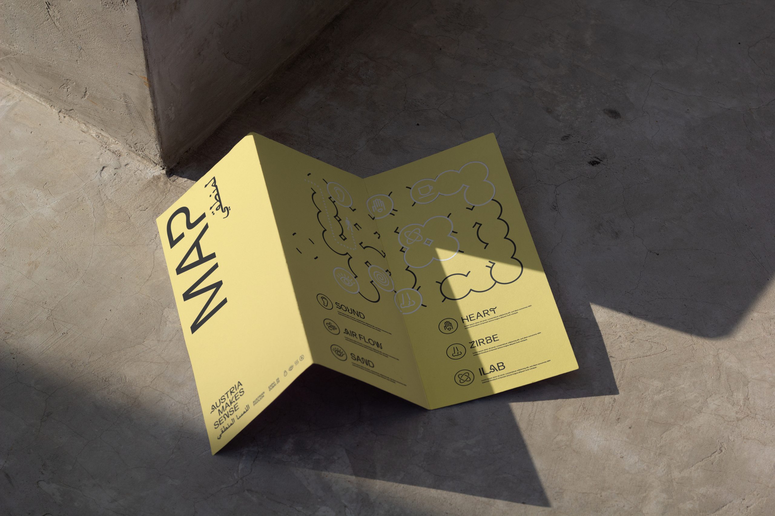
Airflow – a custom fluctuating display font
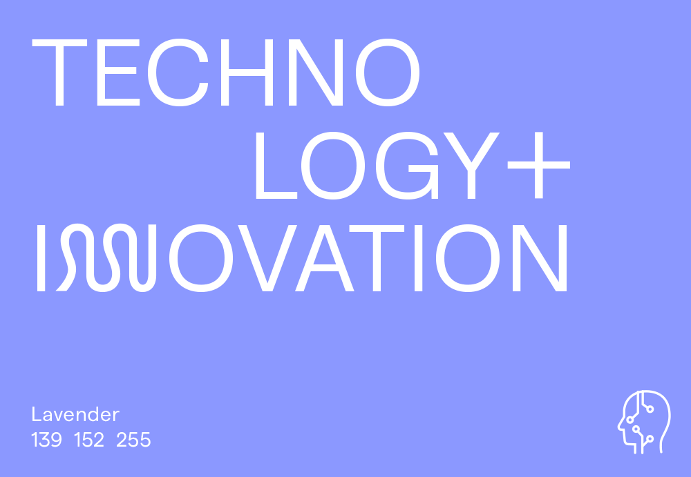
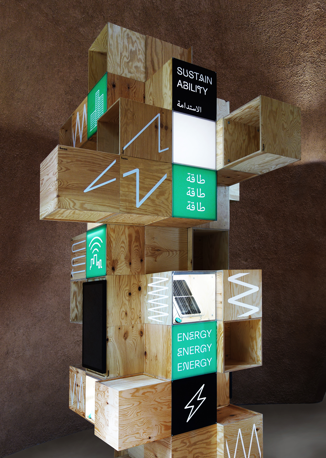
The display font “Airflow” combines Arabian calligraphy with the latin alphabet and is inspired by the movement of the air through the pavilion. It is used whenever we wanted to ensure a bold, yet contemplative typographic expression. It works especially well in combination with the icon language which is used in the exhibition on site and for all printed material.
Bleeds visual identity for the Austrian contribution at Expo Dubai envisions the remarkable architecture of the pavilion and creates as striking experience that stands unmistakable for itself. It was a pleasure for me to work with the team!
— Helmut Doeller, Project lead at Expo Austria
Exhibition design
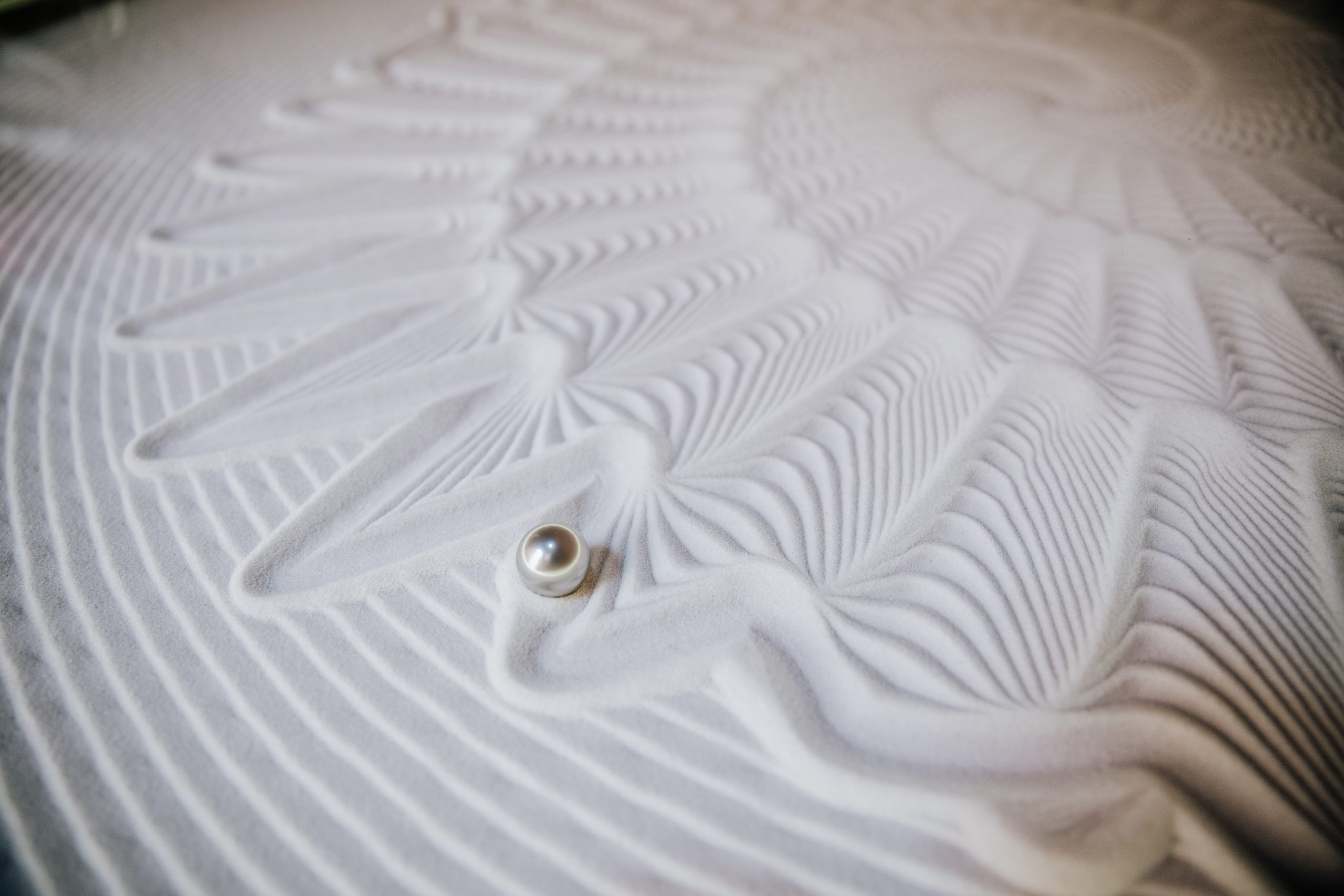
The experience space in the pavilion offers a non verbal dialogue that addresses the senses. The use of an intercultural icon language breaks down barriers such as language, education, age and cultural background. The graphics are scratched into the clay of the cones, mindfully using our earthly resources while creating a surprising visual experience for the visitors.
© Image credits: Querkraft / Fabian Kahr, Andreas Keller, Ars Electronica