Why did the mushroom go to the party?
Because he's a fungi!
— Louis Tomlinson
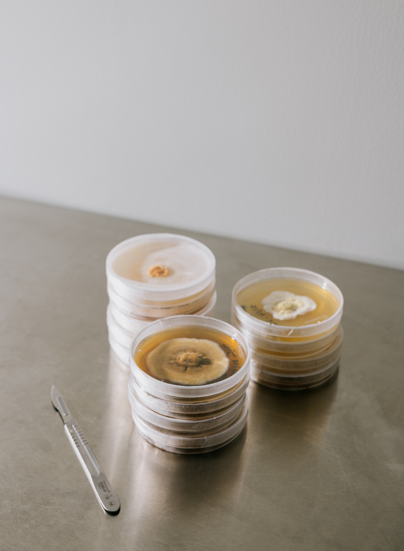
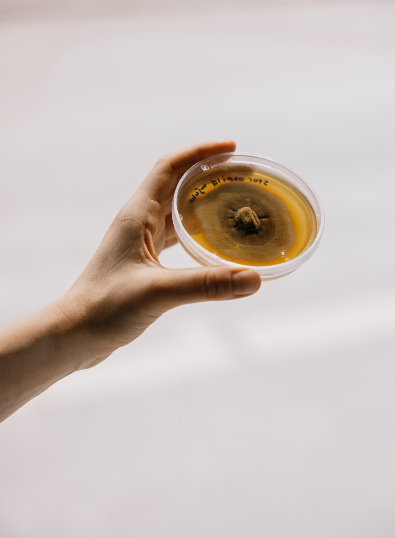
Mycela develops 100% circular materials with special properties for use in art, interior and architecture. Through the use of a living organism - namely fungus (mycelium) - various types of organic waste such as wood, textiles, cardboard and the like are transformed into a competitive, circular and 100% sustainable alternative to traditional materials with a high environmental footprint.
Category→
Bio-tech
Work→
Visual identity, webpage & art direction
Awards→
Art Directors Club
Client→
Mycela
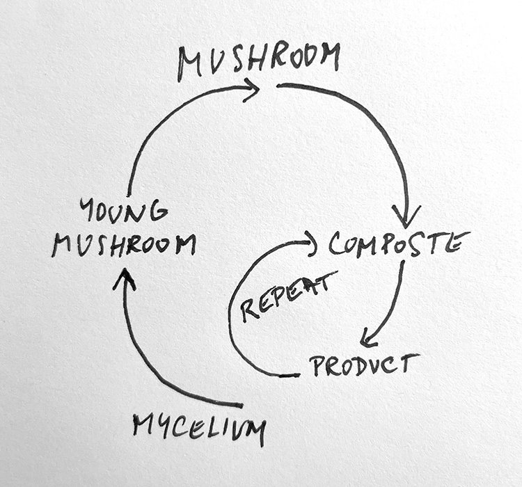
Concept
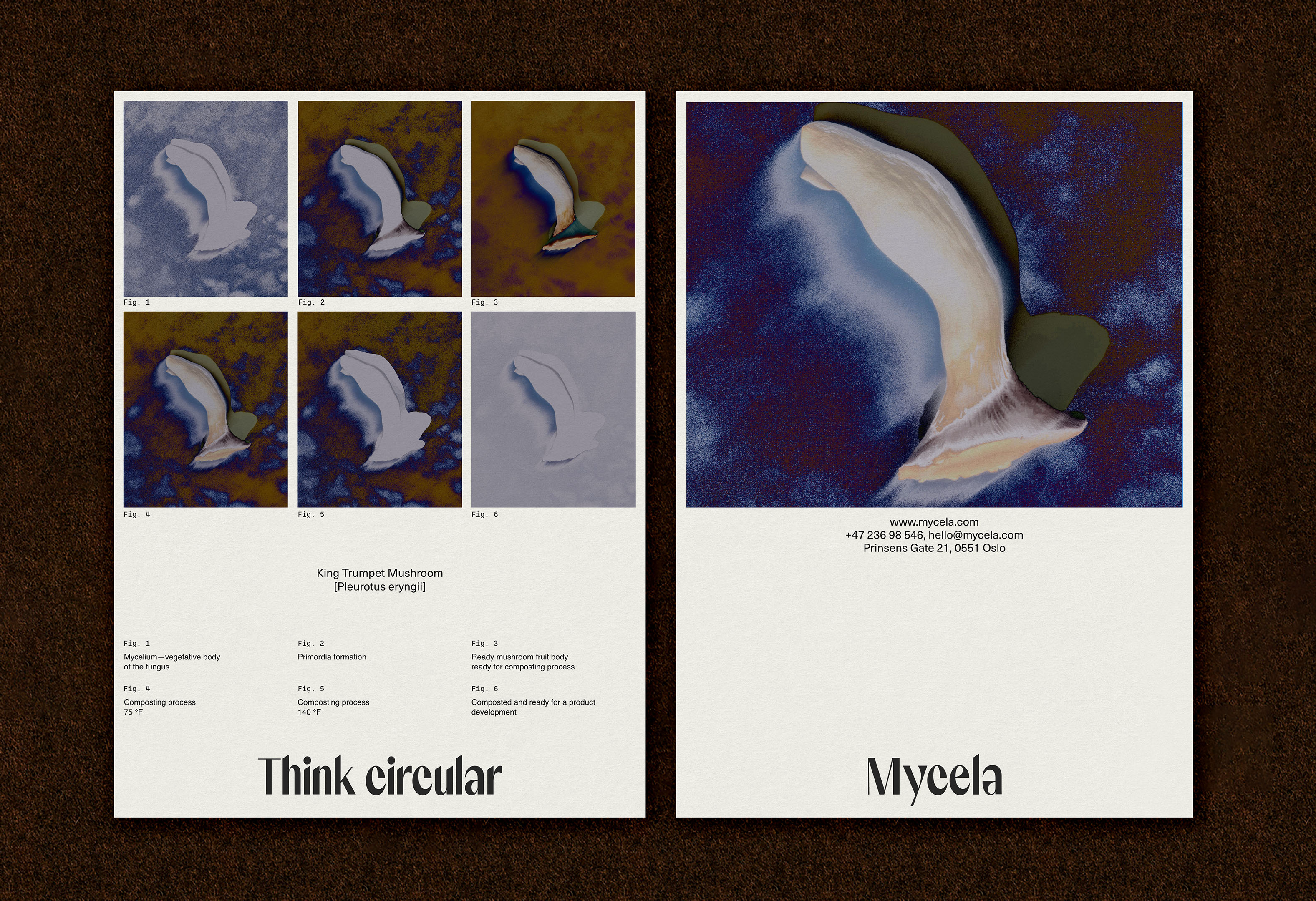
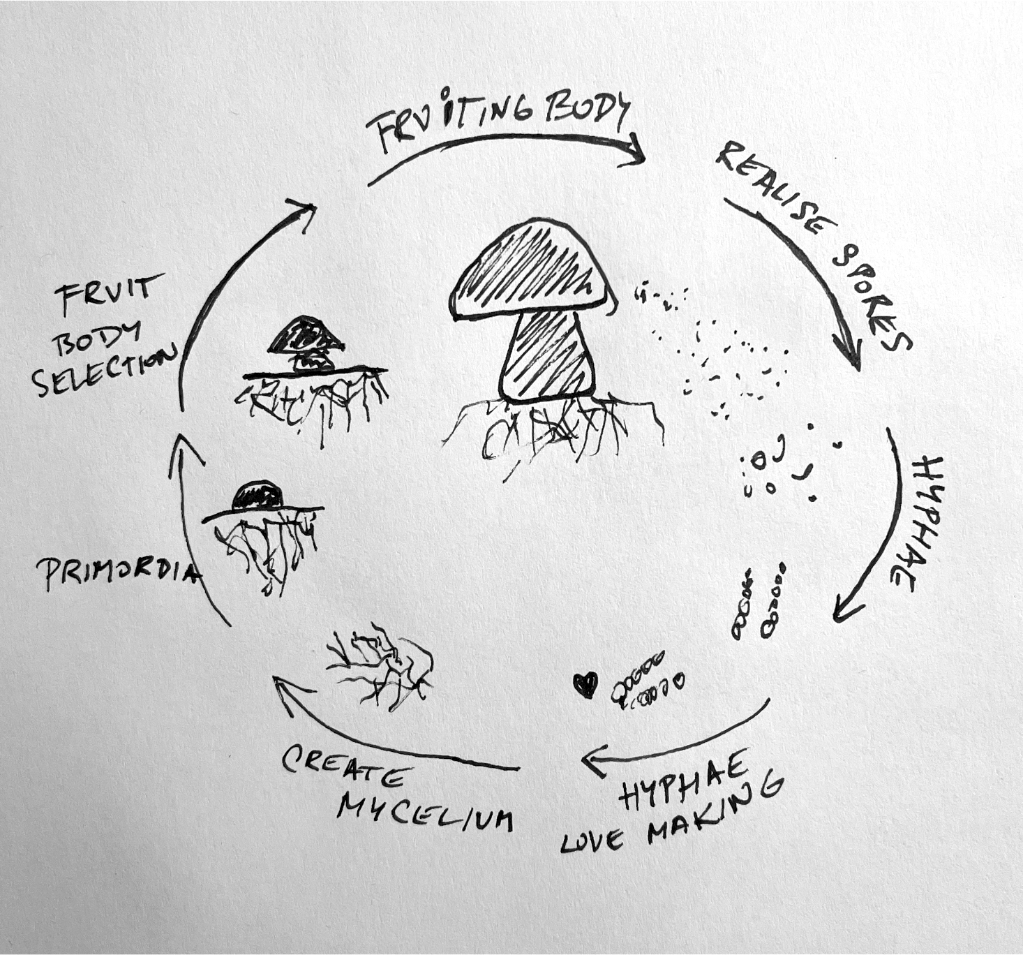
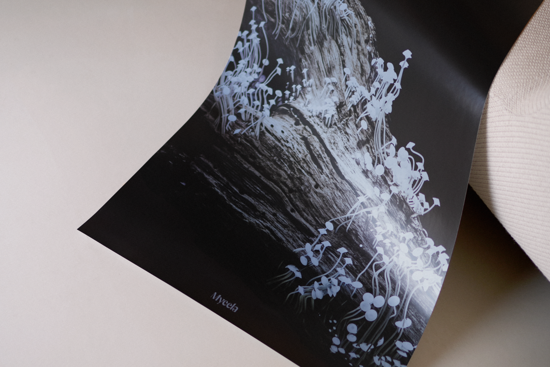
The life cycle of the mycelium Mycela extracts became the cornerstone of the identity. From compost, to products, to compost again. In fact, the identity also composts itself through the use of color profiles and images. The simple idea allows for large and imaginative applications, and lives in the intersection of the natural and the scientific.
[Fig. 1]
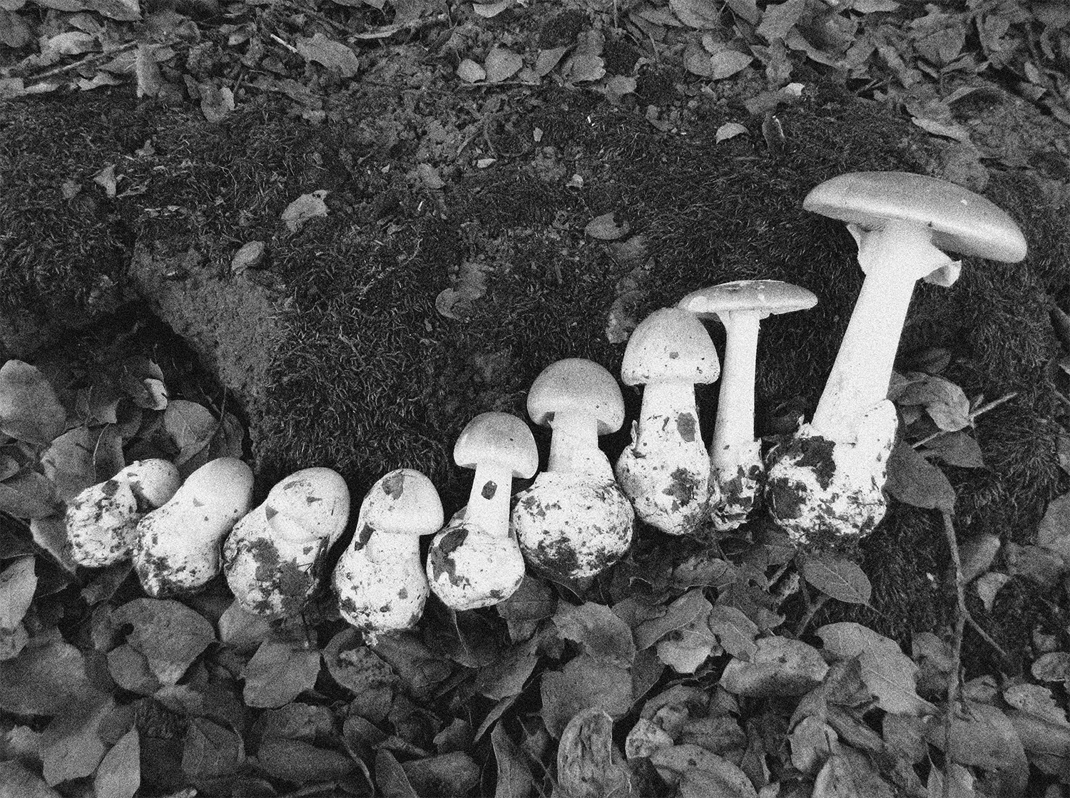
Life of mushroom
[Fig. 2]
Mushroom growth revolution
[Fig. 3]
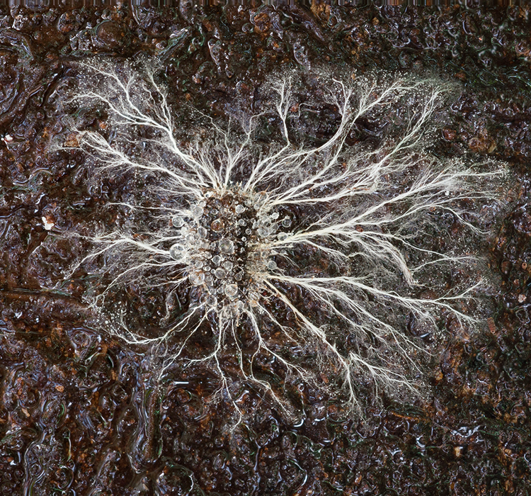
Mycelium
[Fig. 4]
From mushroom to a product
[Fig. 5]
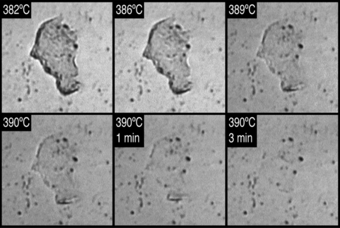
Composting timelapse
Solution
With a product that is still open to definition and application, it was important that the identity did not limit the product, but rather inspired its use.
Although Mycela caters to a B2B market, they offer a product that must appeal both emotionally and rationally to be considered. Therefore, the identity takes the freedom to borrow from the design language of the products and services their target group deliver in, through the use of typography and composition. The visual directions are simple but effective, and allow their vision and the product to shine through. Filters and color profiles are also an economical and applicable measure for the small start-up to use in their communication.
Brand photo
Julie Hrnčířová (Abrakadabra)
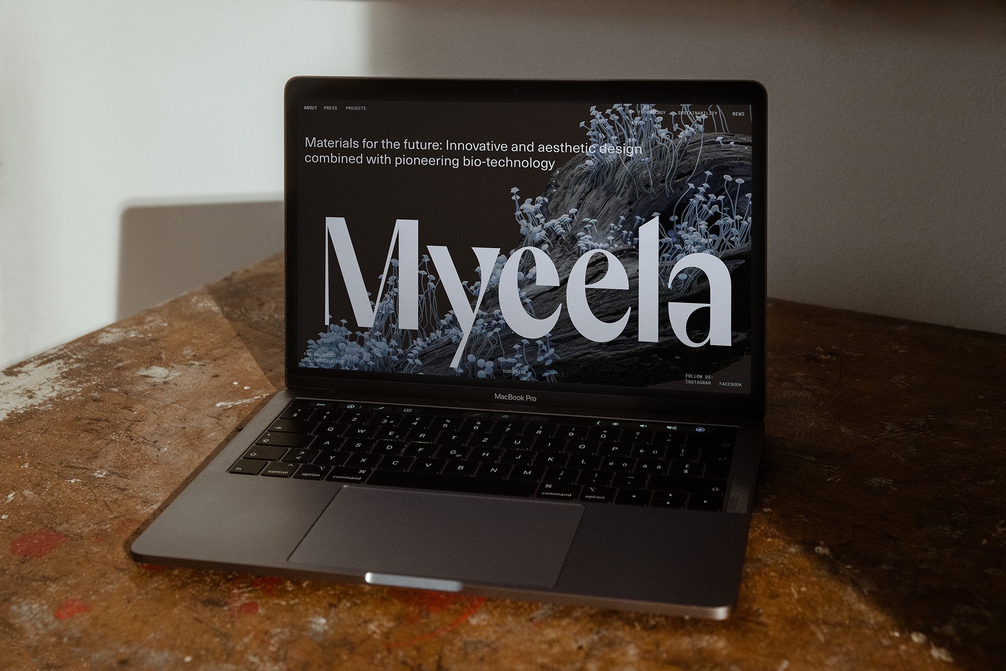
Typography and colors
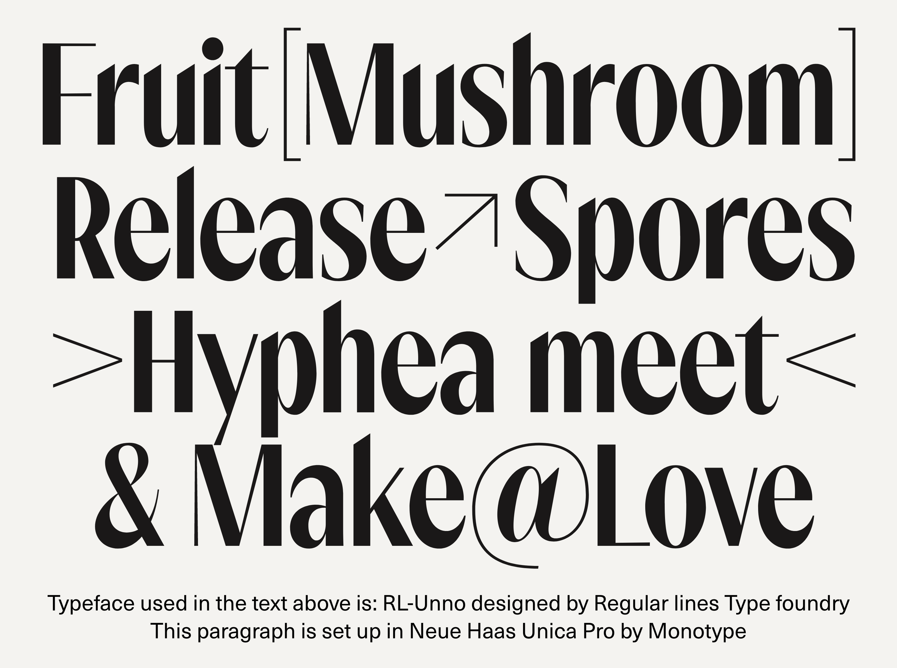
Display typeface RL-Unno with elegant organic details blends well with the mono typeface that is commonly used in plant specimens.
[Fig. 1]
Fonts: RL-Unno by Regular Lines Type Foundry & Neue Haas Unica Pro by Monotype
[Fig. 2]
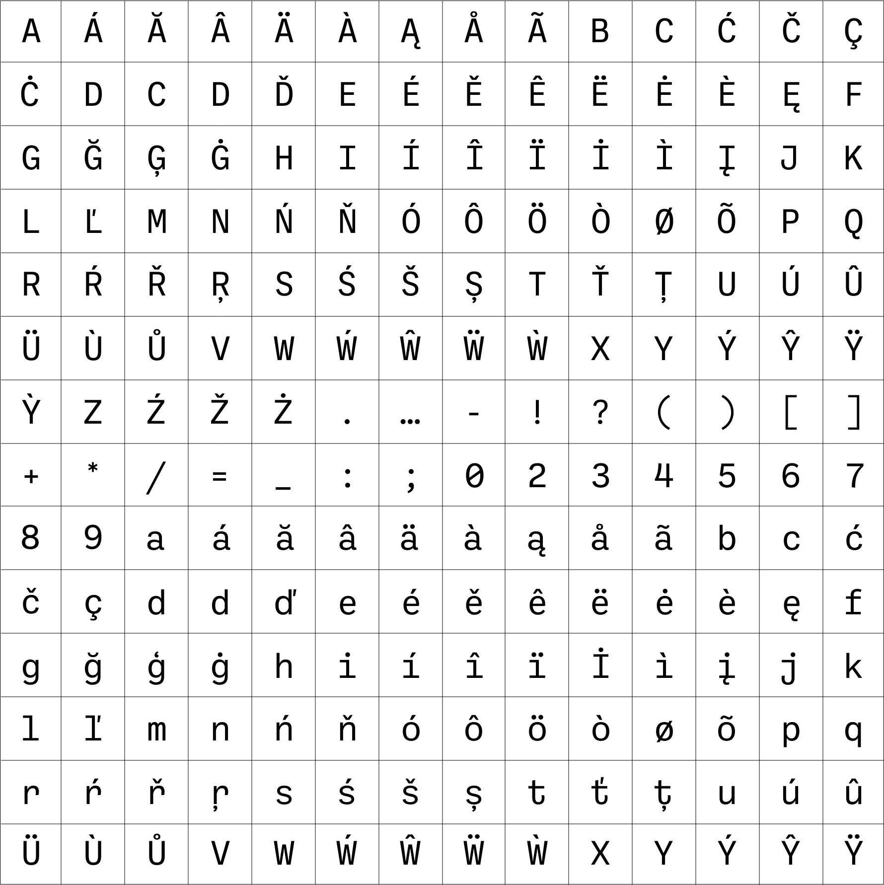
Ballinger Mono
[Fig. 3]
Color palette
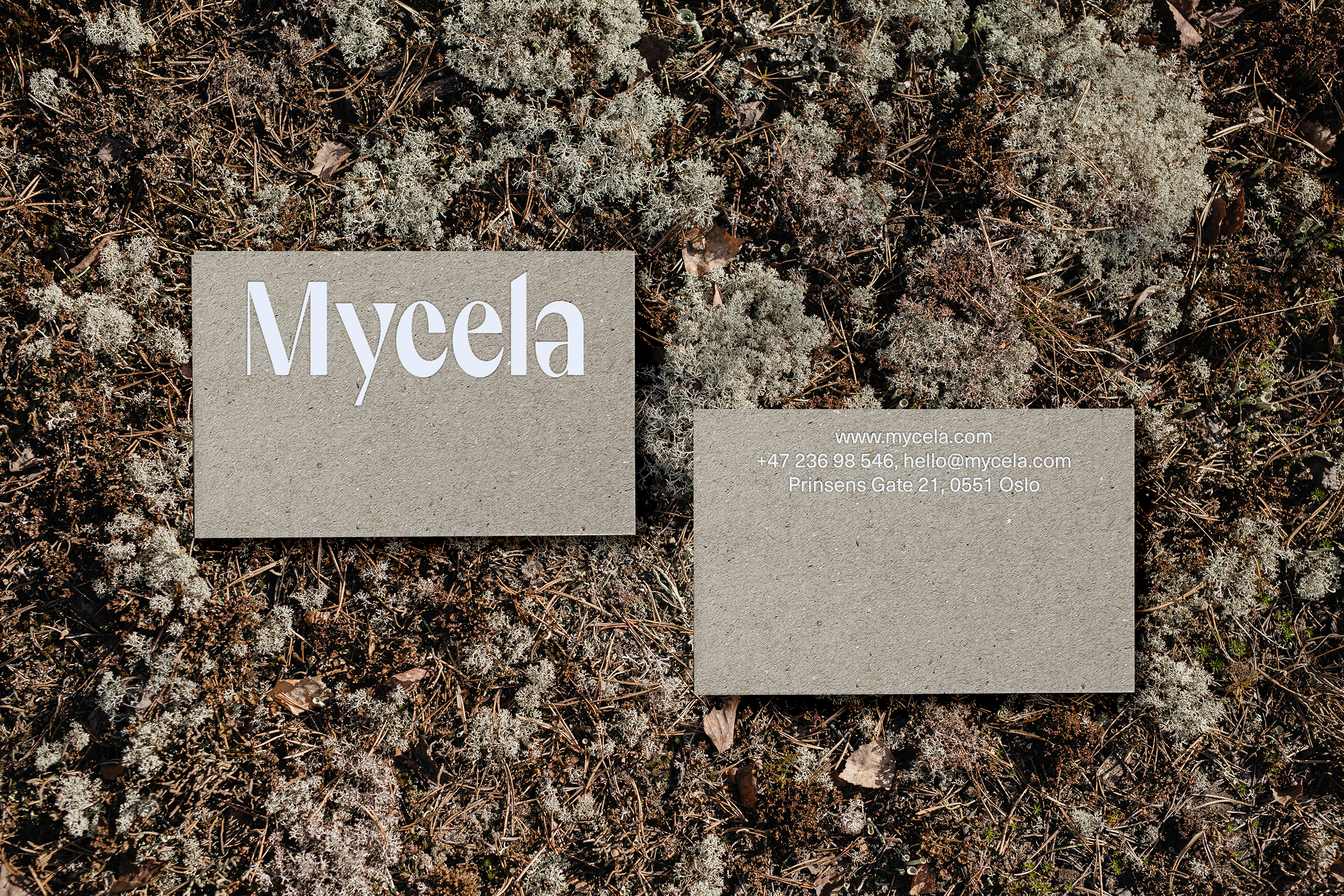
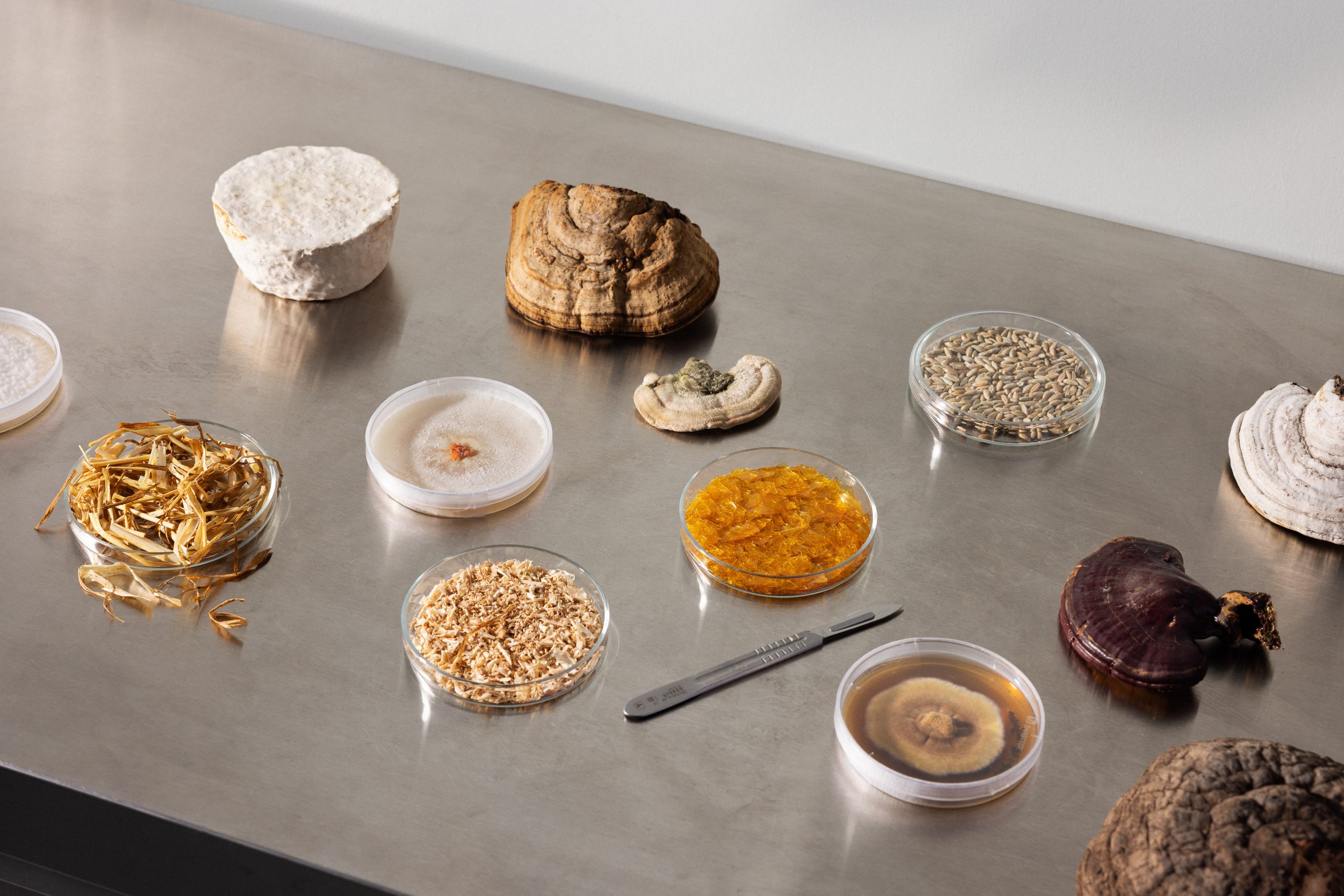
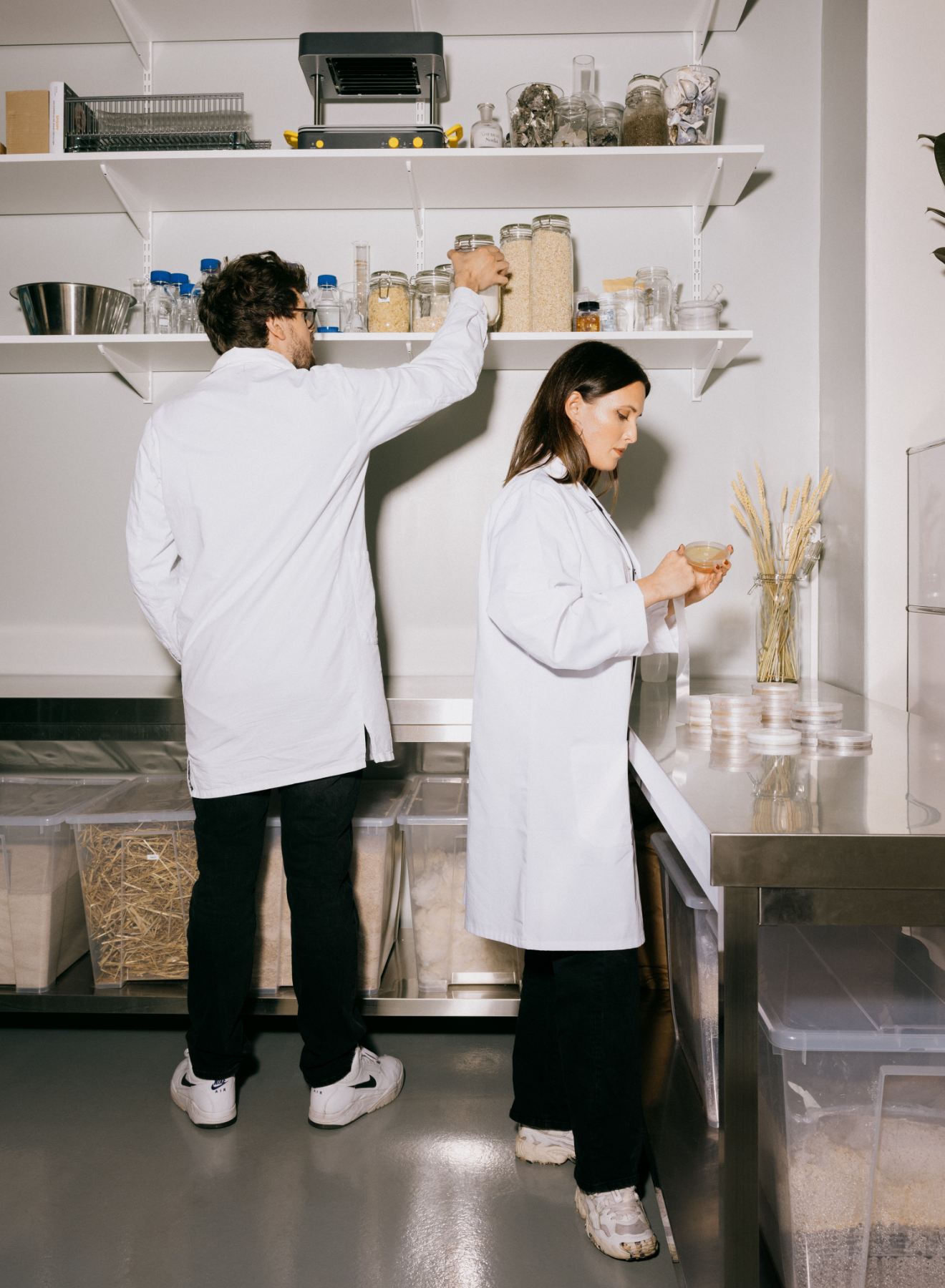
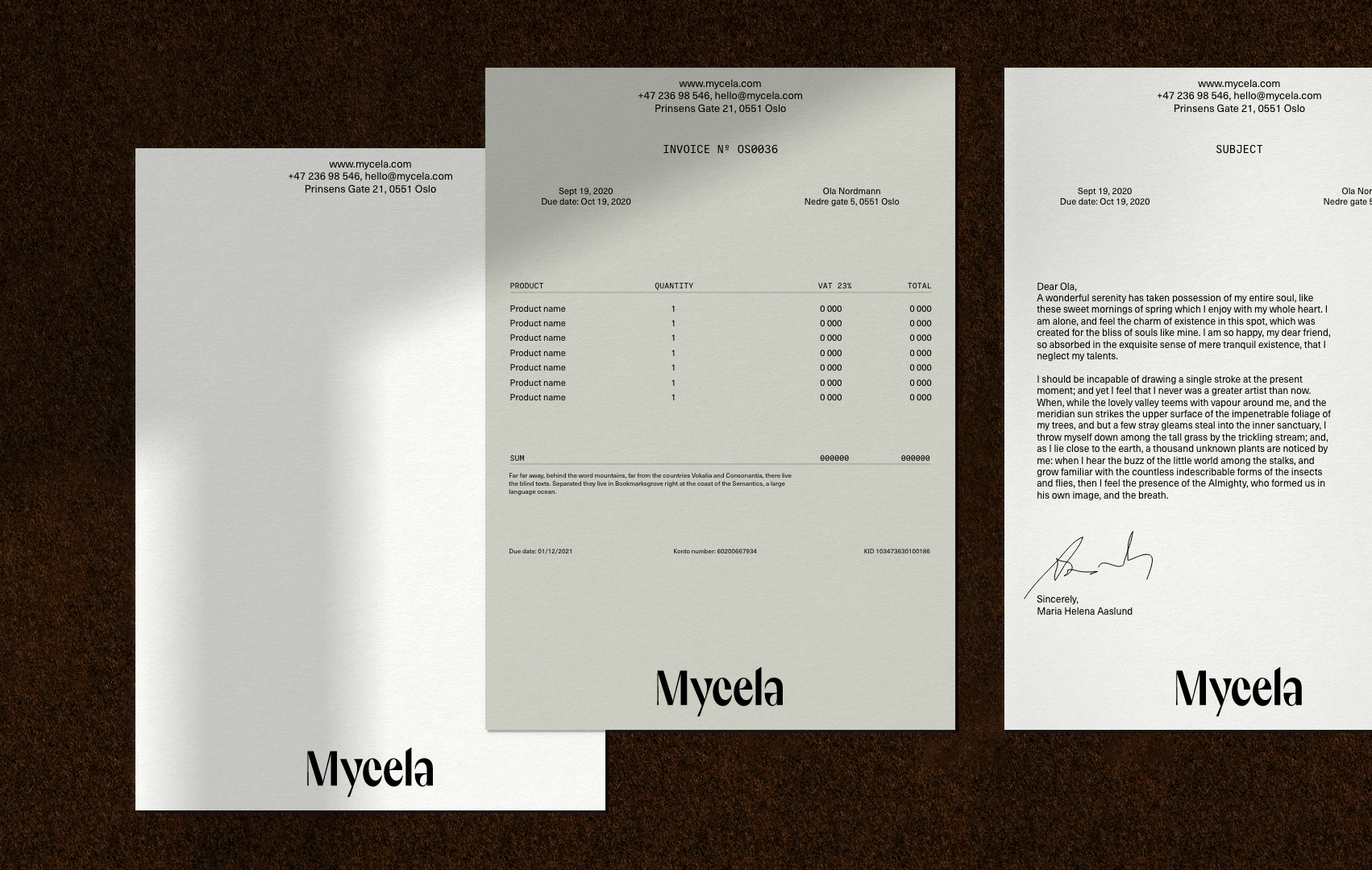
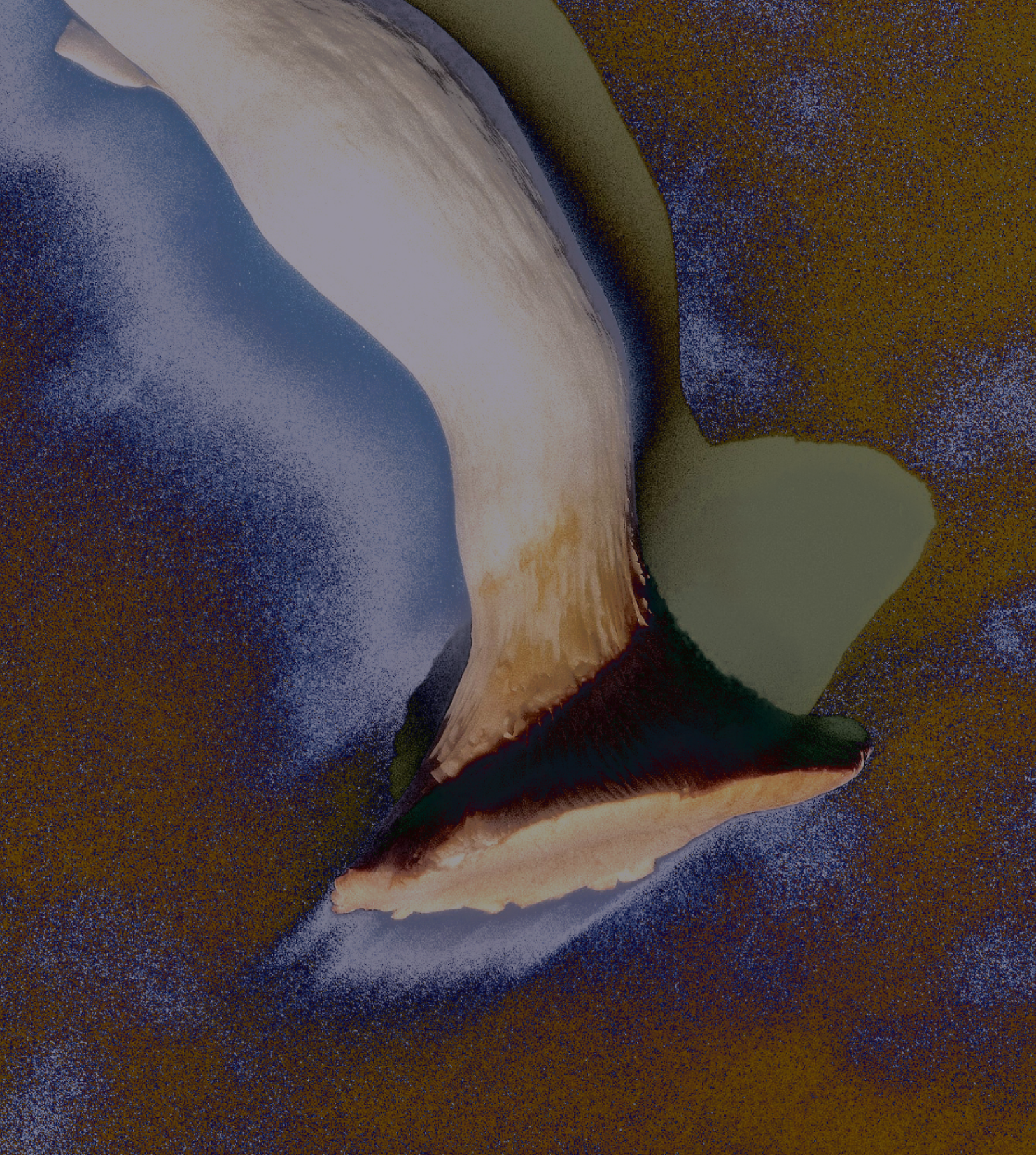
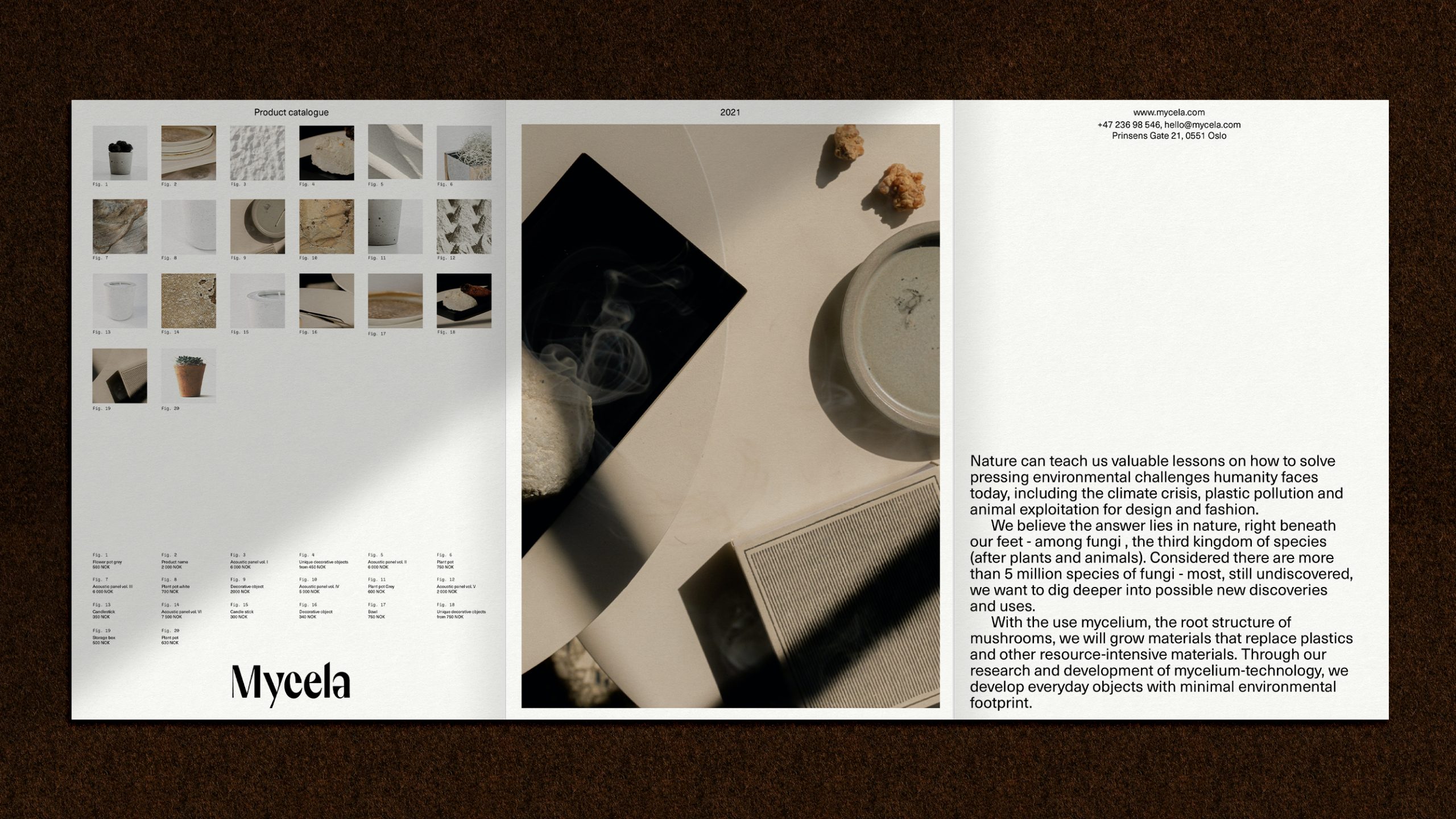
Illustration (as a visual playground)
The illustrations are bridging nature with science. By using a digital effect with Mycela color combinations, the illustrations become both, abstract and figurative with grainy feel.
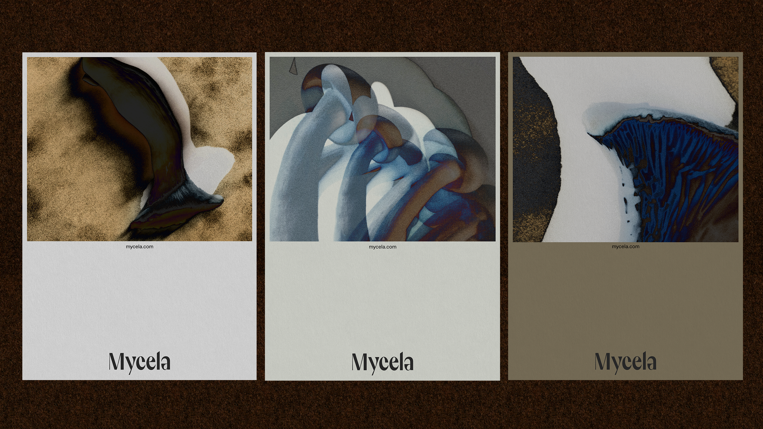
Modular layout system