Avo Consulting
Rebel Within
In 2019 Bleed created Avo’s initial visual identity, which played on a combination of the company’s playfulness and professional liability. Five years later it was time to refresh their brand and visual identity to emphasise that Avo is no longer a small start-up, but an actual established player in the Norwegian consultancy industry. Still, at the same time, keep the initial core of the company; playful, curious and tech-driven.
To change something that already works well, can be a proper challenge. Avo wanted to grow up, but still keep the rebel within.
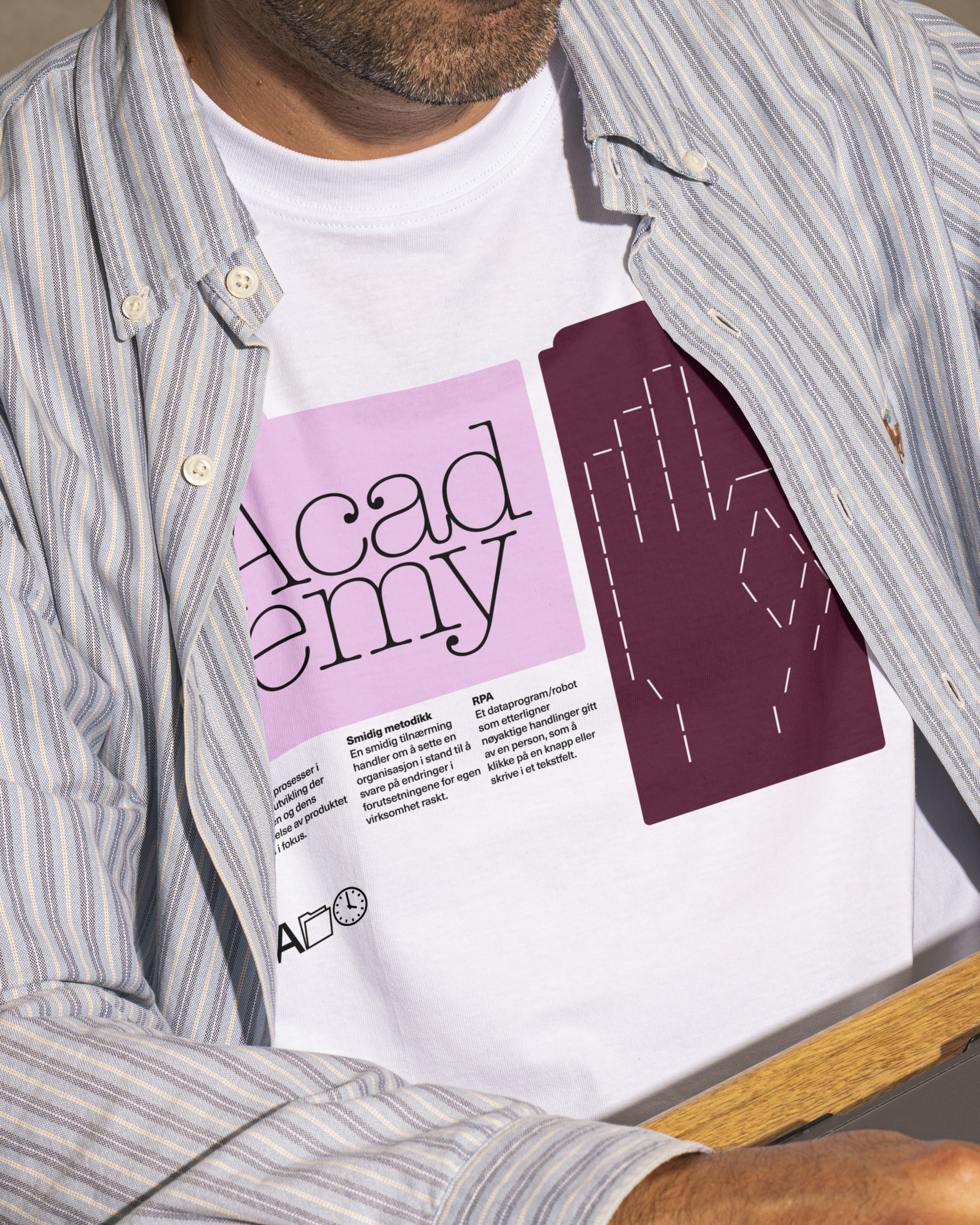
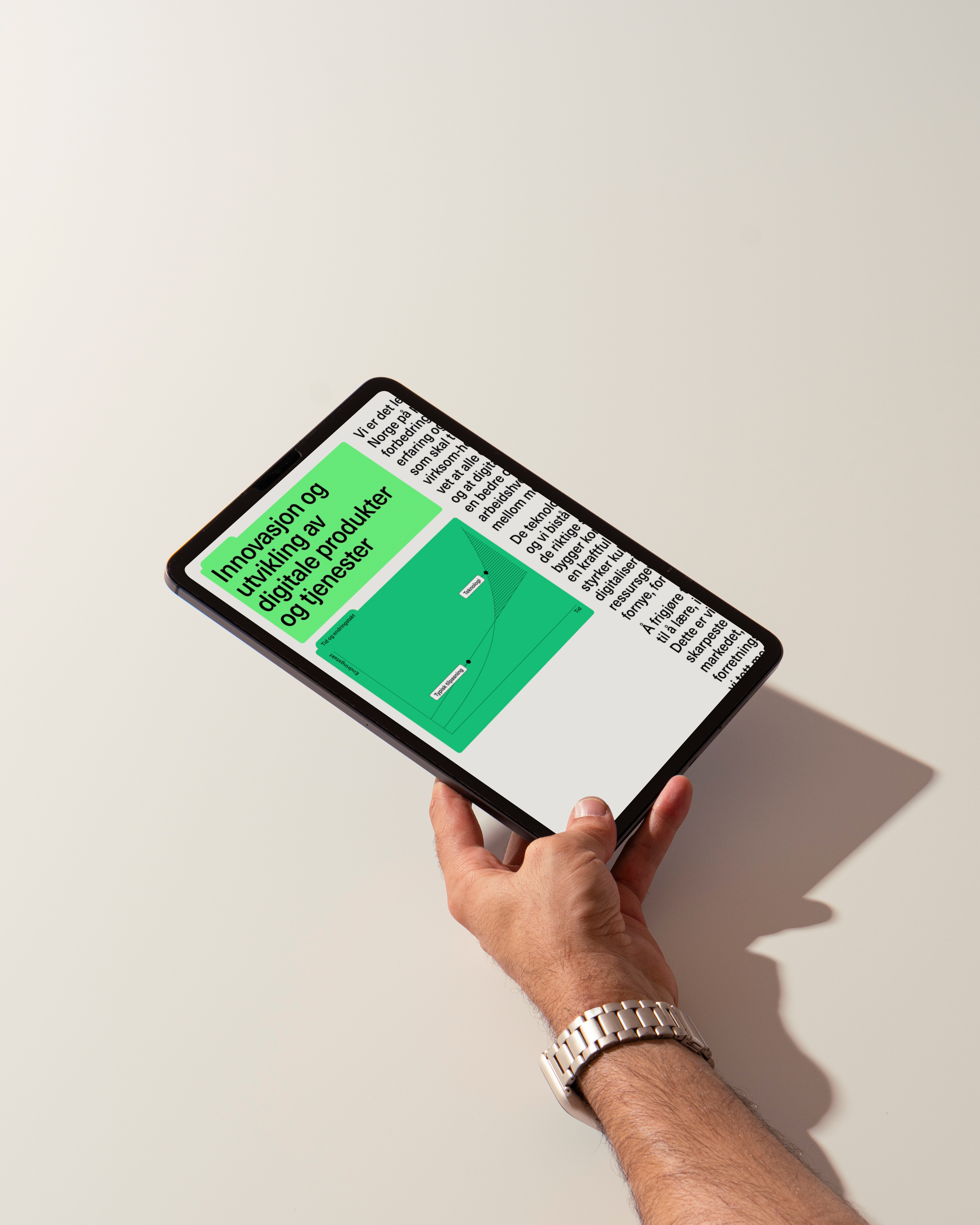
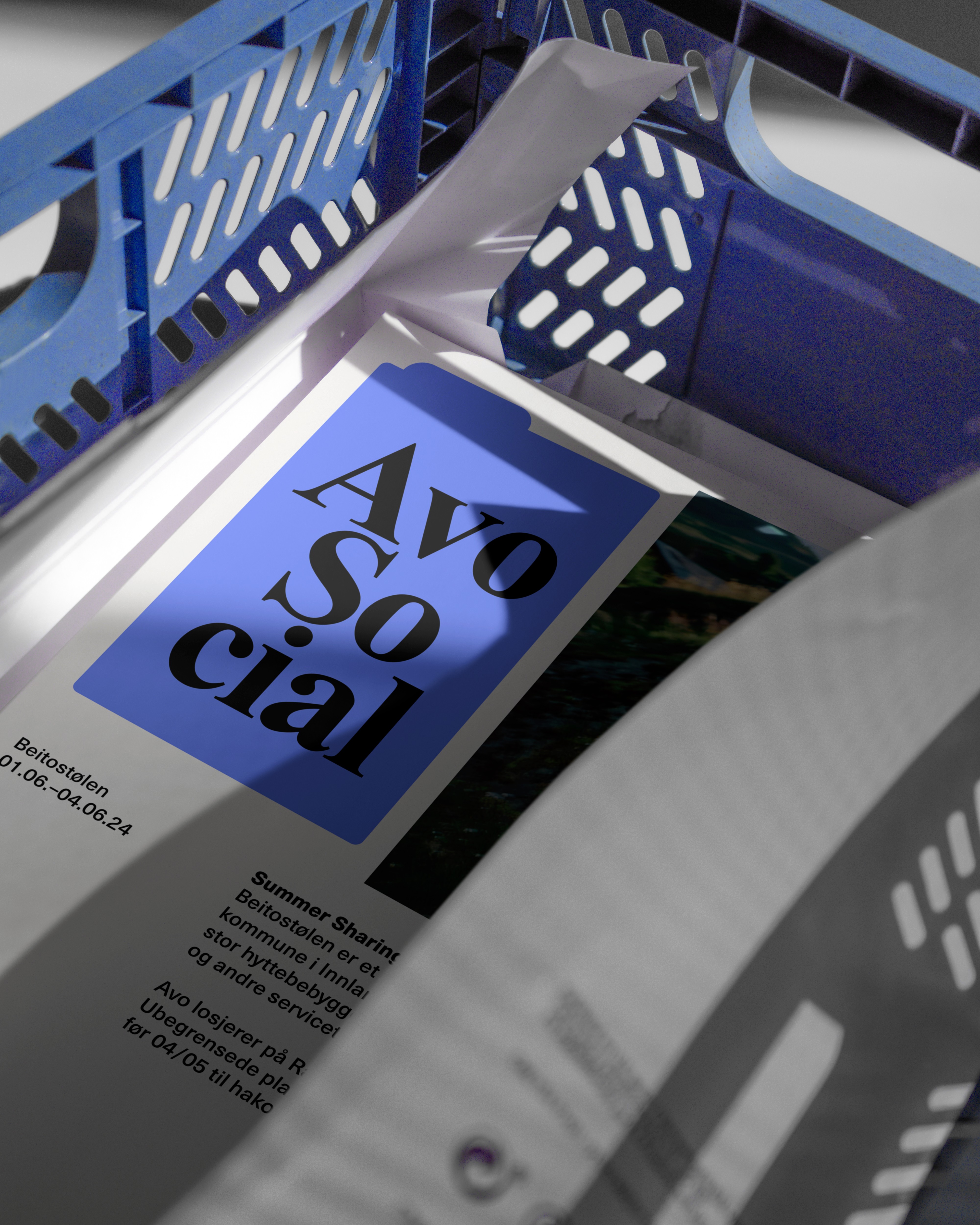
In the core of the new design system we still find Avo’s characteristic logo – The ‘Avodings’ – that symbolises the company’s ability to change and include. At the samt time, the identity is built out with many new elements, most noticeably the usage of program windows or tabs as a graphic language. The windows creates pockets where Avo can refer to the different methods or programs they’re working within. These containers also opens up for a playful approach, as they can be filled with whatever fonts that are default to the program they’re working in.
The language of the windows nods to the collection of competence Avo is holding, at the same time giving Avo an unique visual tool that can be scaled from being super straight to super crazy. The layouts are inspired by Mac’s ‘Mission Control’. Different windows combined then become like Avo’s work bench.
Without stealing the spotlight from the already defined jargon in the logo, Avo has been updated with an identity and website that has functional new graphic tools that plays well within the same universe as the established expression. The usage of text in the program windows creates clear modules and recognition - which is perceived as a prolonging of the playfulness Avo has been getting known for - and at the same time enables Avo to create a sea of interesting compositions.
The consultancy industry is known to mystify technology. Avo, on the contrary, have made an index on their website, where they can define industry hype words, which creates a dictionary for the users appearing as an clickable asterisk. Back-end the website is automatically populated with the asterisks when being utilised in an article or page. In addition it has been a goal to simplify UX and make even clearer CTAs as i.e ‘contact’ and ‘booking’.