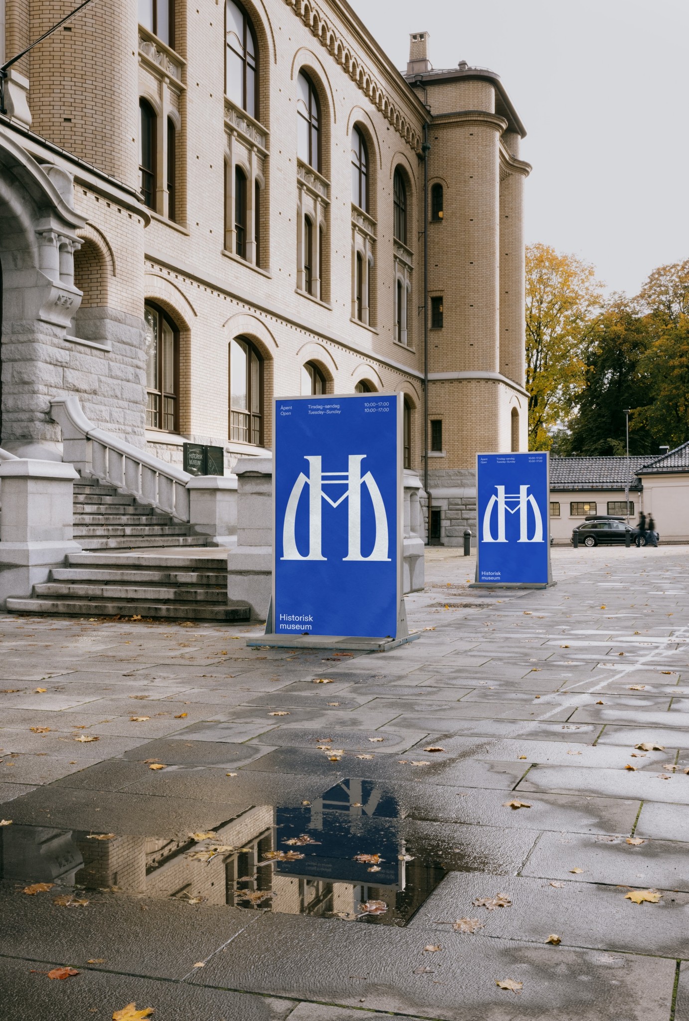
The Historical Museum
Future <> Past
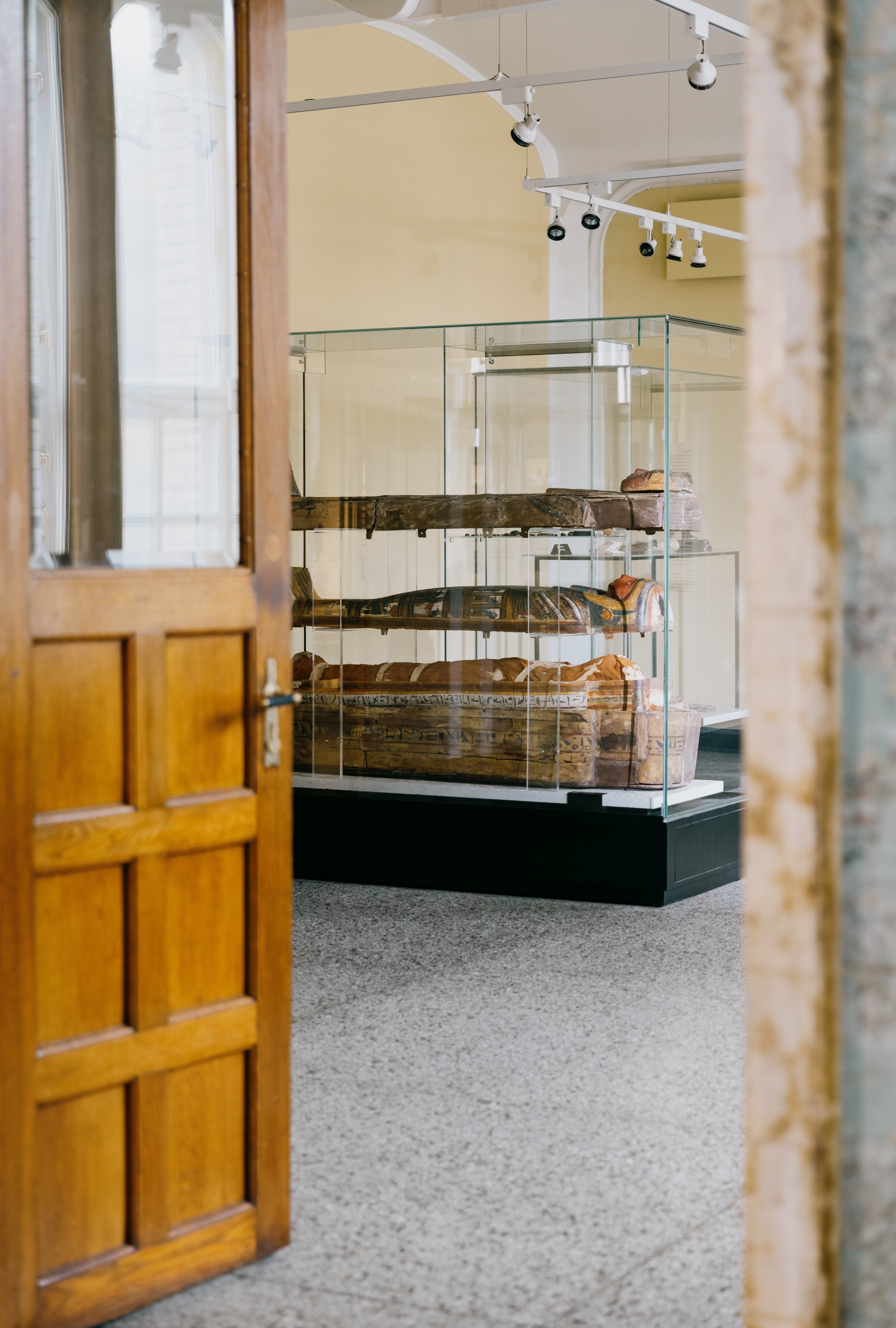
The Historical Museum contains Norway’s largest collection of ethnographic and historical artifacts, from the stone age to our time.
The museum was opened for the public in 1904, and is one of the few buildings in Oslo drawn in the style of Art Noveau. During the latter years the museum has remodeled much of their interior and exterior, reclaiming the building towards it’s original shape.
In its current form, the museum is a result of a merge between three of the University of Oslo’s cultural historical museums in the early 2000’s. 20 years later, a need was seen to clarify both the brand and the visual identity. The project aimed to both secure the Historical Museum as an independent sender and brand, at the same time as the new profile would make the museum a natural part of UiO’s many museums and institutions.
100 years in the making
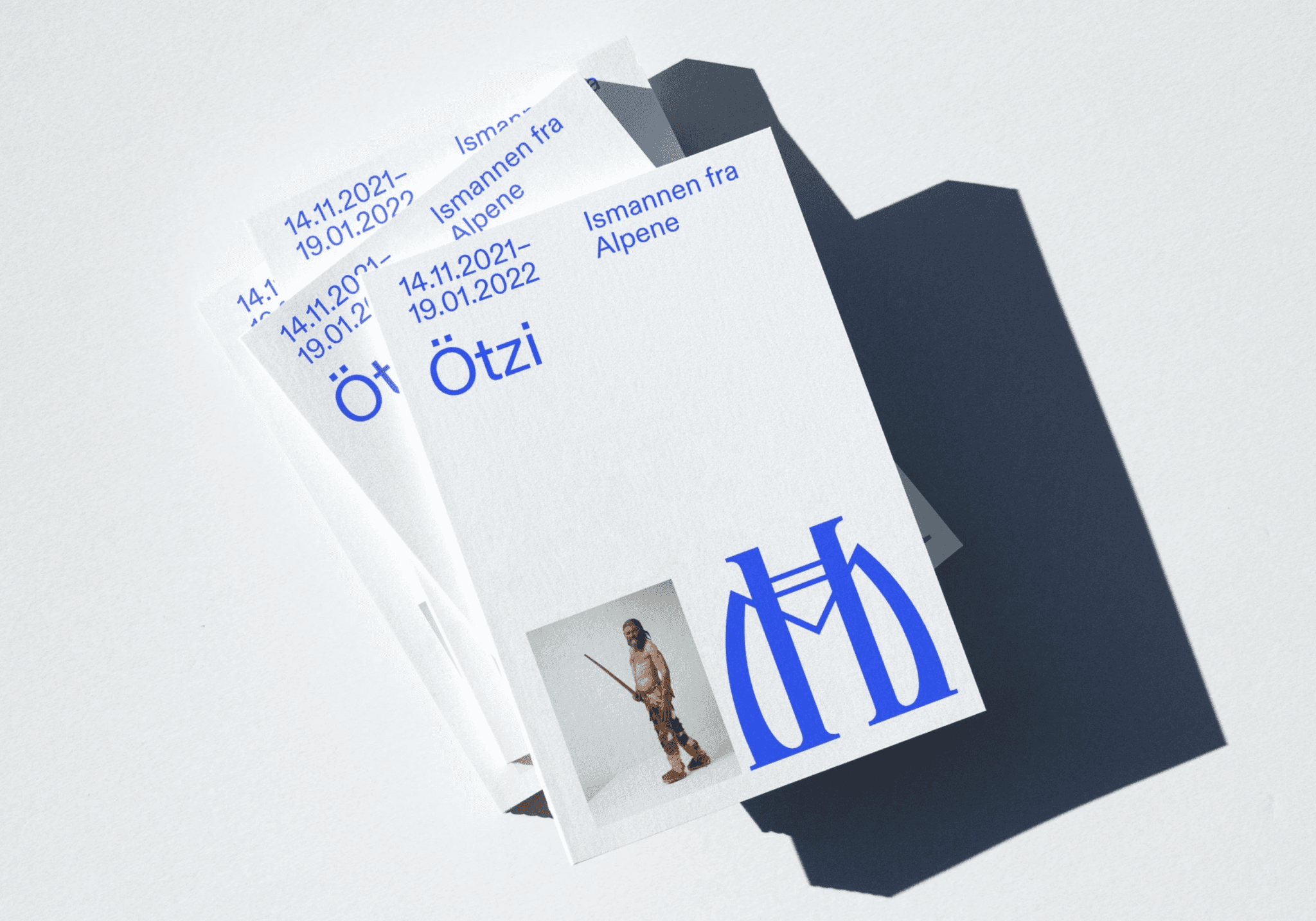
Some in mosaic. Some gilded in chandeliers. Some painted on the walls. The architect of the museum, Henrik Bull, drew multiple versions of a monogram that adorns a variety of embellishments and details in the building. As a museum which role is the preserve and convey history, it became important in the identity that it should also convey its own. The monogram has been updated, and retrieves shapes from several of the different versions the monogram was designed on in the building
Traditionally contemporary
The Historical Museum aims to be a contemporary history communicator with clear roots and credibility. The monogram became a graphic focal point in the identity that can vary in size and clarity, which carries the history of the museum itself
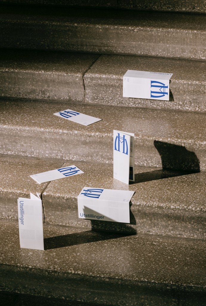
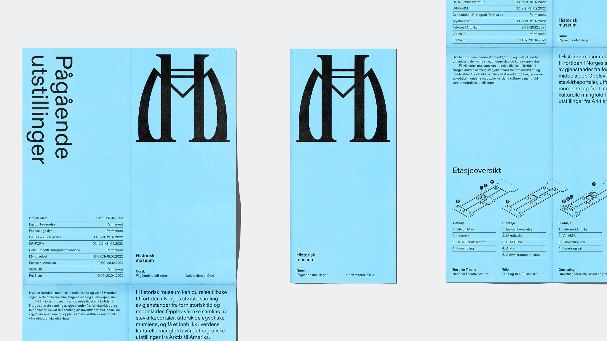
The monogram, as well as the building, has a rich and strong design language. Therefore the other elements of the identity were toned down to a minimum which gives the monogram the space to be the main feature. The identity has a large opportunity for balance between sober and experimental, where the use of typography, colors and the placement and size of the monogram provide new rules for each exhibition.
Documentation photo
Jan Khür (Abrakadabra)


