Sbanken
Banking Made Simple
Sbanken, previously known as Skandiabanken, has consistently held the title of having the most satisfied customers in Norway since 2002. As the first fully digital bank in the country, Sbanken has always embraced innovation, challenging the traditional banking industry with its customer-centric approach.
The rebranding initiative was driven by Sbanken’s separation from Skandia, marking its evolution into an independent Norwegian bank listed on the Oslo Stock Exchange. The challenge was to redefine the bank’s visual identity while preserving its core values of openness, simplicity, and fee-free services. Sbanken needed a brand refresh that would signal its independence while maintaining the strong customer trust and recognition it had built over the years.
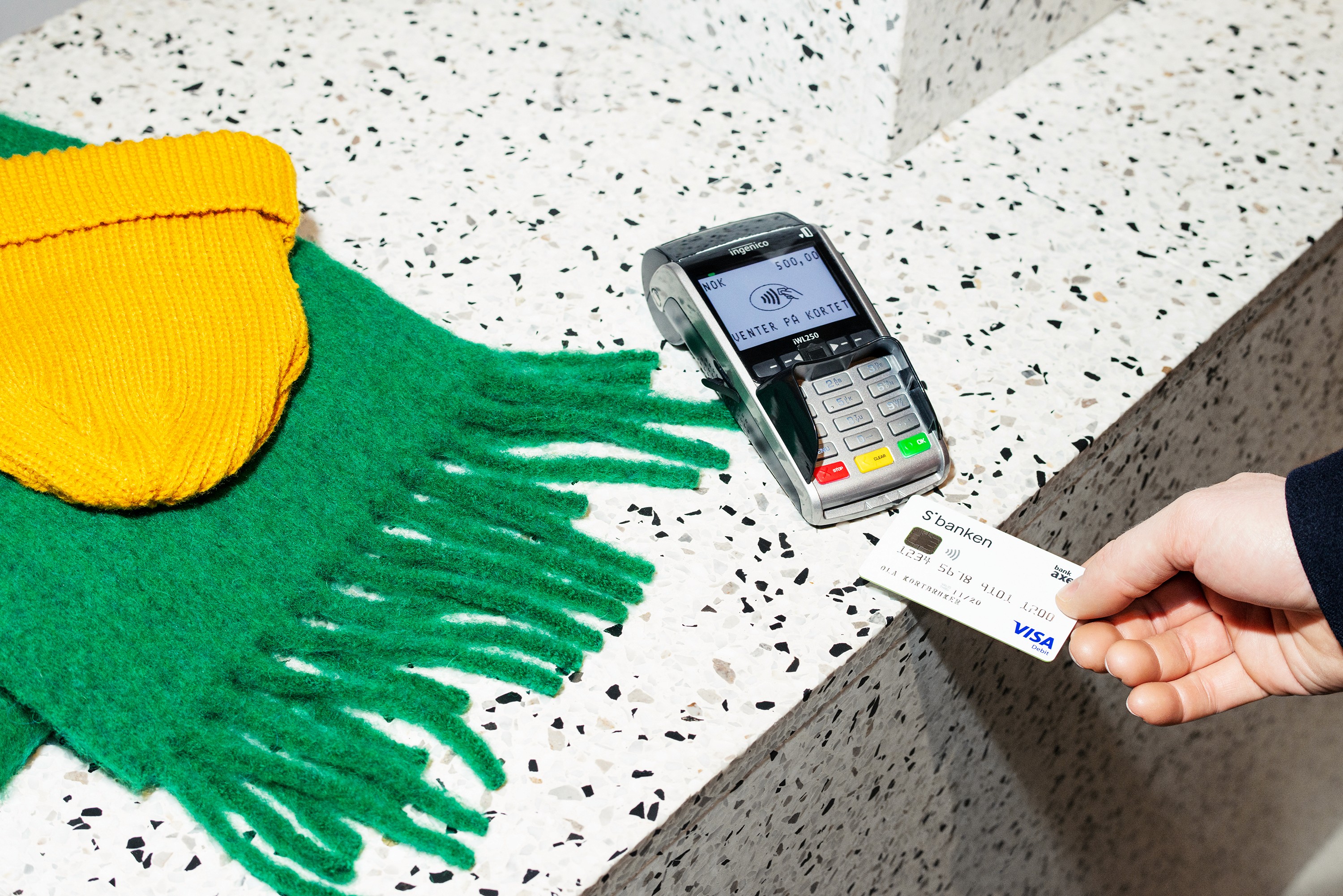
The new visual identity for Sbanken was centered around the concept of “your sphere,” reflecting a focus on individuals, families, and communities. This approach emphasized the bank’s commitment to creating a banking experience that is simple, rebellious, and transparent.
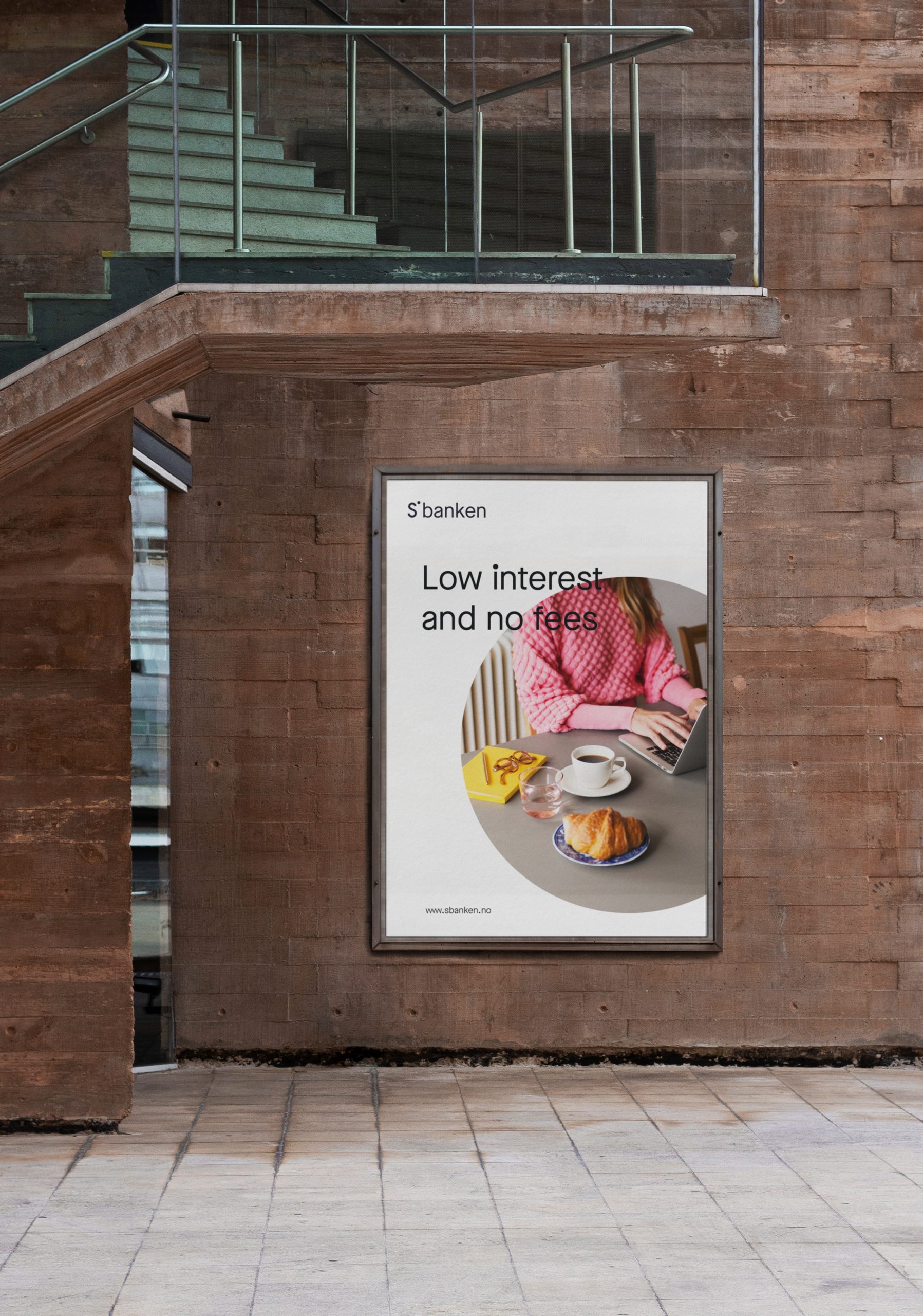
Our goal was to evolve the brand without losing its essence. By modernizing the visual identity, we ensured that the new name, Sbanken, continued to carry the same brand associations that customers had come to trust. The visual design was refined to highlight the bank’s commitment to openness and simplicity, setting it apart in an industry often seen as uniform and traditional.
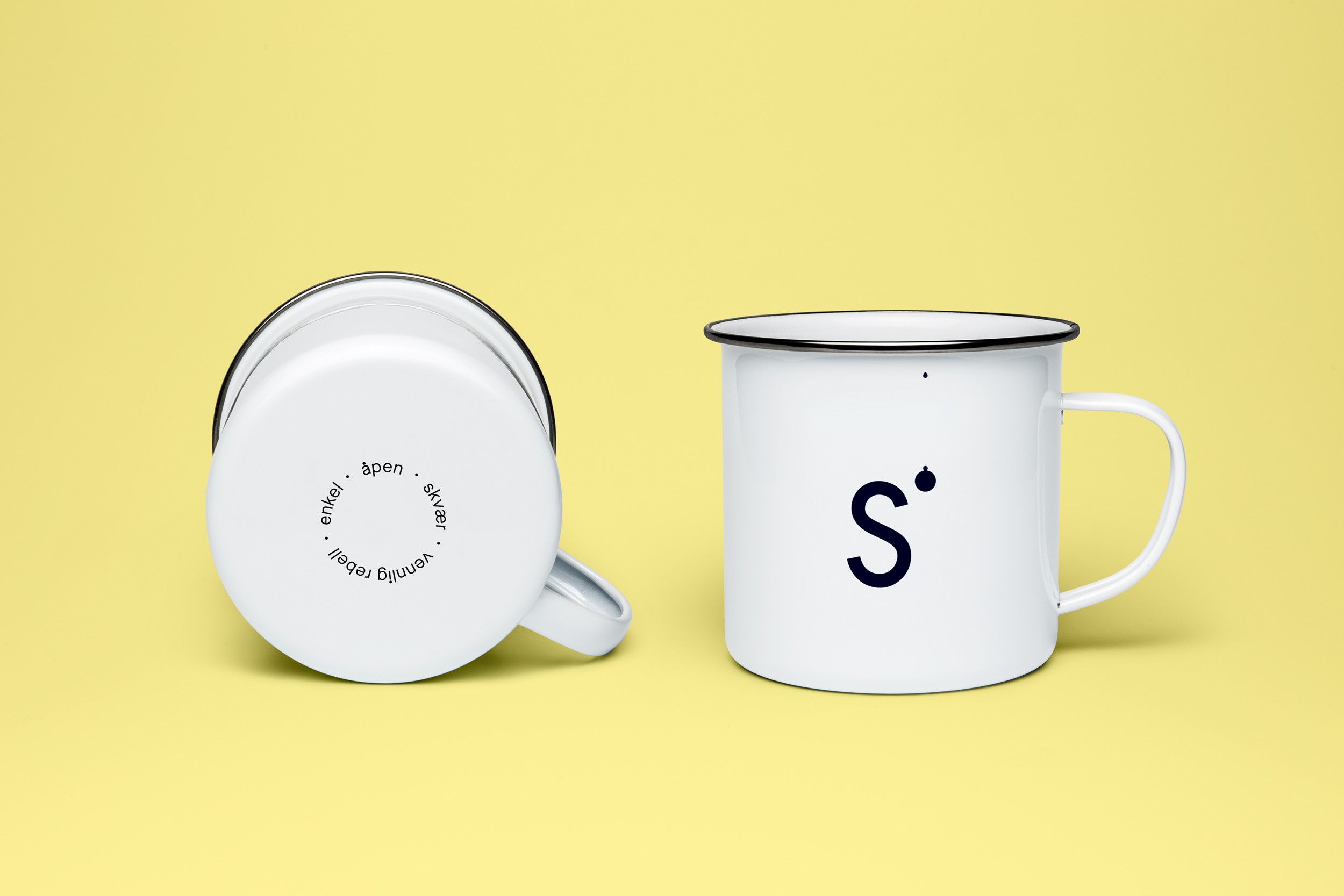
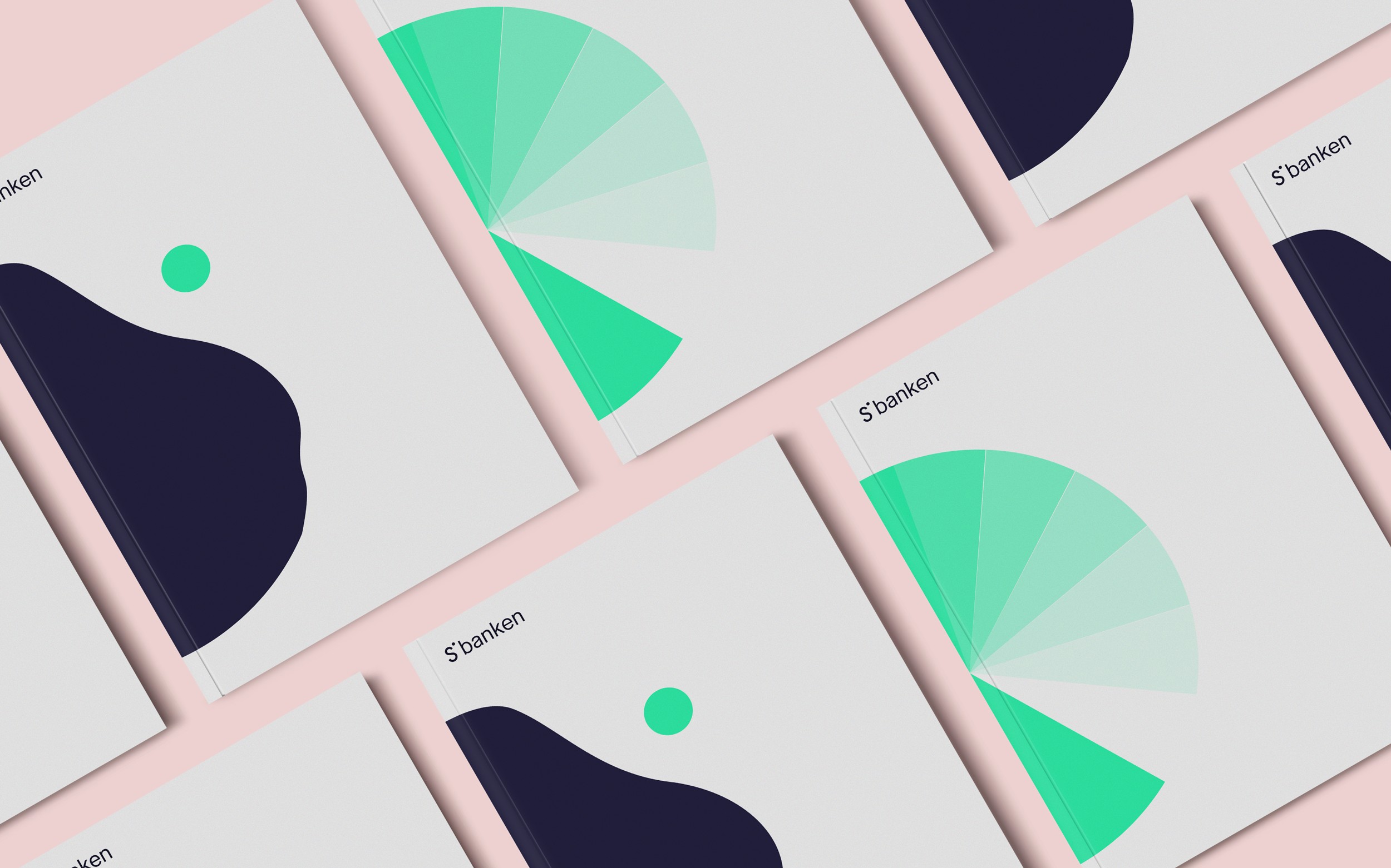
The circle became a key element of the new identity, symbolizing Sbanken’s unwavering presence and support, regardless of where customers are on their financial journey. This visual metaphor reinforced the bank’s promise of freedom and flexibility, assuring customers that Sbanken would always be there to help them find the best solutions.
Typography played a crucial role in the rebranding. We chose a modified version of Maison Neue - Book and Demi for all written content, ensuring clarity and consistency across all communication channels. This typographic choice was designed to be straightforward yet distinctive, mirroring the bank’s values.
The rebranding successfully delivered a new name and visual identity that remained true to Sbanken’s foundational principles. The updated brand is not only a reflection of the bank’s evolution but also a reinforcement of its long-standing commitment to being simple, rebellious, and open.
It has been an exciting journey, in good collaboration with Bleed, we have built a clear and flexible concept, which has now been implemented on all surfaces. In the process, we have been positively challenged and renewed. Now we are ready for the next chapter and looking forward to what we are going to deliver in the future. — Johnny Anderson, Head of Concept Development @Sbanken
Brand photos by Hinda Fahre