Skyfall
Launch Now
Skyfall Ventures has been a driving force in the Norwegian and Nordic startup ecosystem since 2014, backing ambitious early-stage founders in tech. Their portfolio includes some of the region’s most notable companies, such as Oda, Otovo, Tise and Databutton.
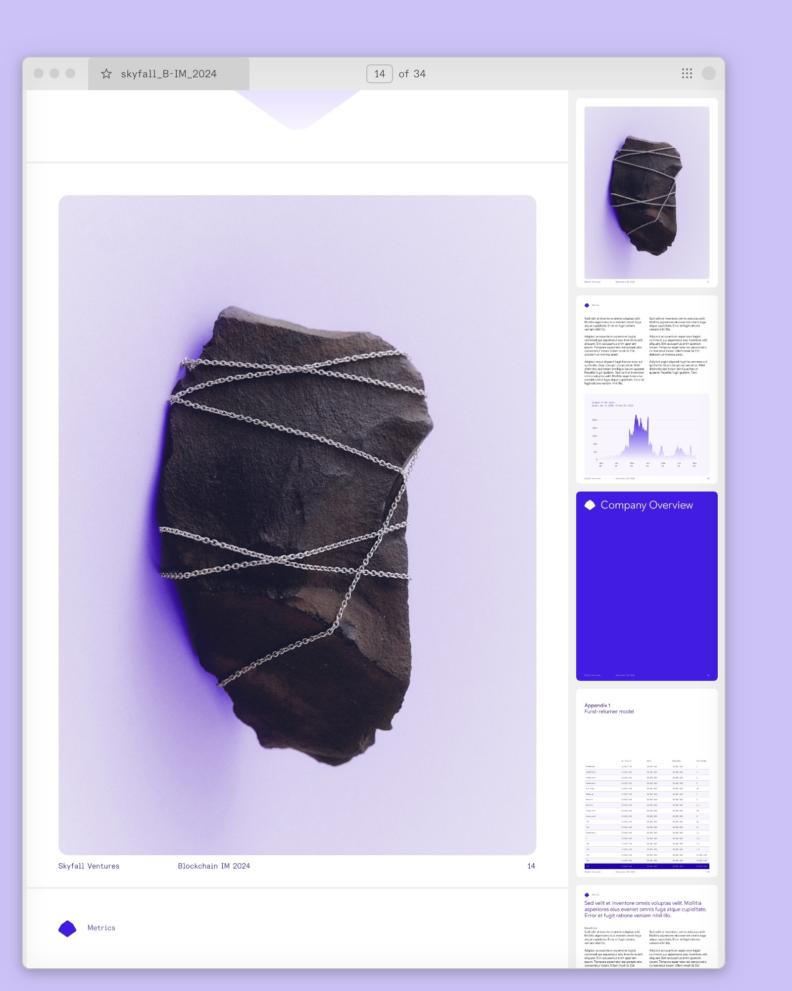
After ten years in the market, Skyfall wanted to revitalize their brand – a renewal that could honor their history while pointing firmly toward the future. Bleed was tasked with creating a new visual identity and website that could capture this duality.
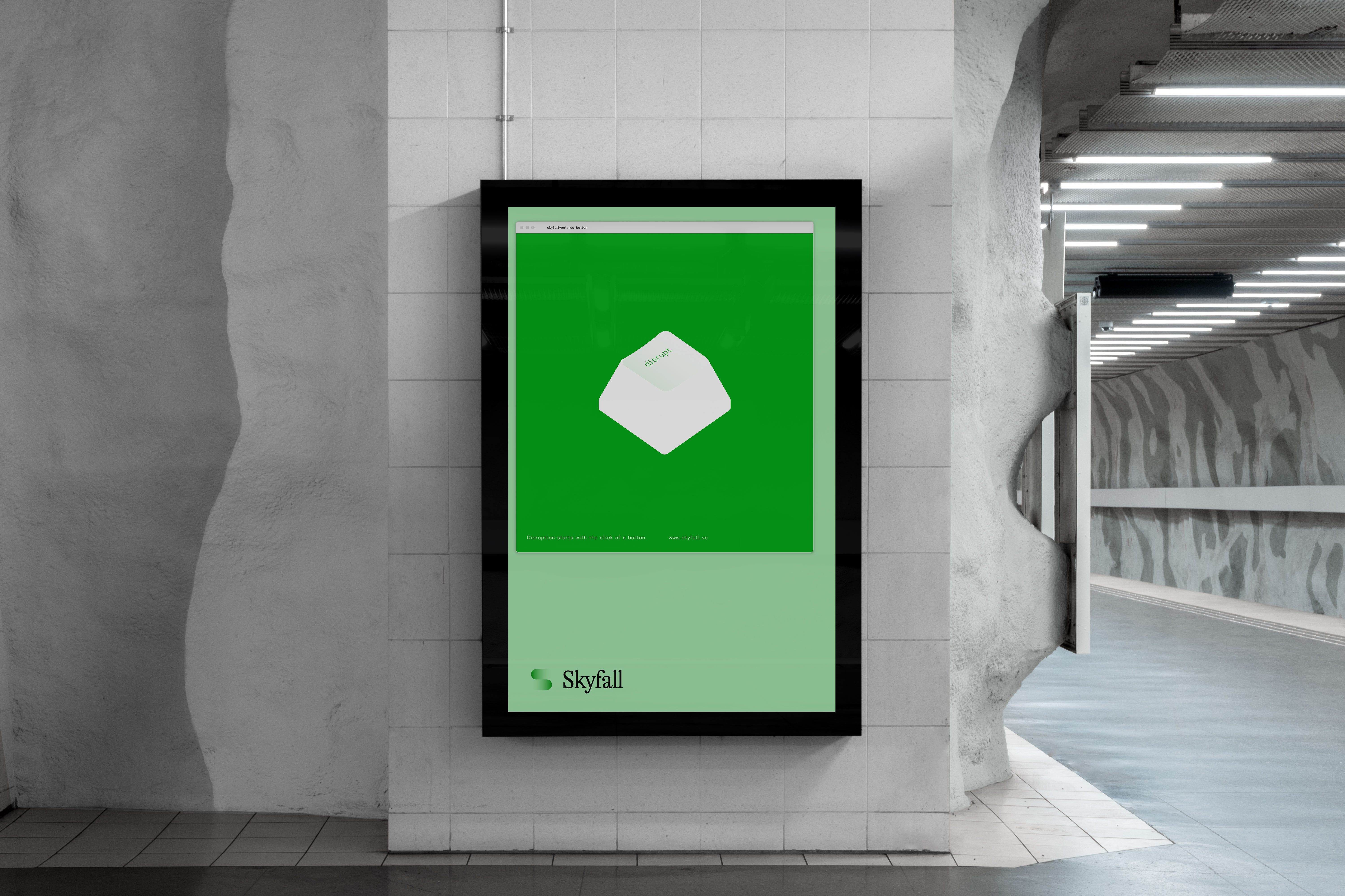
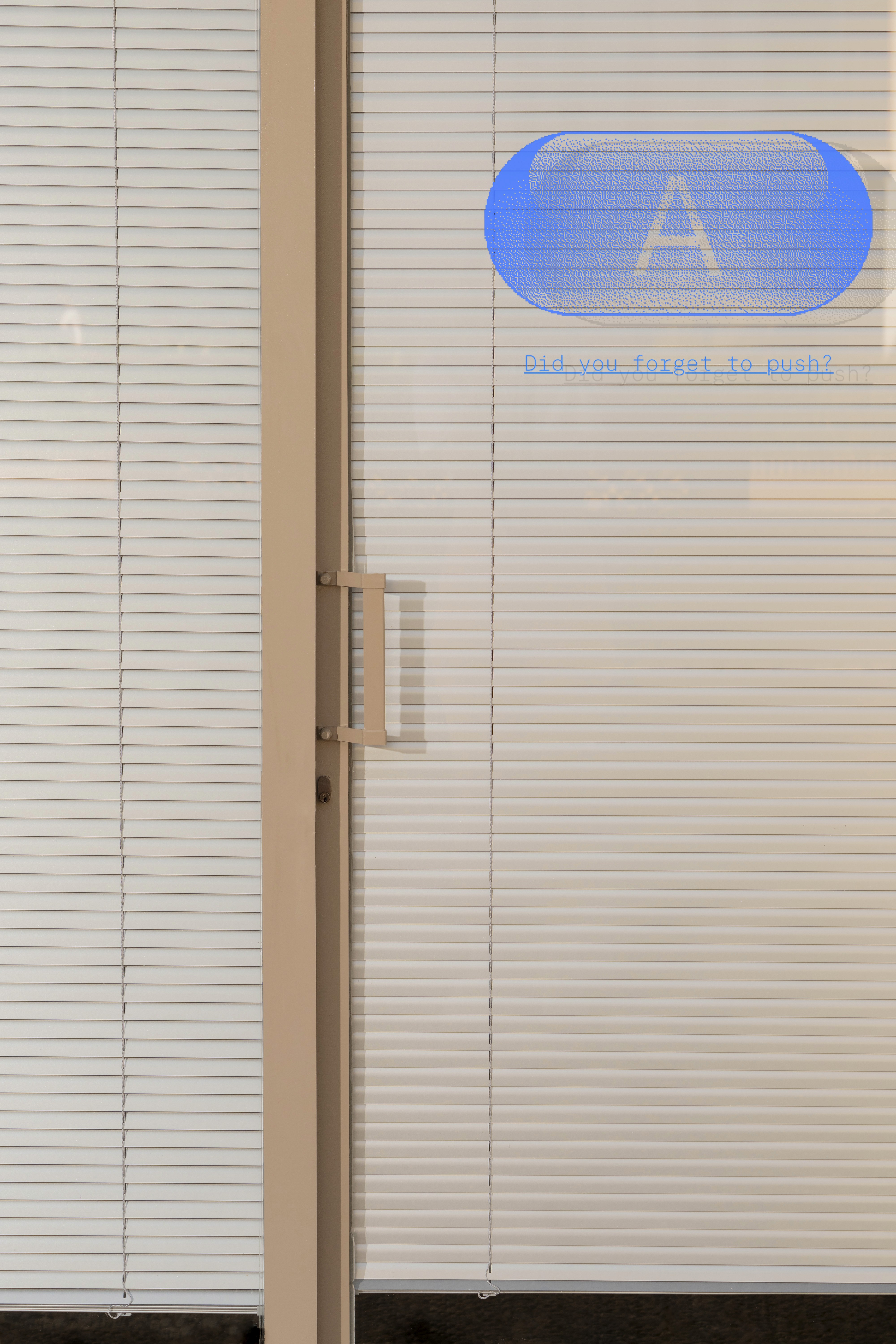
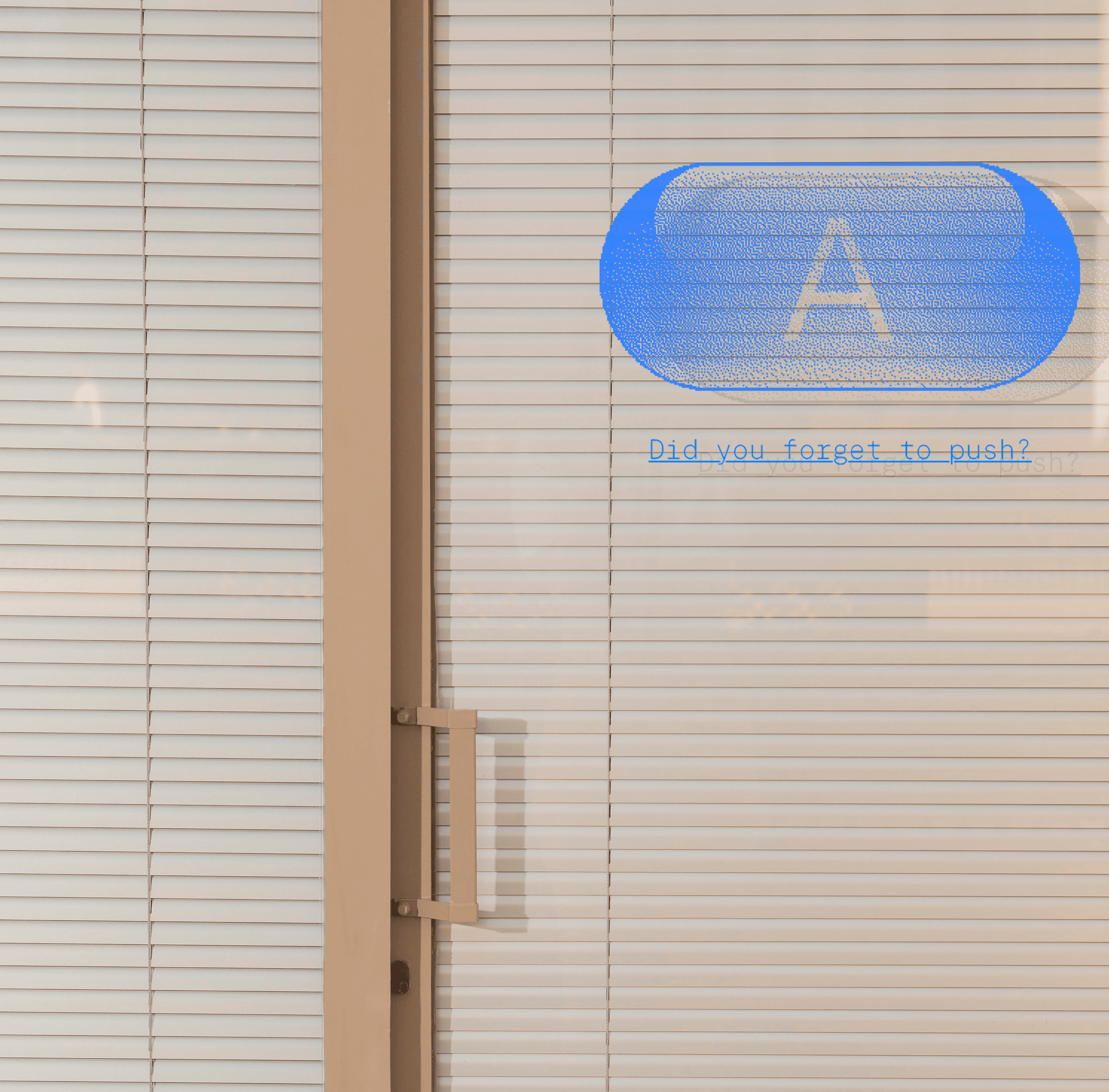
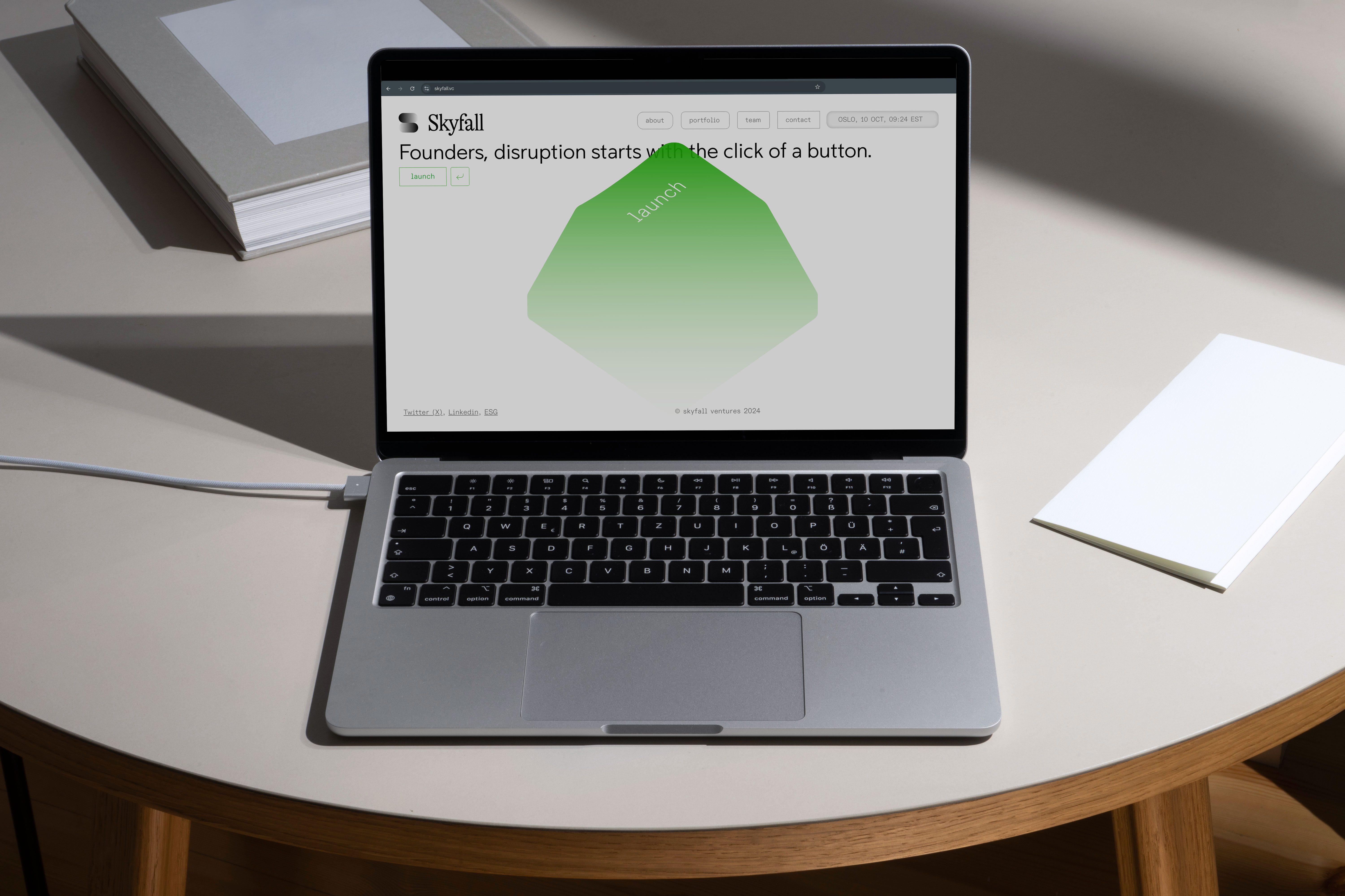
The concept revolves around engaging both sides of the brain – analytical and creative. At the core is a large “enter button,” functioning both as a UI element and as a symbol of action, reflecting Skyfall’s role in helping founders take their crucial first step. The abstracted “S” logo embraces Nordic simplicity, while the color palette highlights Skyfall’s key investment categories.
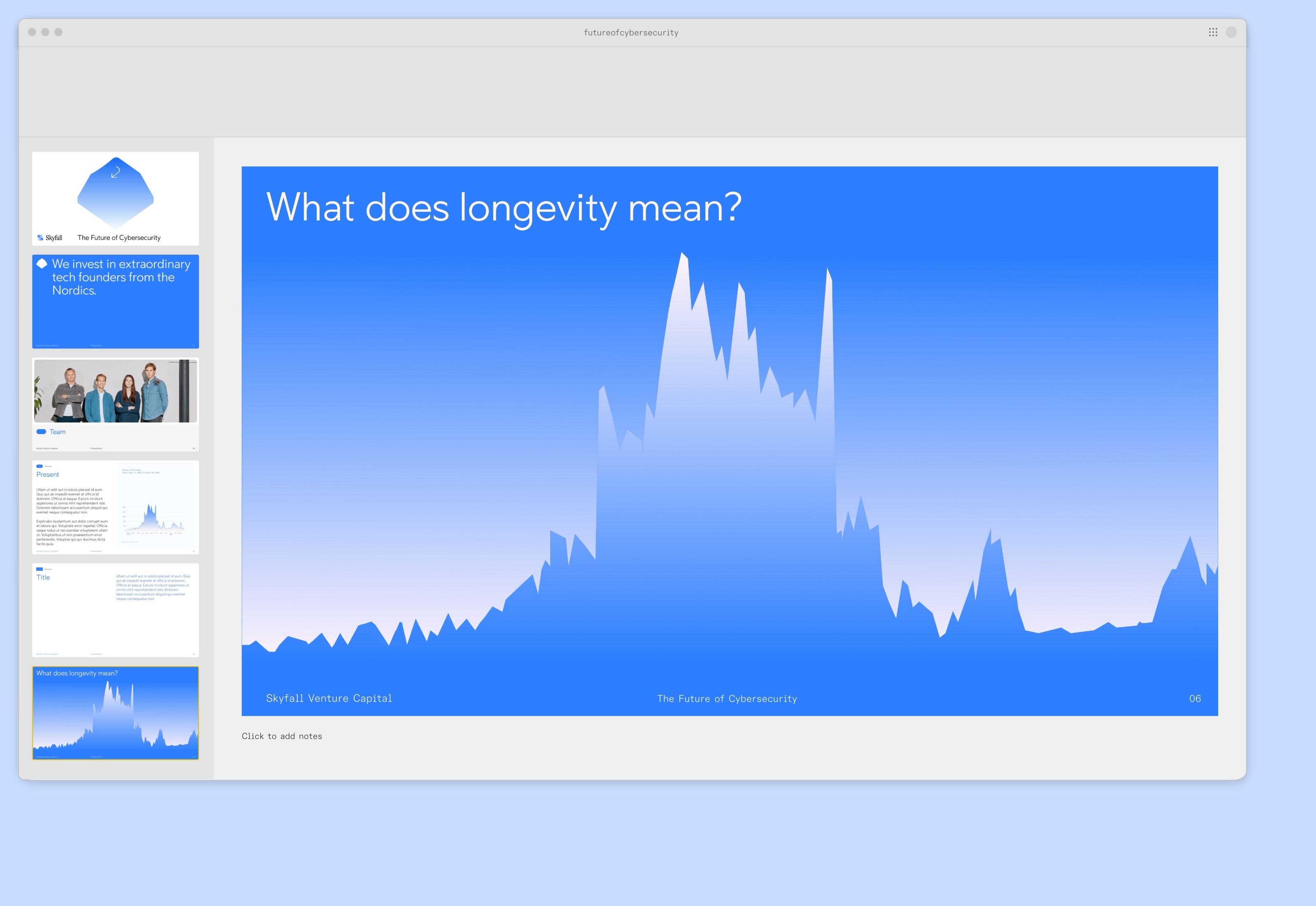
Typography balances technical precision with human warmth, while the editorial photography style is merged with the button motif through gradient backgrounds, creating depth and cohesion across applications.
“The new identity brings together our philosophy and strategy in a way that both inspires and positions us. We’re very pleased with both the process and the result,” says Espen Malmo, managing partner and co-founder of Skyfall Ventures.
The outcome is a bold and modern identity that captures Skyfall’s pioneering spirit and their commitment to the next generation of founders.