World Expo Dubai
Austria Makes Sense
Category;
Science & Technology
Award(s);
Red Dot Awards, CCA
Services;
Strategy, Visual Identity, Design System, Animation System, Font Design, Spacial Design, Art Direction
Category;
Science & Technology
Award(s);
Red Dot Awards, CCA
Services;
Strategy, Visual Identity, Design System, Animation System, Font Design, Spacial Design, Art Direction
Since the inaugural World Fair in 1851, the world has turned its eyes to these grand exhibitions, showcasing the potential of future architecture and innovation.
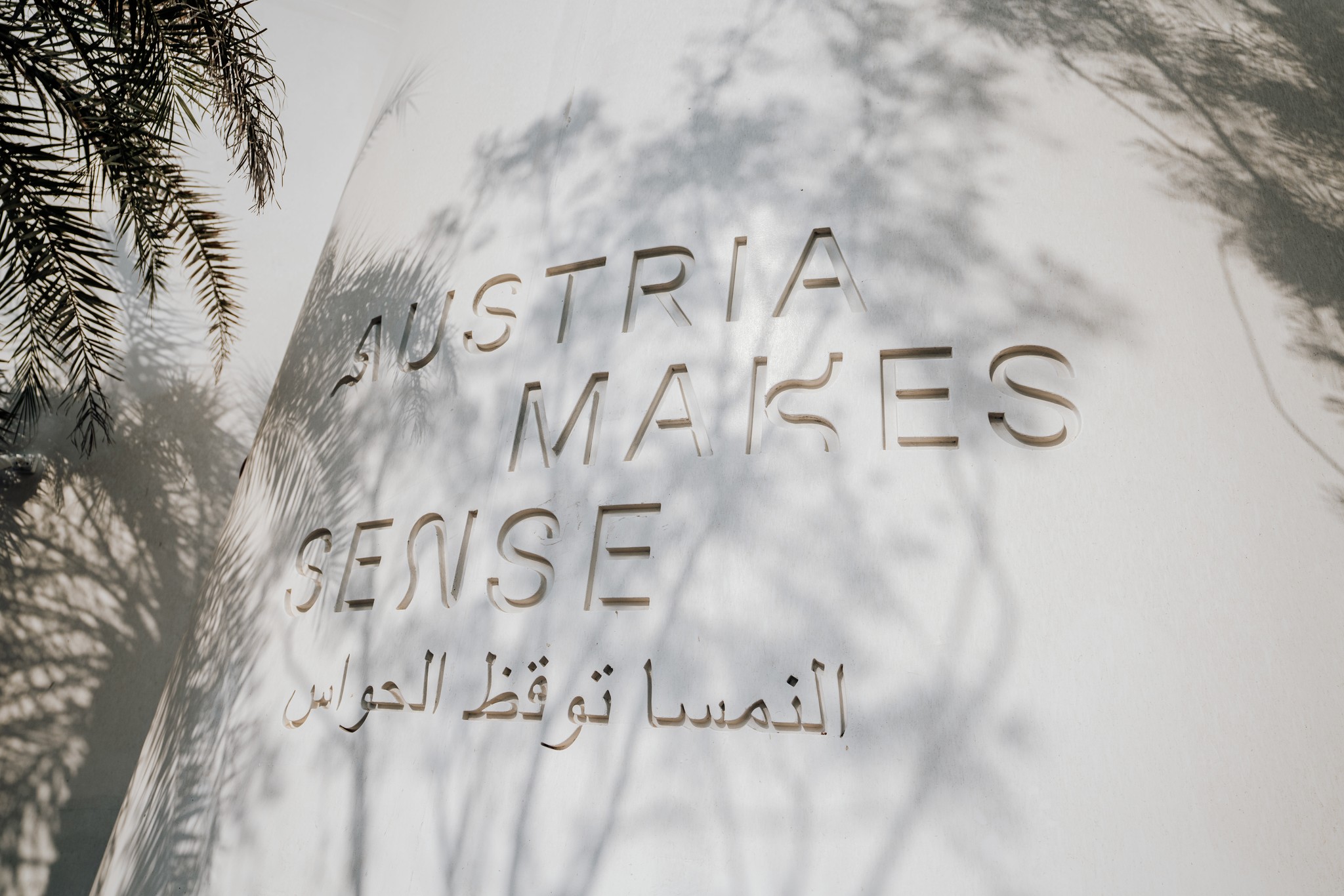
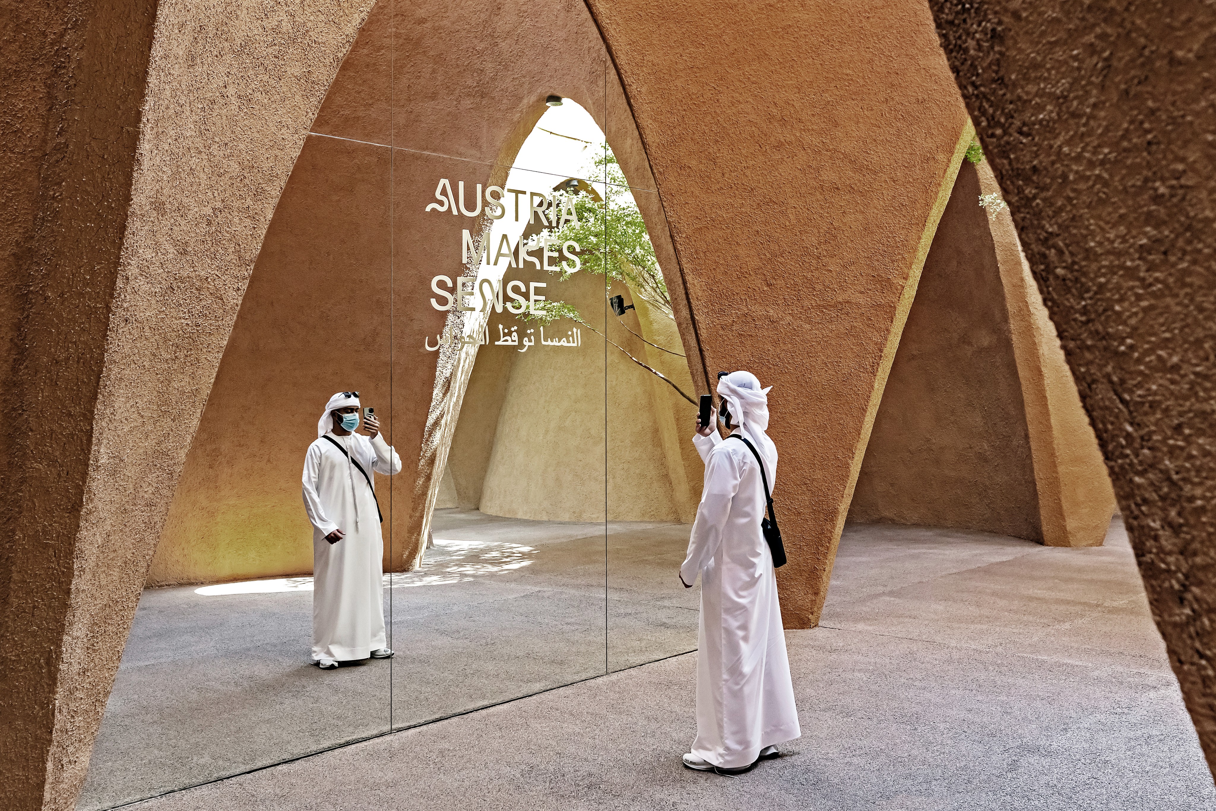
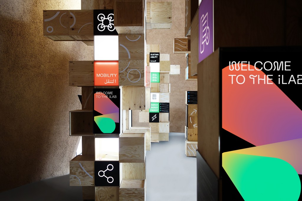
The 2020 edition of the Expo—postponed to 2021—was held in Dubai under the theme “Connecting Minds, Creating the Future.” Austria presented itself to 25 million visitors with a striking pavilion under the motto “Austria makes sense,” with Bleed responsible for developing the visual identity and exhibition graphics.
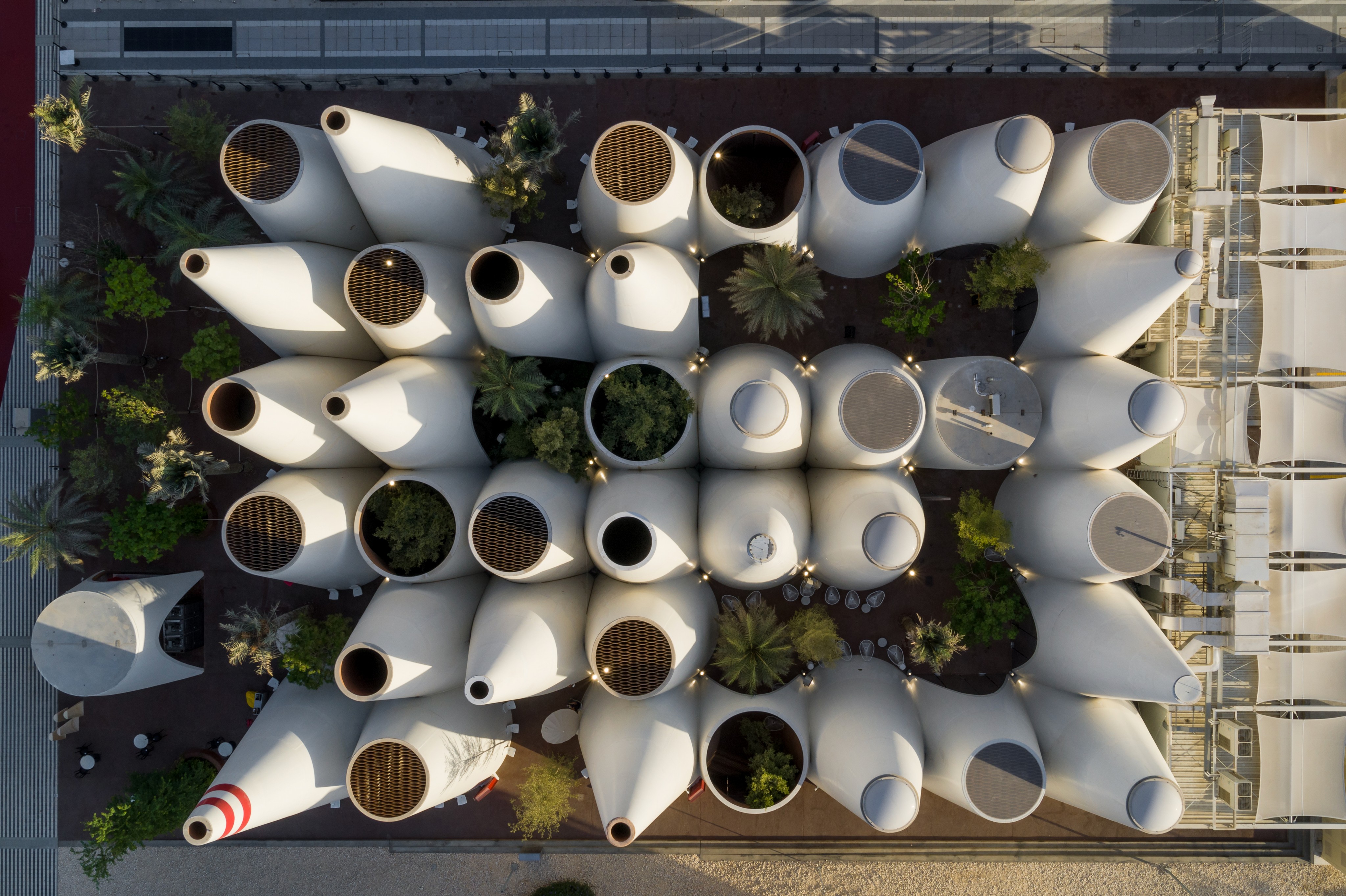
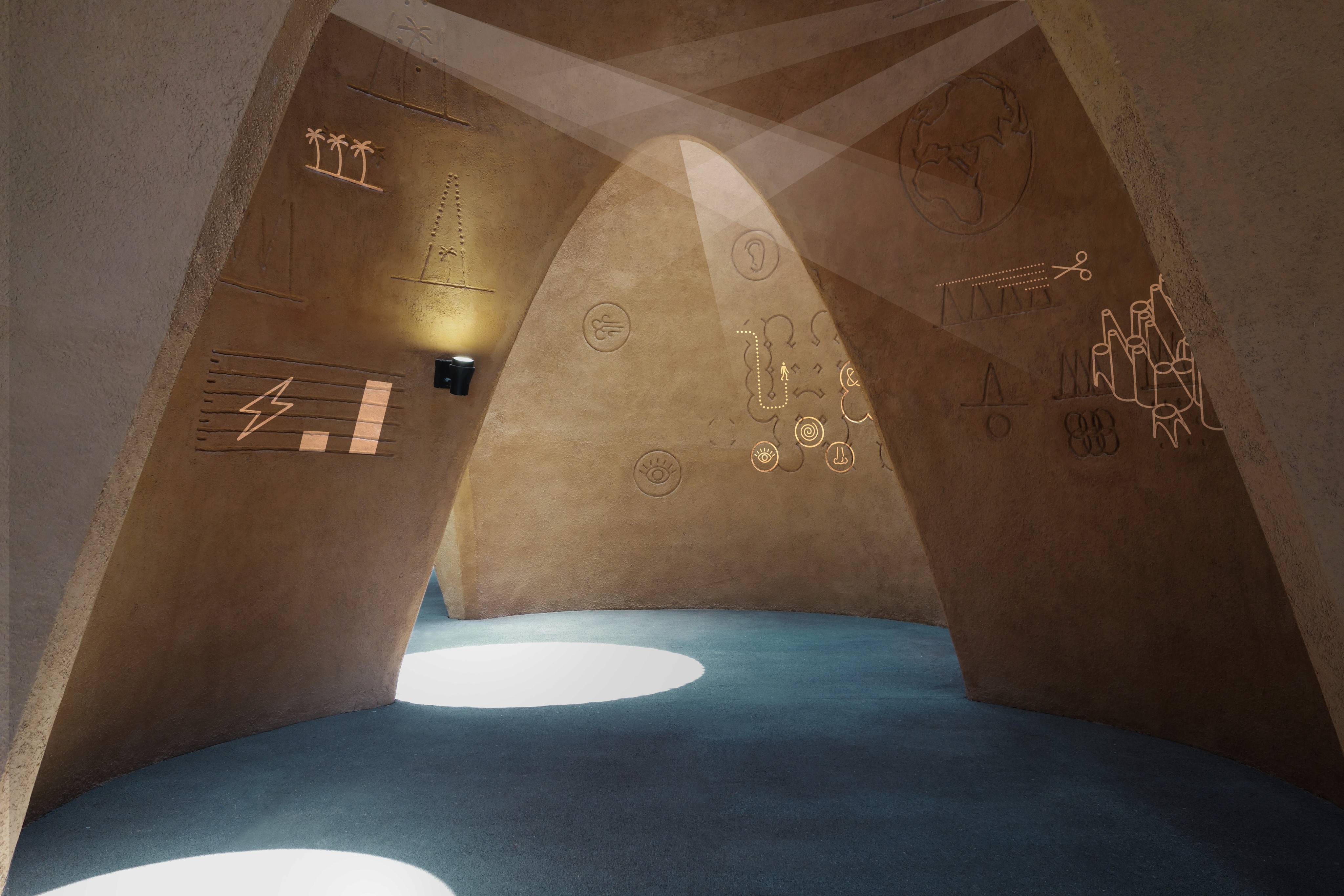
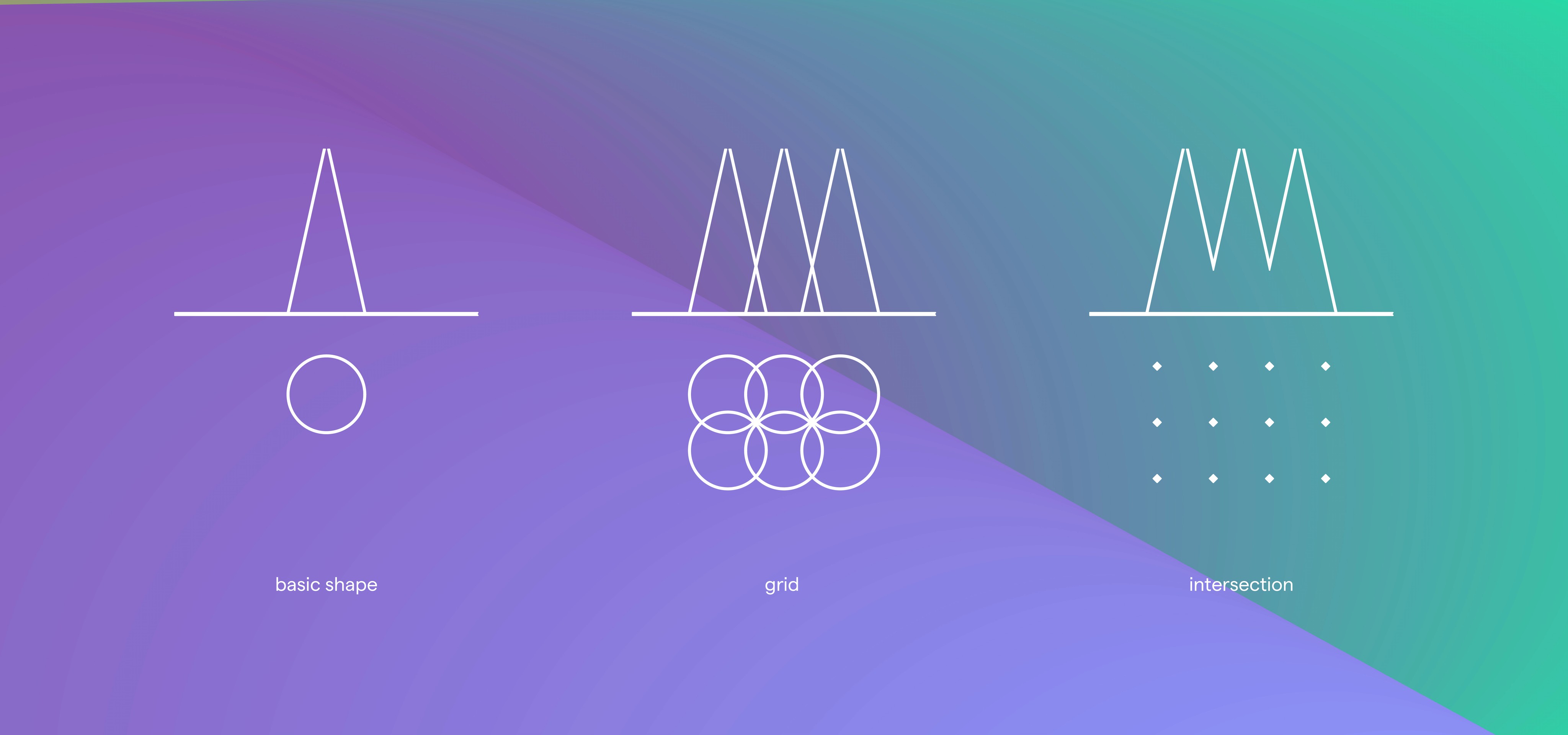
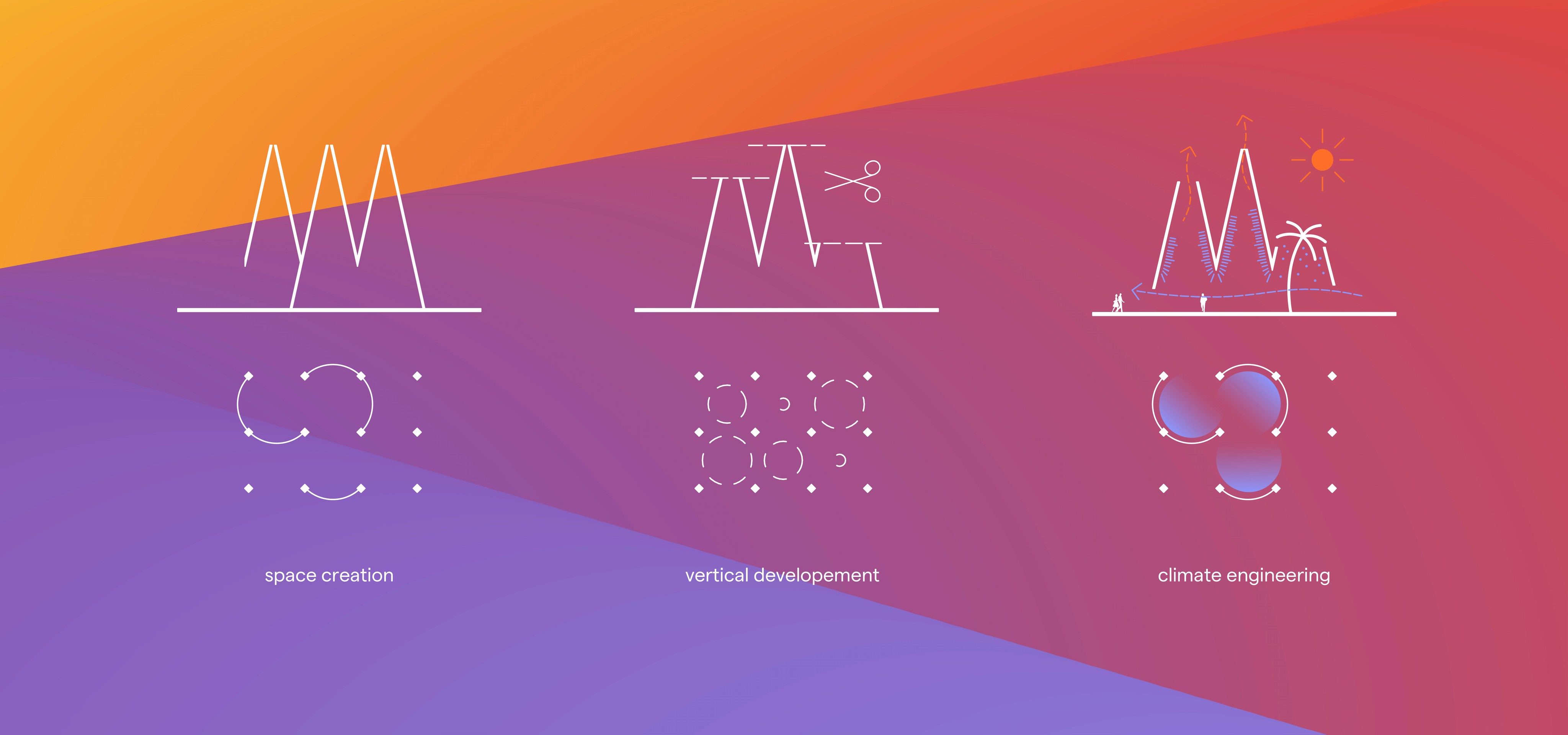
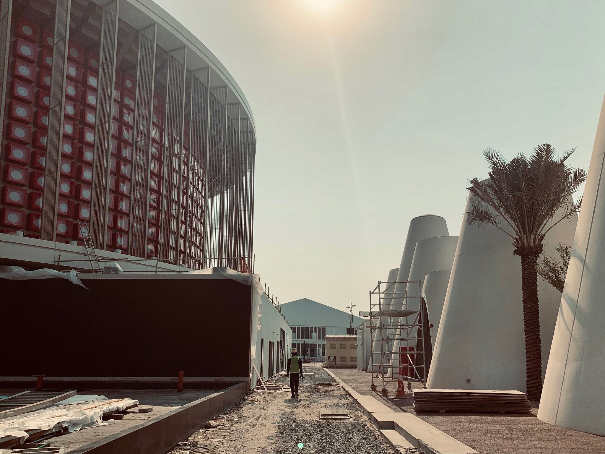
Designed and engineered by the renowned architects Querkraft, the pavilion masterfully blended traditional Oriental building techniques with innovative Austrian craftsmanship. A network of 38 intersecting cones created a unique spatial experience for visitors. Drawing inspiration from Arabian wind towers, the architecture incorporated an intelligent climate concept that naturally cooled the pavilion through continuous airflow. The onsite exhibition was expertly executed by Ars Electronica Solutions in collaboration with Büero Wien. In this context, we crafted a light, airy visual identity and a sensuous exhibition to engage an international audience.
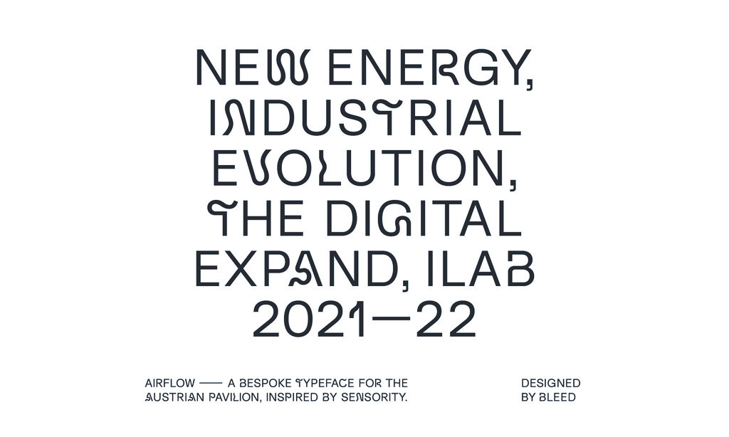
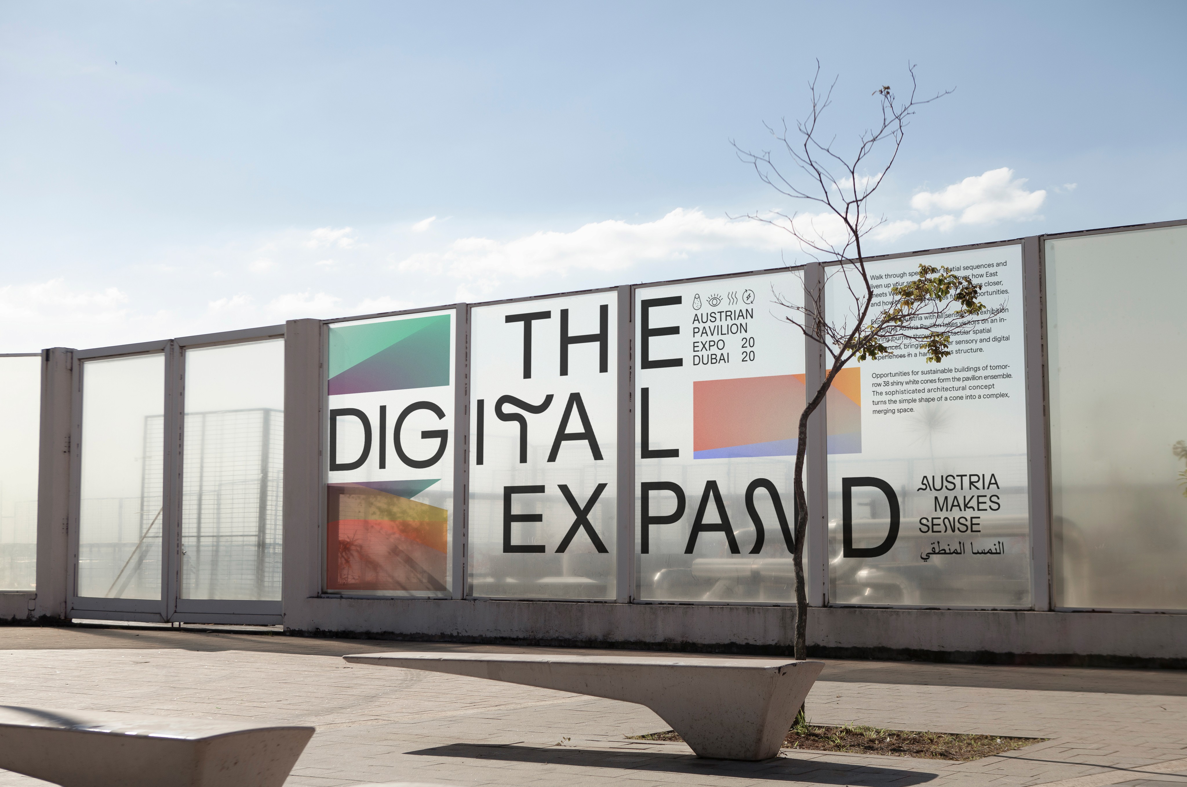
Airflow – A Custom Fluctuating Display Font
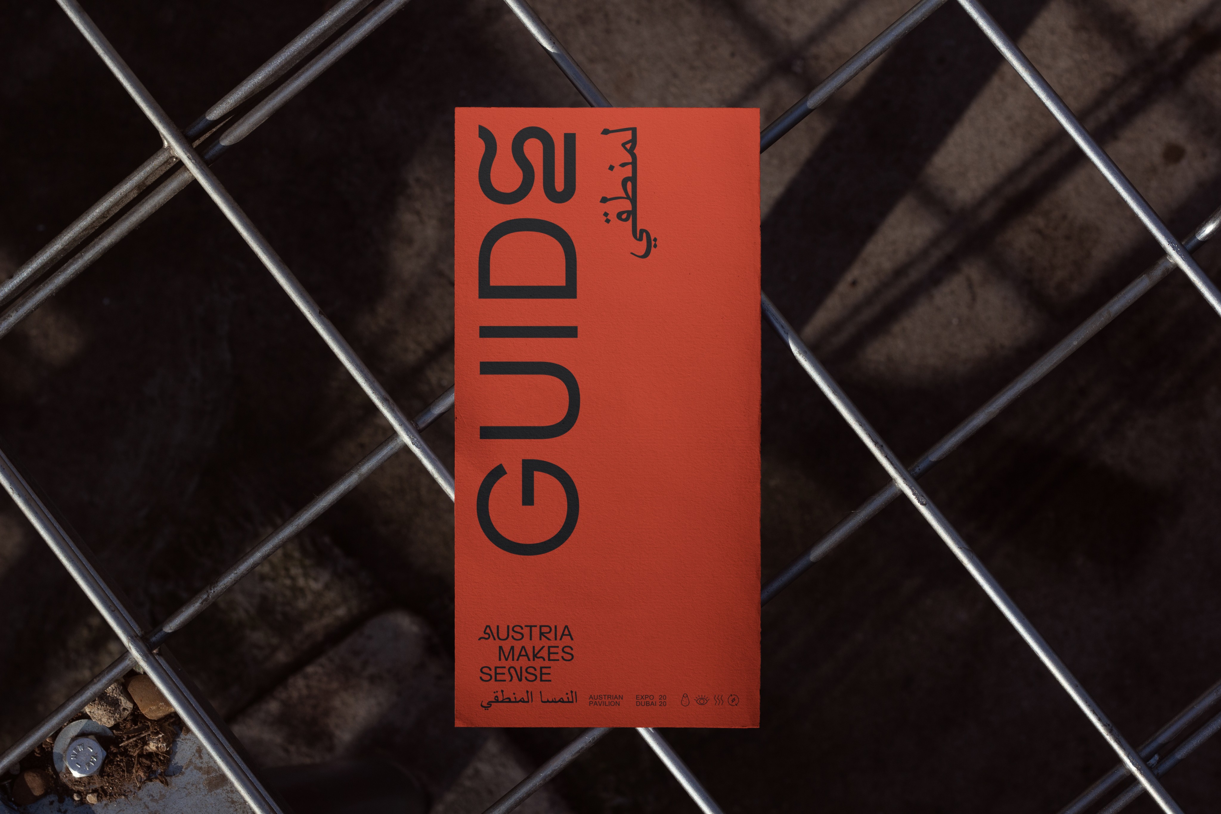
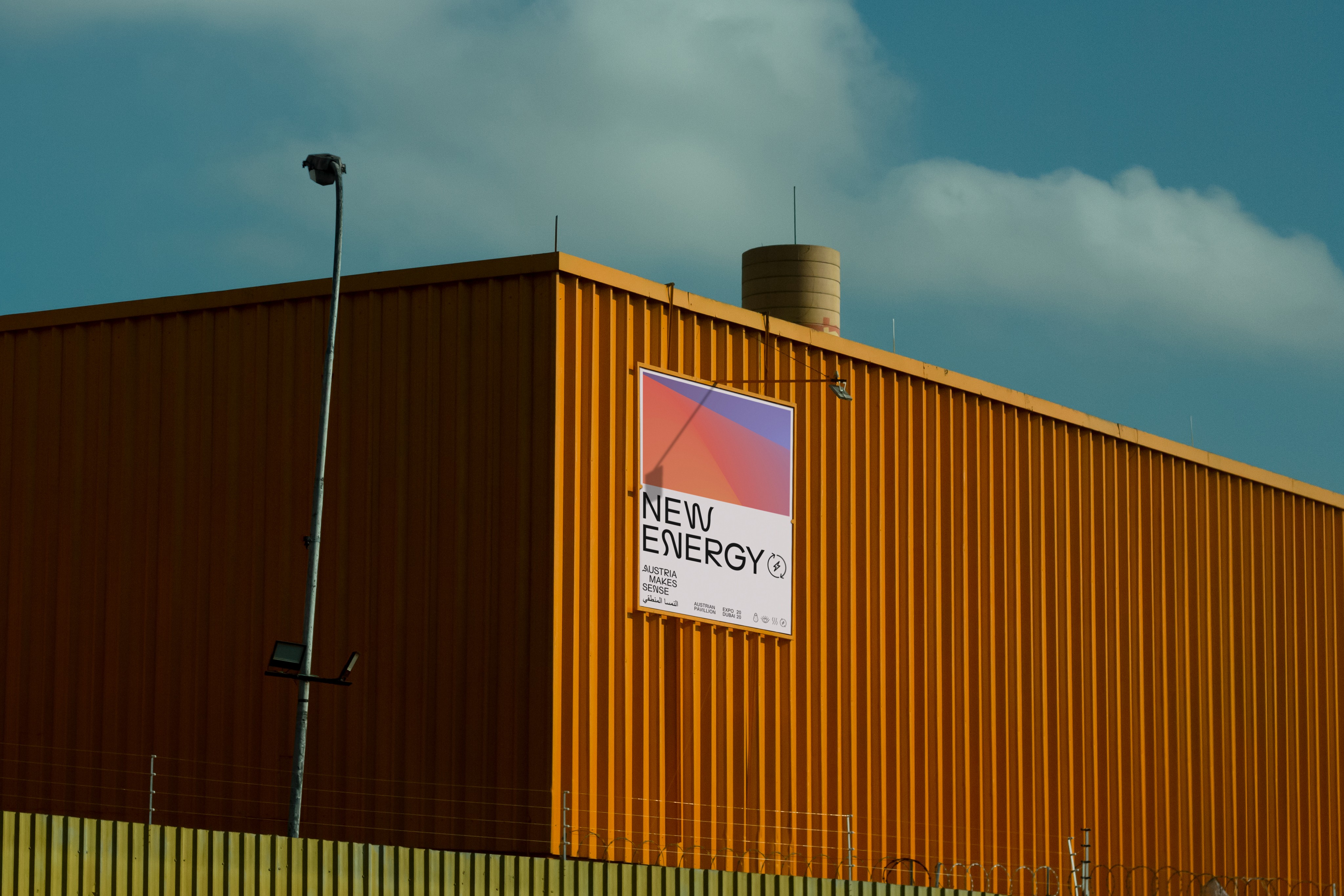
The “Airflow” display font merges elements of Arabian calligraphy with the Latin alphabet, inspired by the movement of air through the pavilion. It was employed to deliver a bold yet contemplative typographic expression, particularly effective when paired with the iconography used in the onsite exhibition and printed materials.
Bleed’s visual identity for Austria’s Expo Dubai pavilion captures the remarkable architecture and creates a distinctive experience that stands out on its own. Working with the team on this project was an absolute pleasure.
— Helmut Doeller, Project Lead at Expo Austria
Exhibition Design
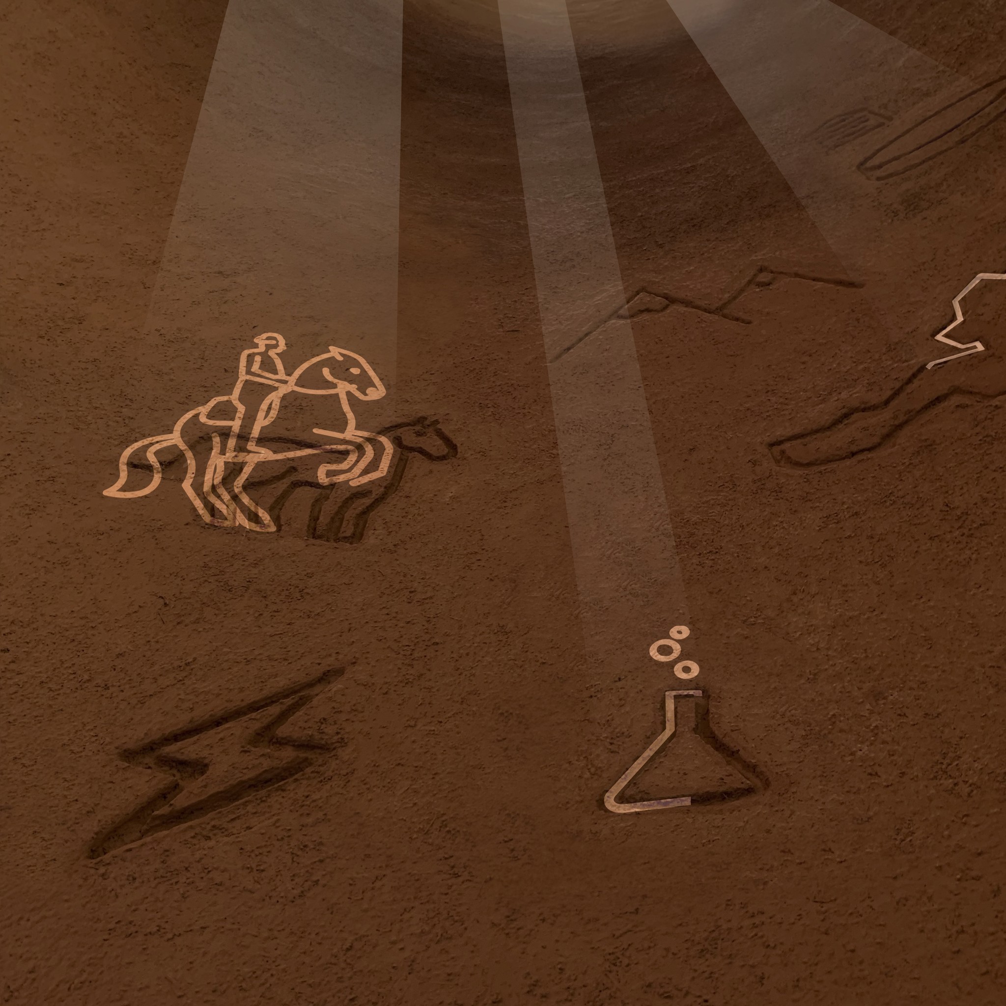
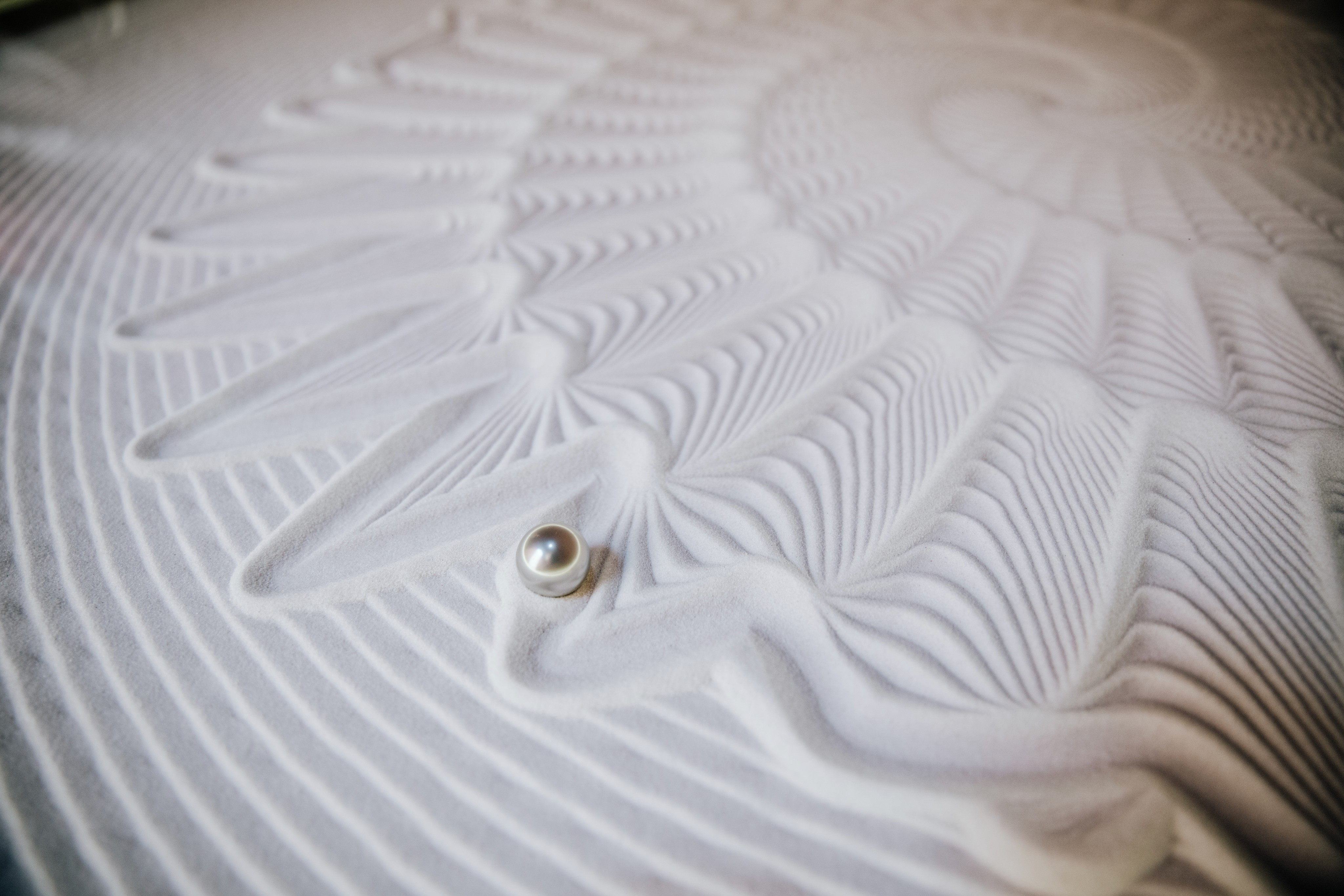
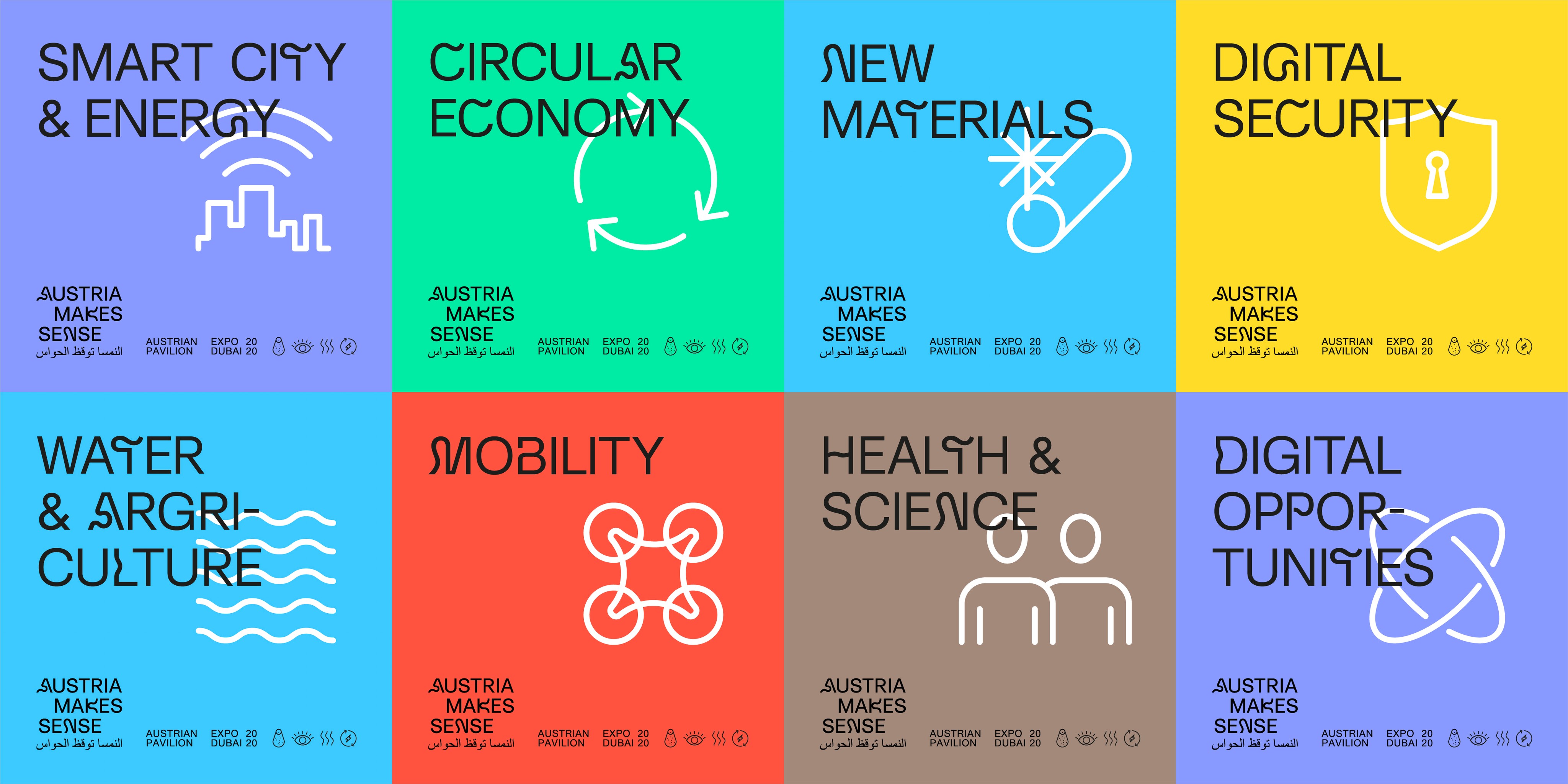
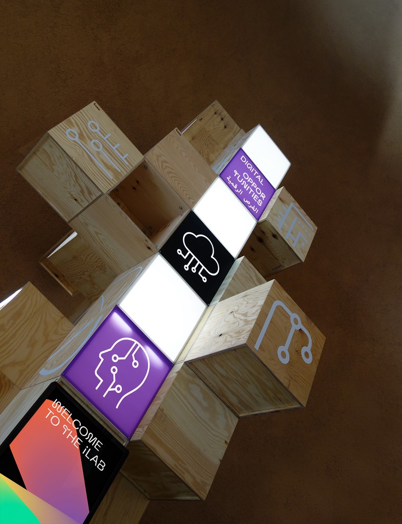
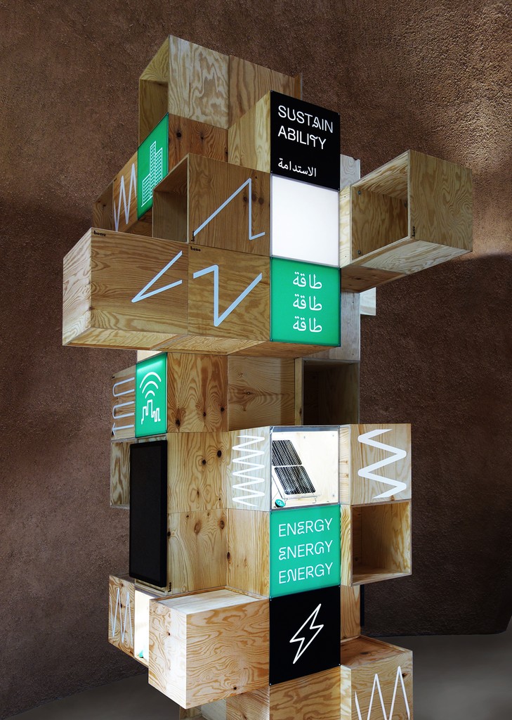
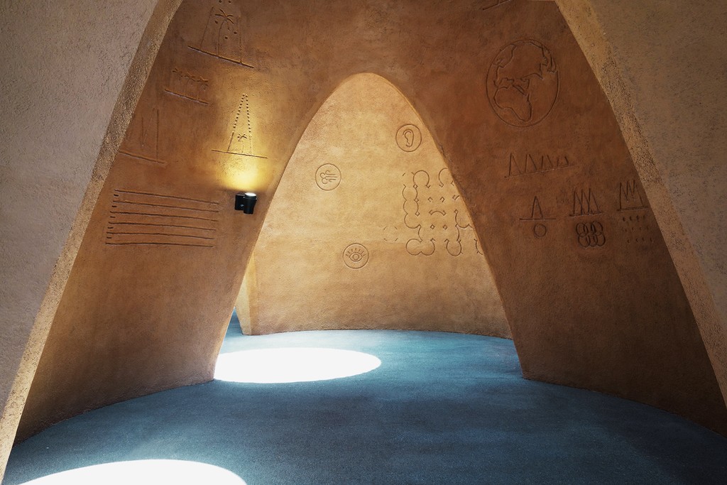
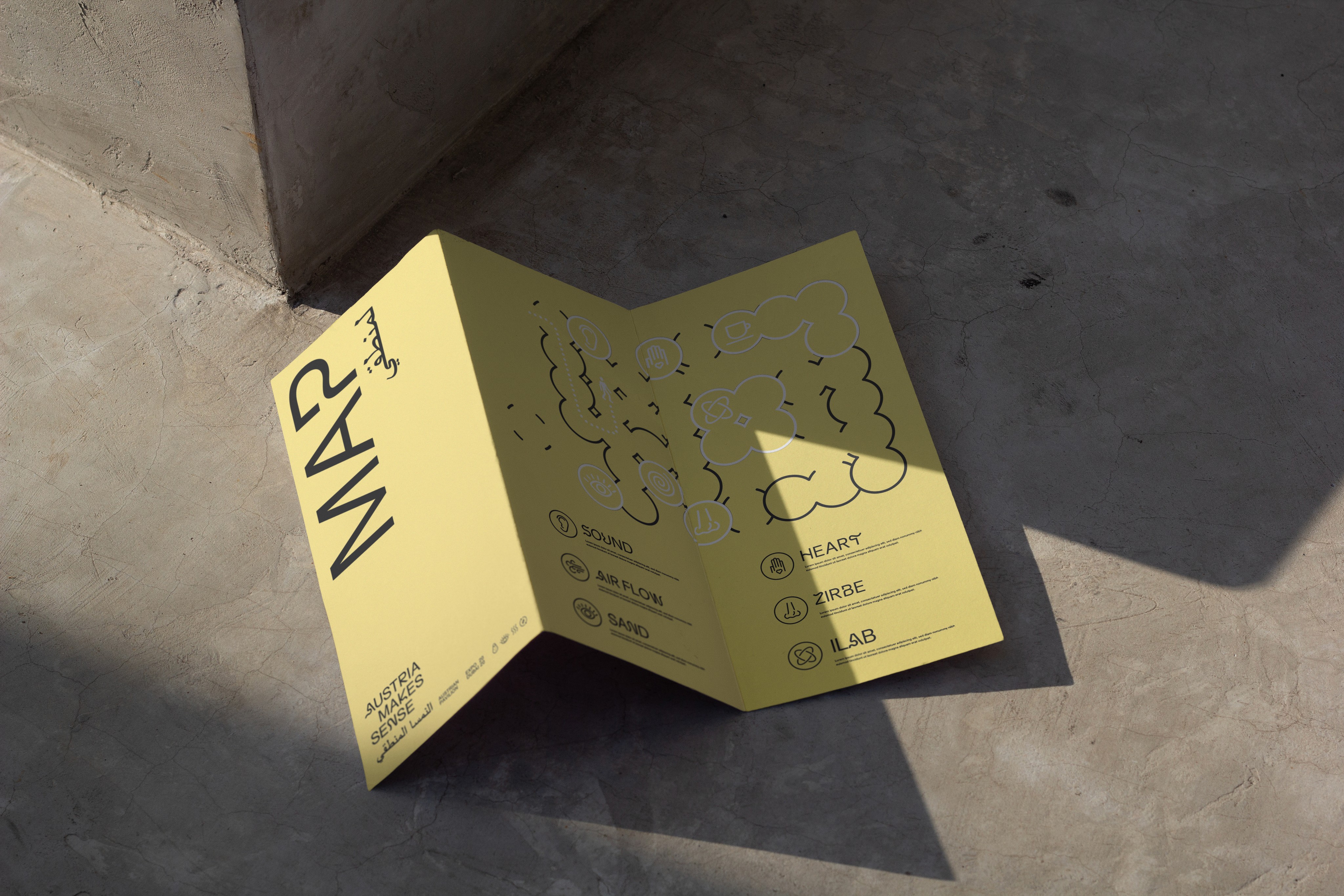
The experiential space within the pavilion facilitates a non-verbal dialogue that engages the senses. By utilizing an intercultural icon language, the exhibition transcends barriers of language, education, age, and cultural background. The graphics, etched into the clay cones, thoughtfully utilize natural resources while providing visitors with a surprising visual experience.
Photo and renders
Querkraft / Fabian Kahr, Andreas Keller, Ars Electronica

Bleed Design Studio
Bleed Design Studio
We would love to hear from you!
We would love to hear from you!
We would love to hear from you!
We would love to hear from you!