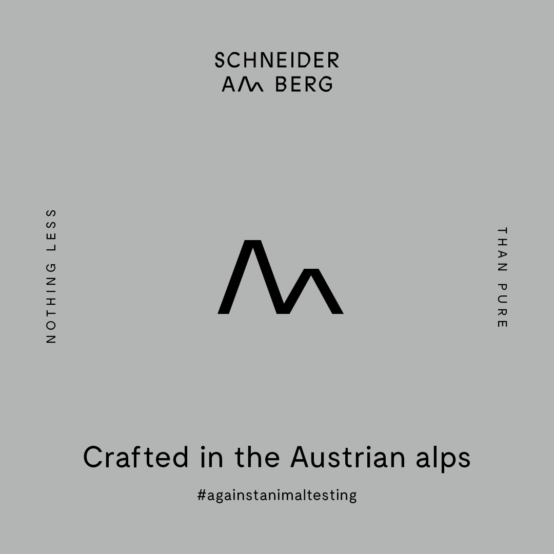
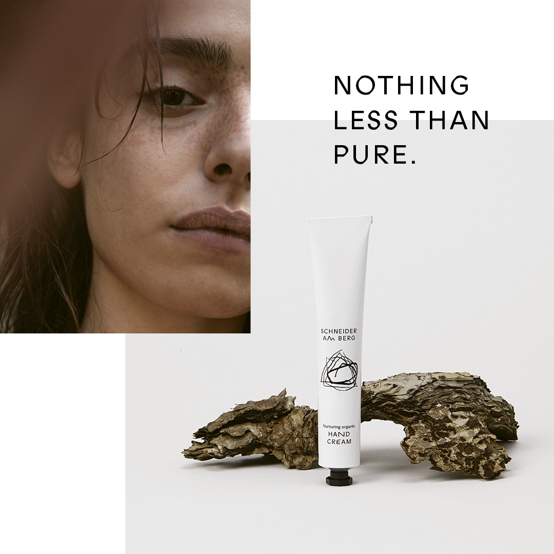
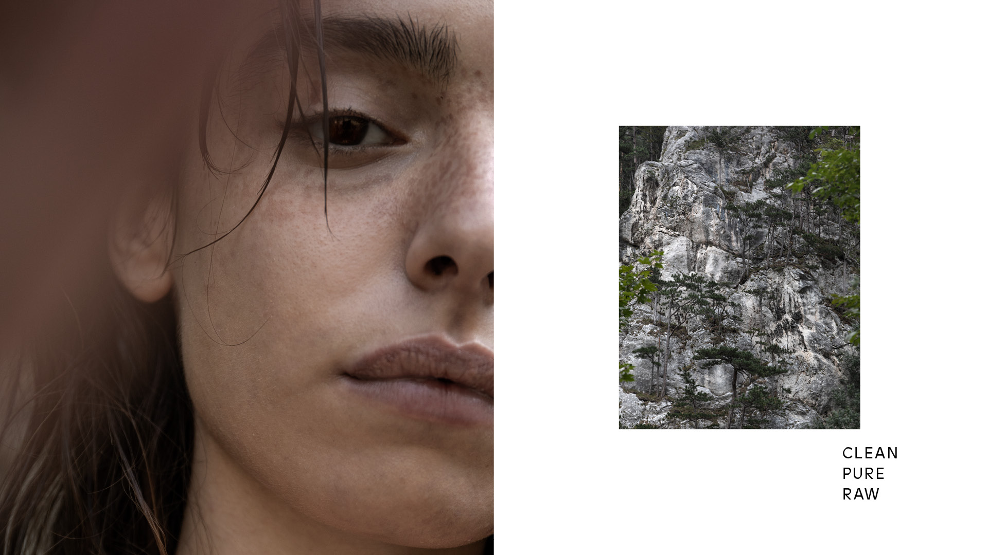
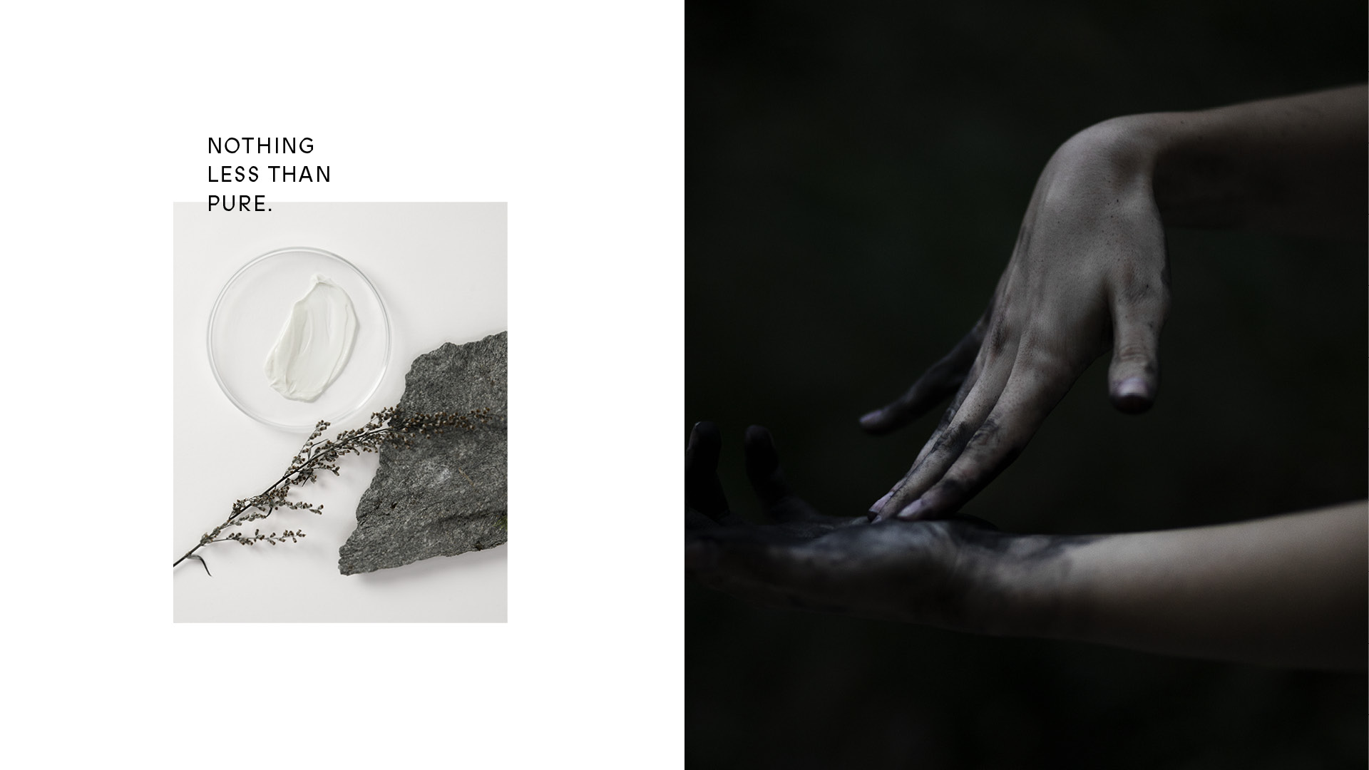
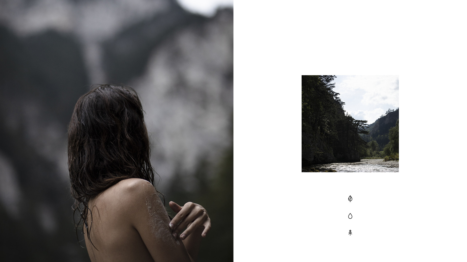
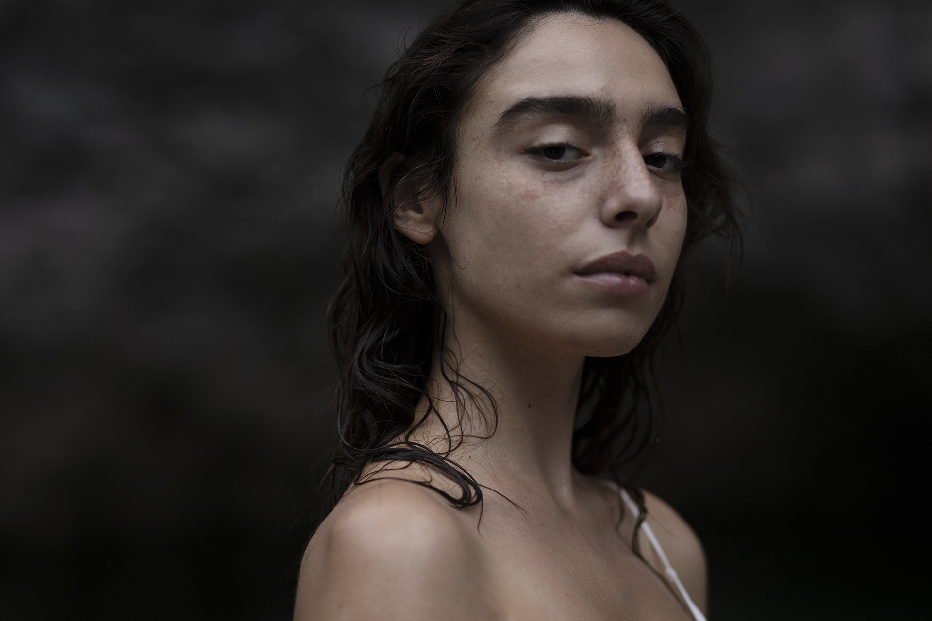
Nothing less than pure
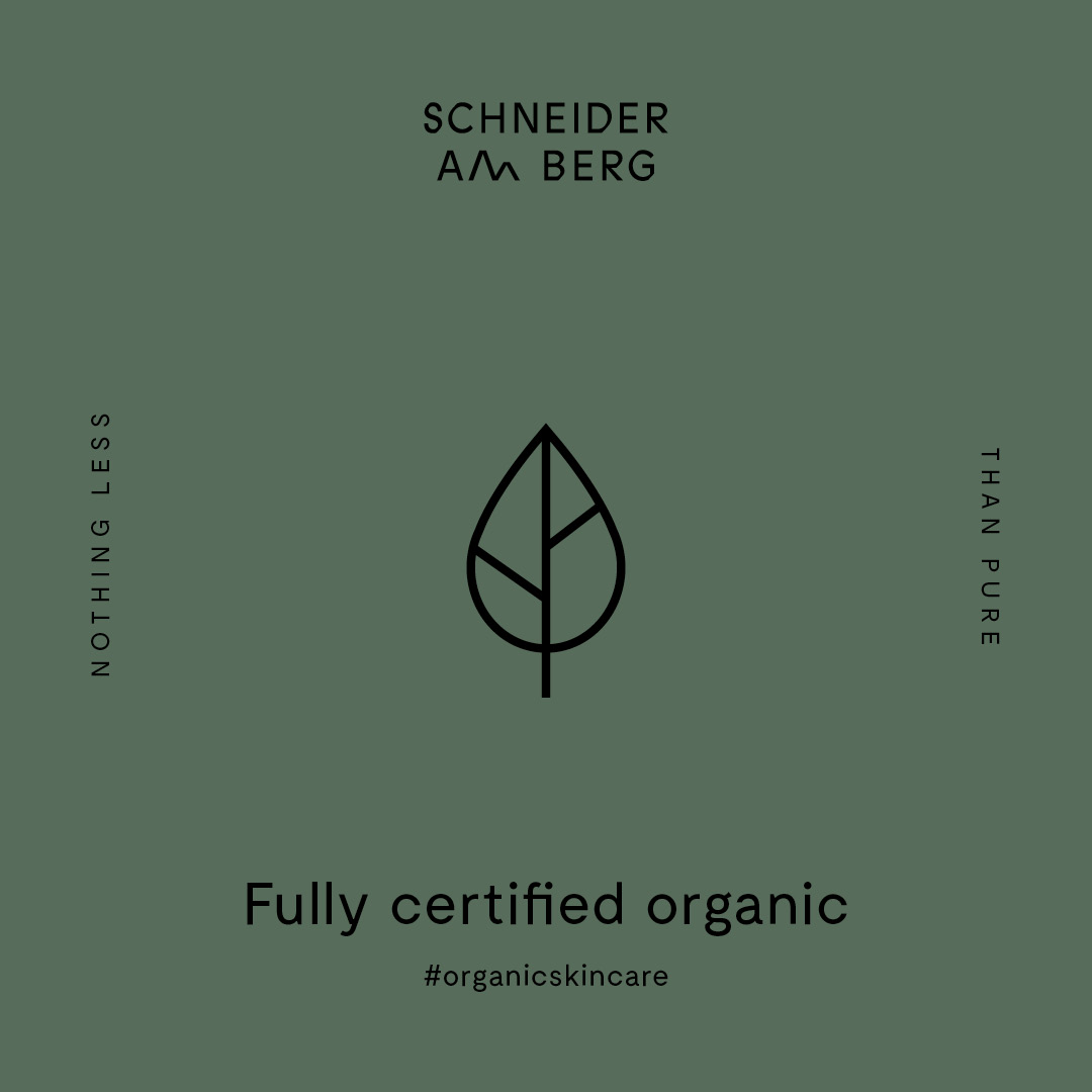
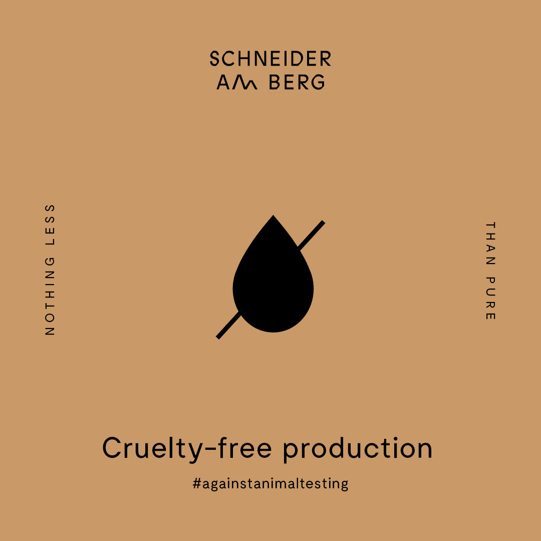
Straight from the Austrian alps, the first Schneider Cosmetics range is all about capturing the pure essence of nature: raw, untamed and 100% organic. The packaging design aims directly on these key factors, carrying a product that’s as natural and uncompromising as human nature itself.
Category→
Fashion & Luxury
Work→
Visual identity, packaging
Awards→
European Design Awards, Visuelt
Client→
Schneider Cosmetics
A statement on skincare
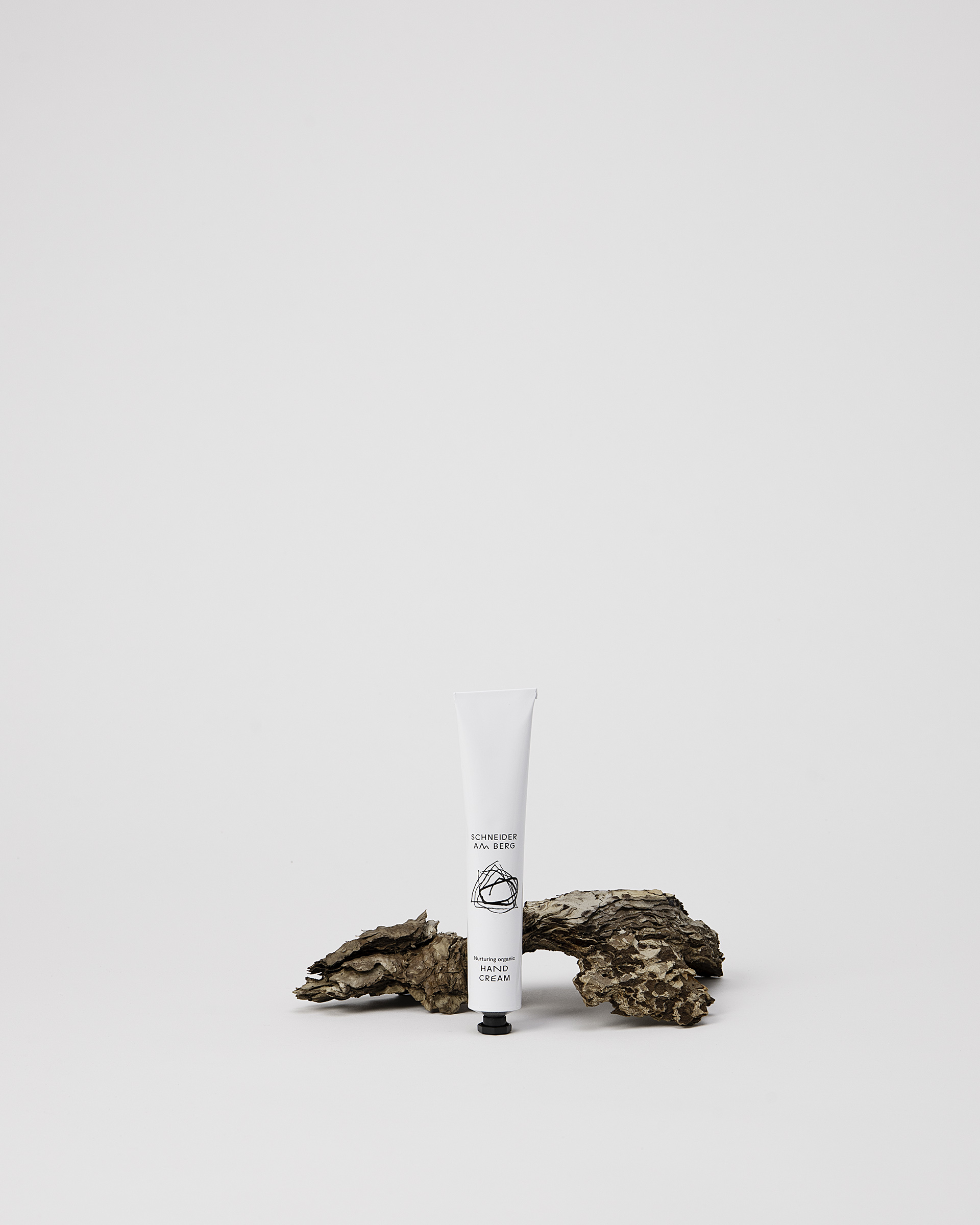
With its first product range young Austrian cosmetics label Schneider Cosmetics wished for a packaging solution that stands out in between the variety of rather generic »apothecary« looking brands. The goal was to set a clear statement not just with the products itself but also on its look, the material sustainability and overall quality while addressing a crowd that is confident, aware and uncompromising when it comes to skincare.
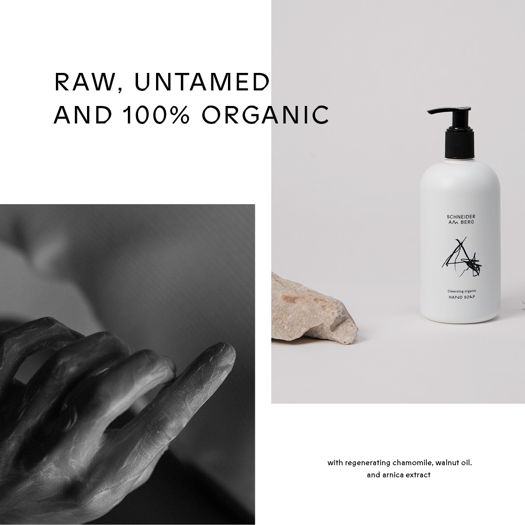
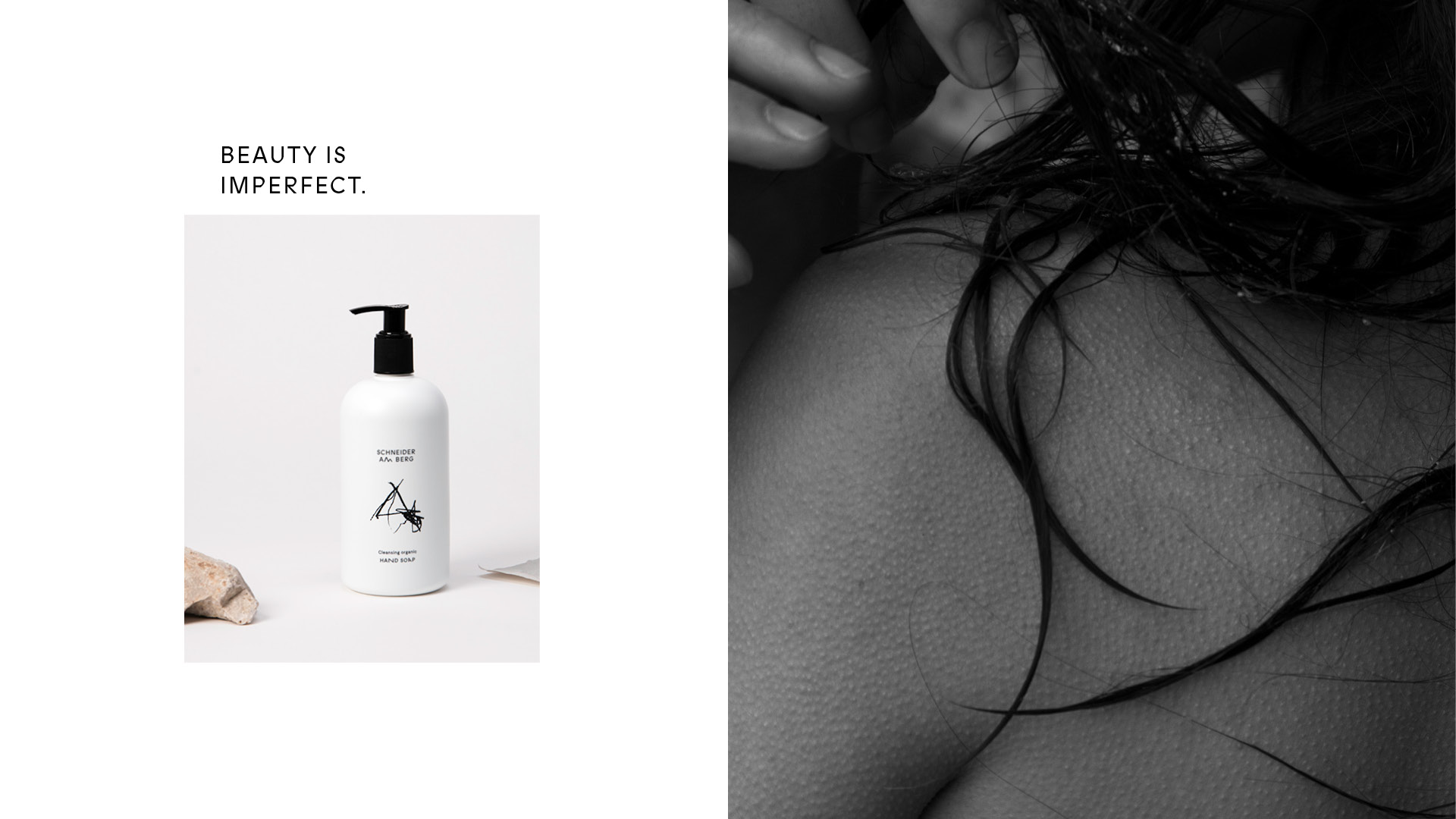
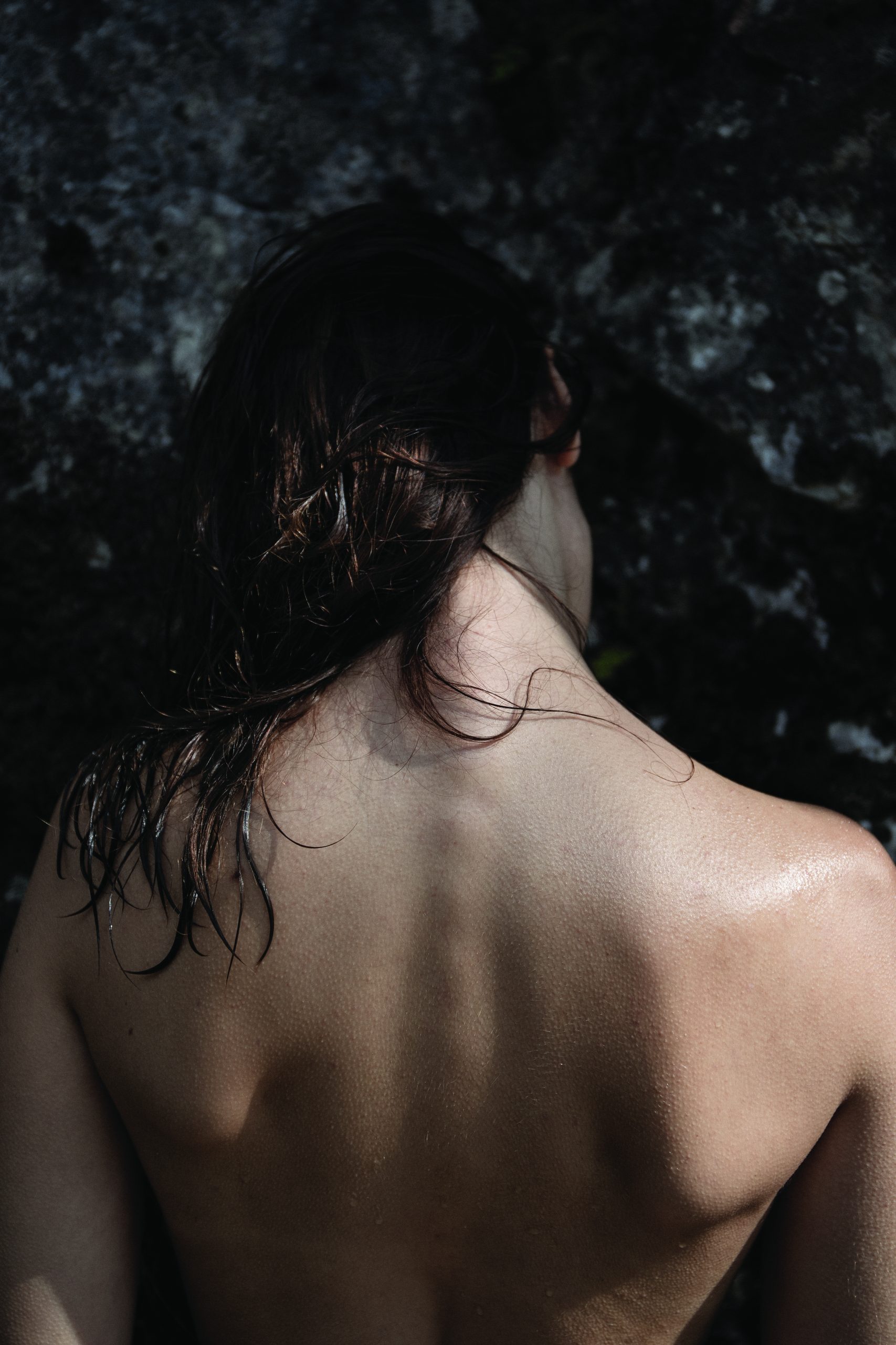
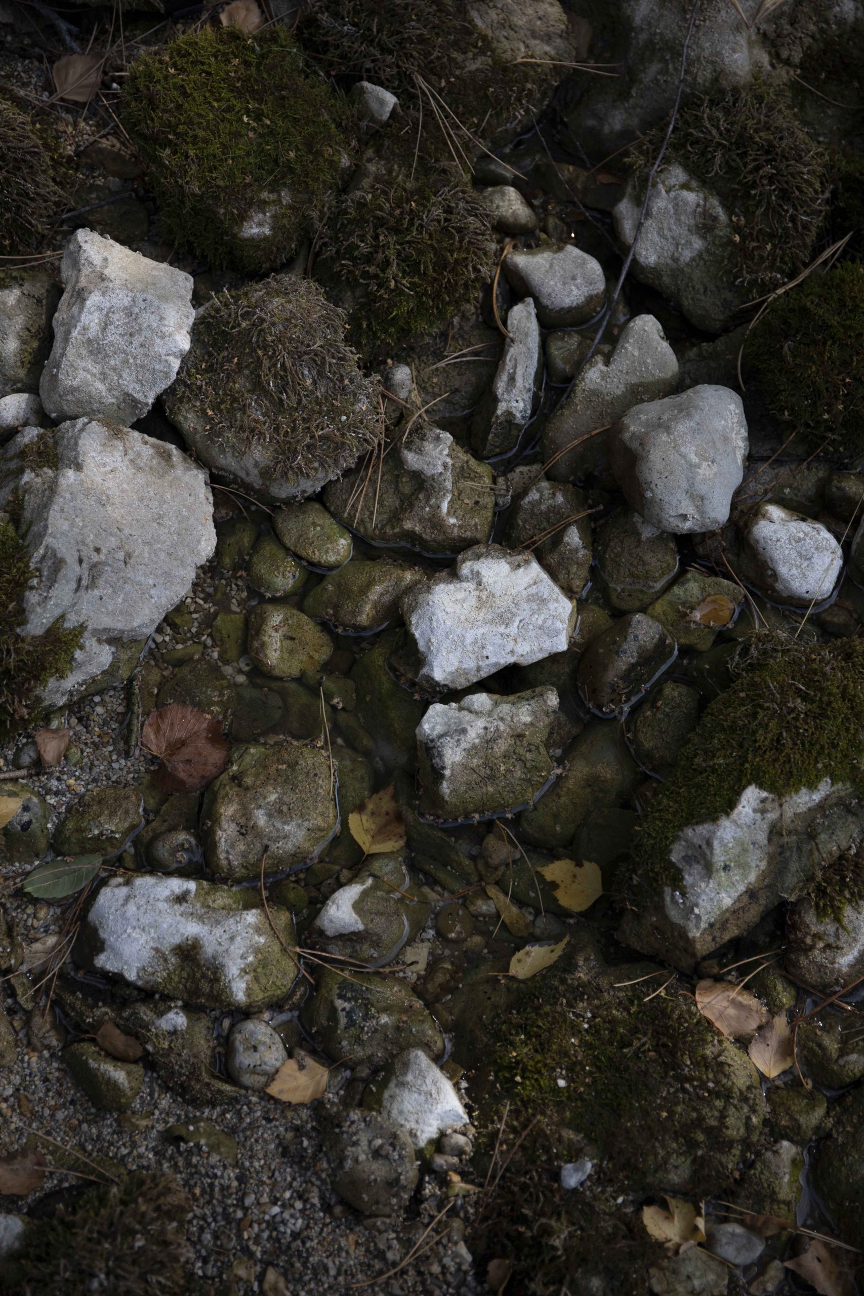
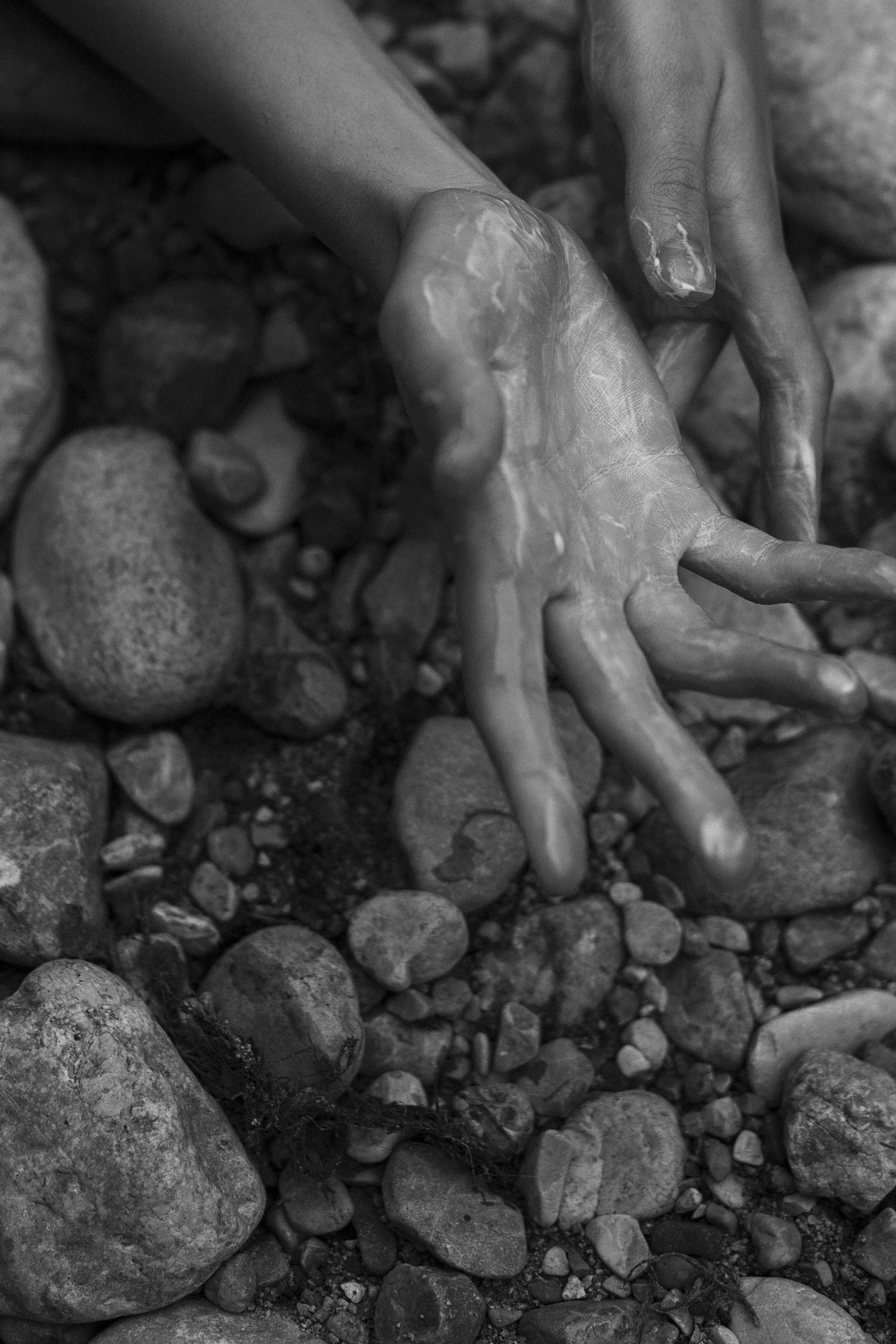
Beauty is imperfect
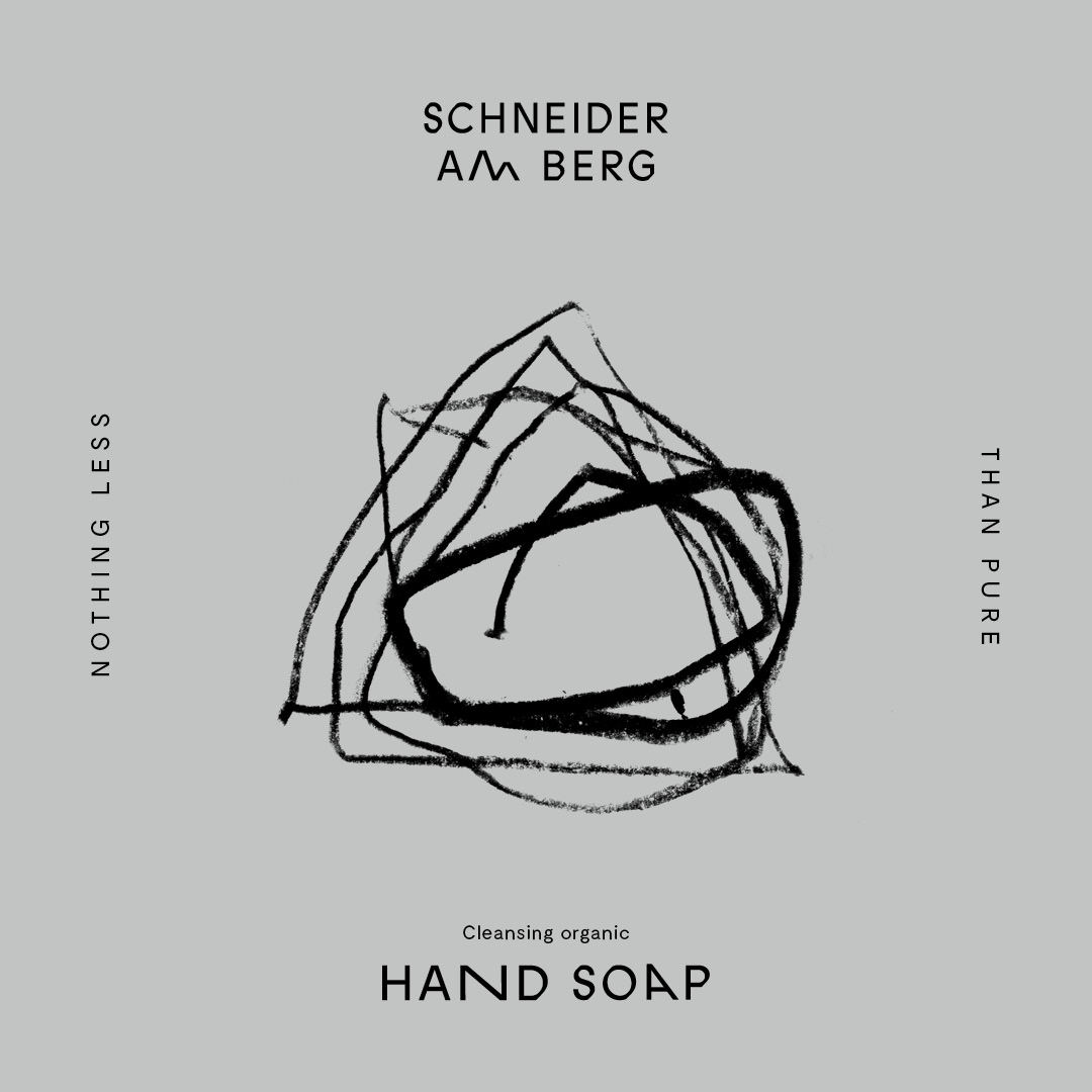
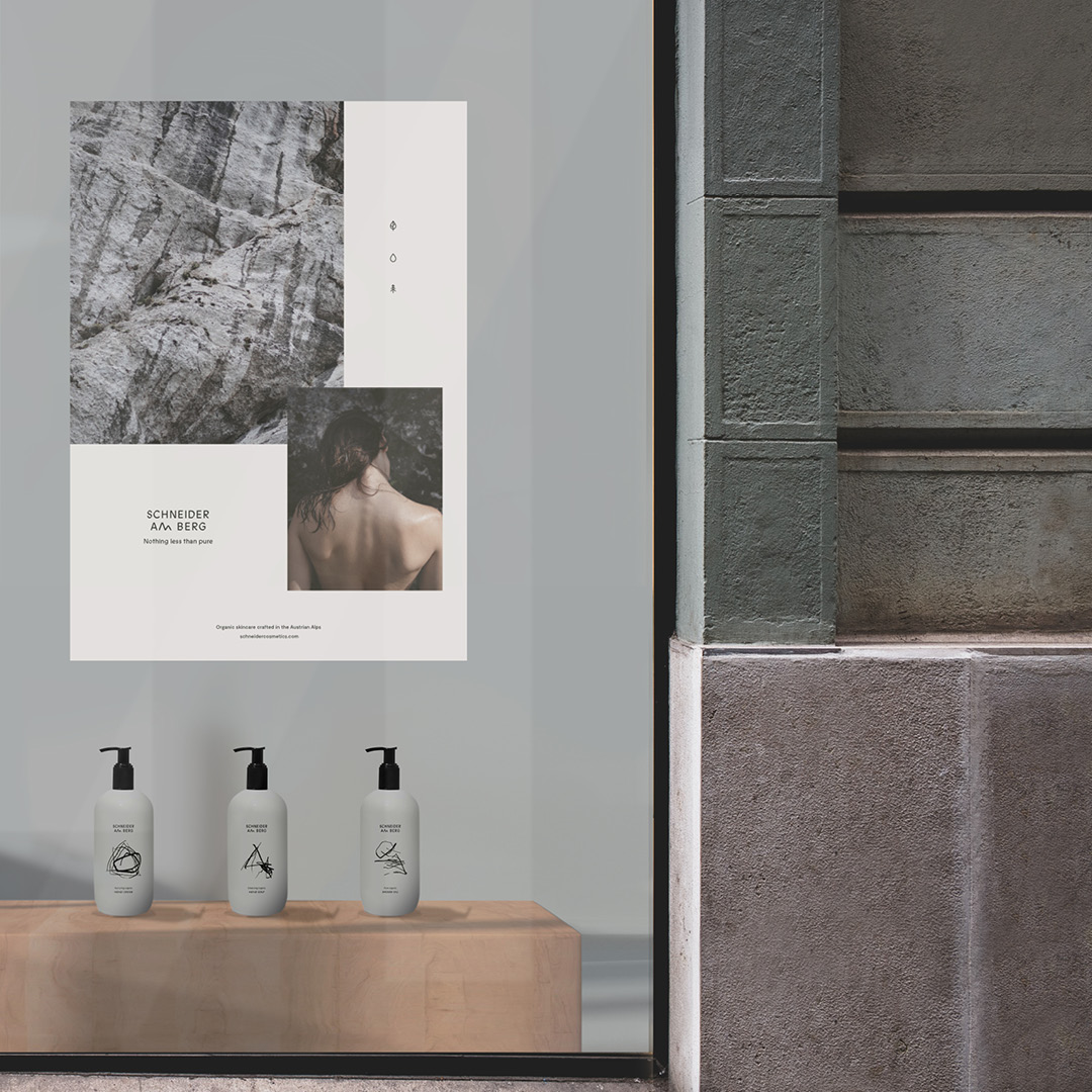
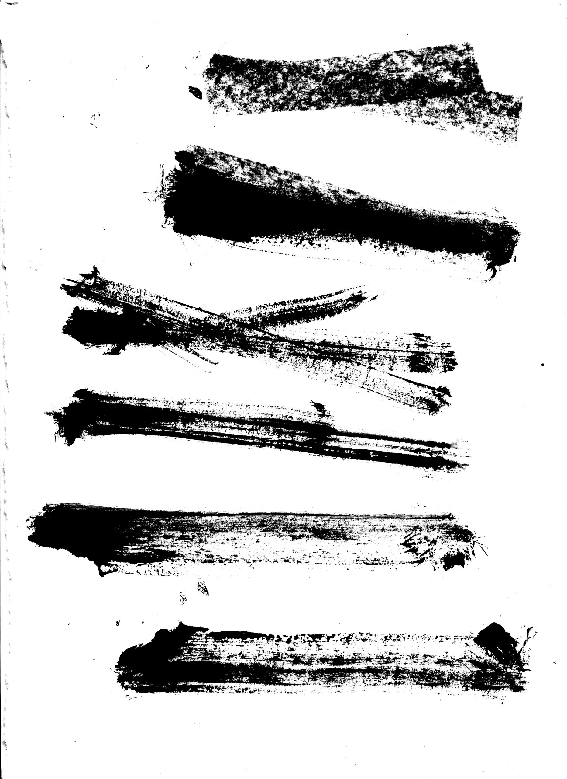
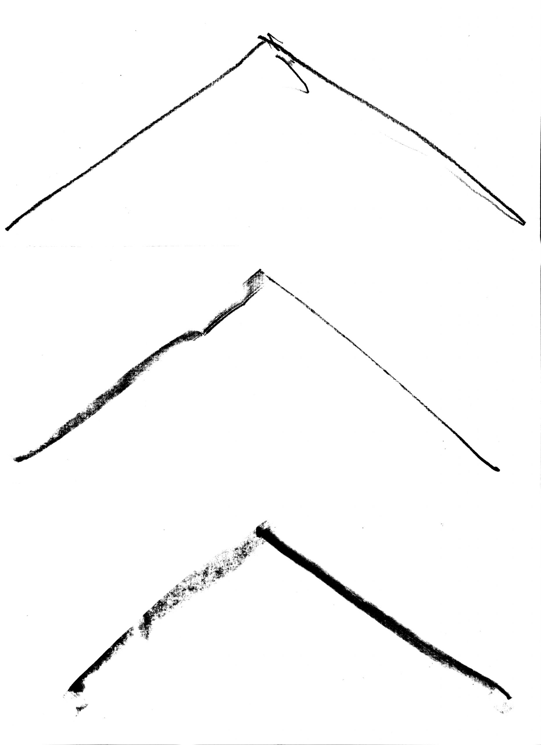
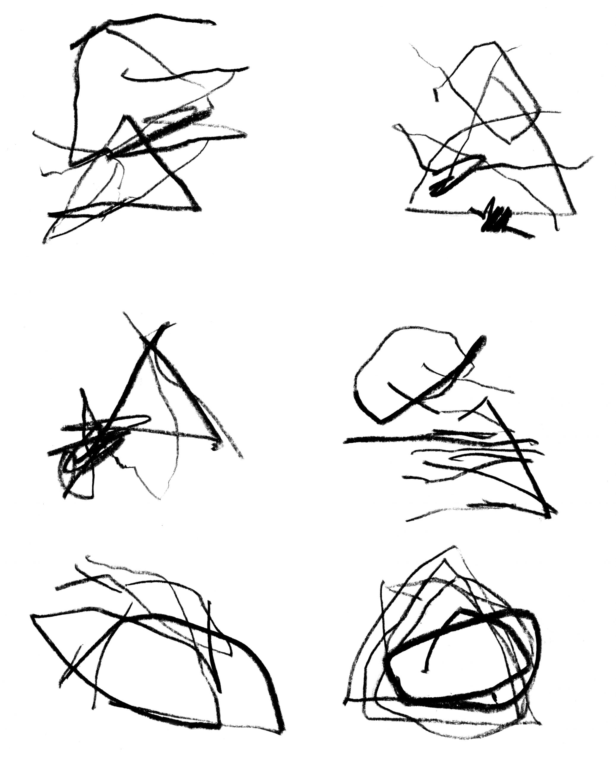
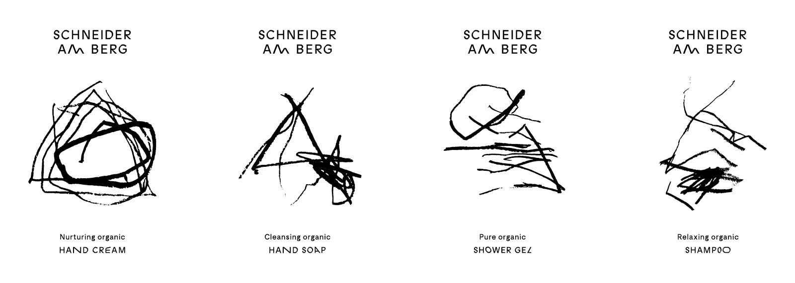
For the packaging design, two contradictory aspects were blended together: The clean pure and the rough wild that can be seen as the nature in all of us. Therefore the visual profile was set on balance and discontinuity to emphasize the uncompromising brand approach. The colours black and white, special detailed typography, custom-made glyph extensions and icons became the collective tone of voice. An abstract mountain symbol for each product breaks the white purity of the containers. Silkscreen print, wrapping paper and product tags on haptic Federigoni Constellation paper finished off a successful product premiere.
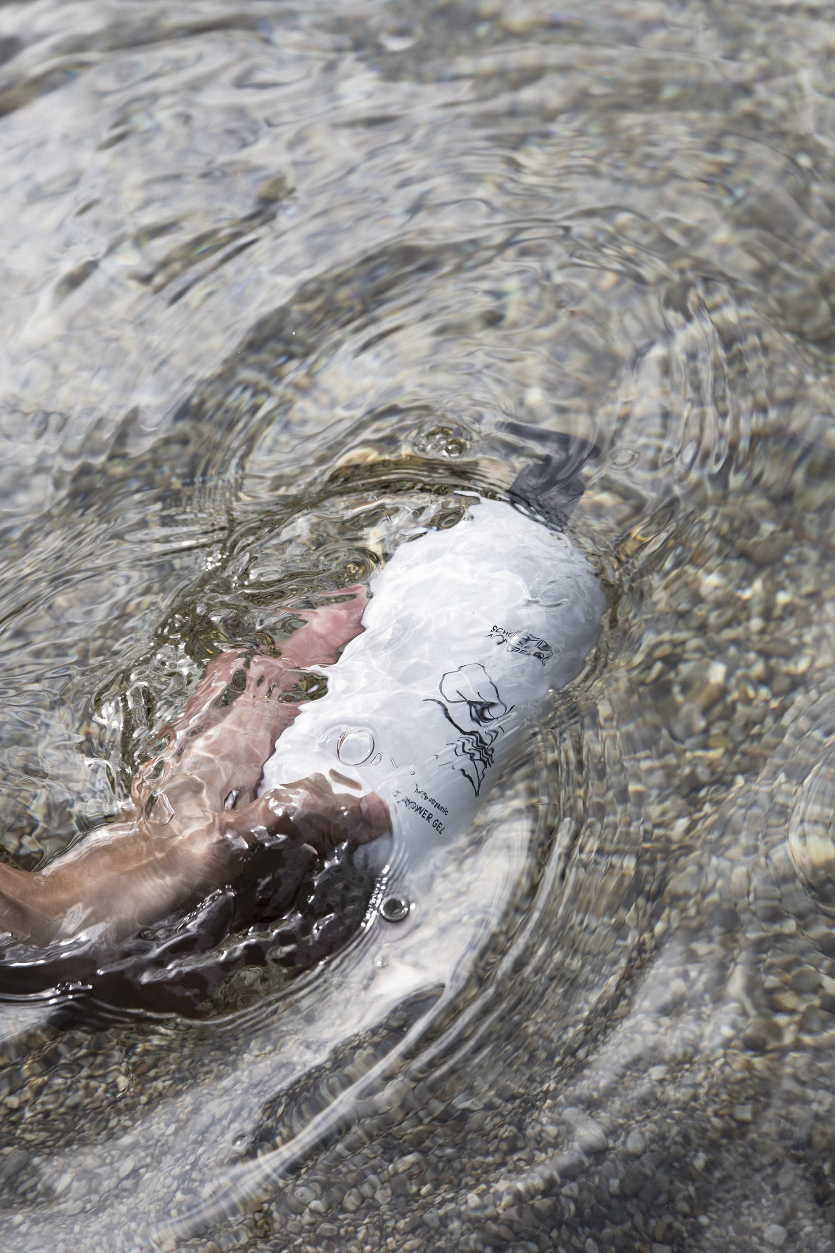
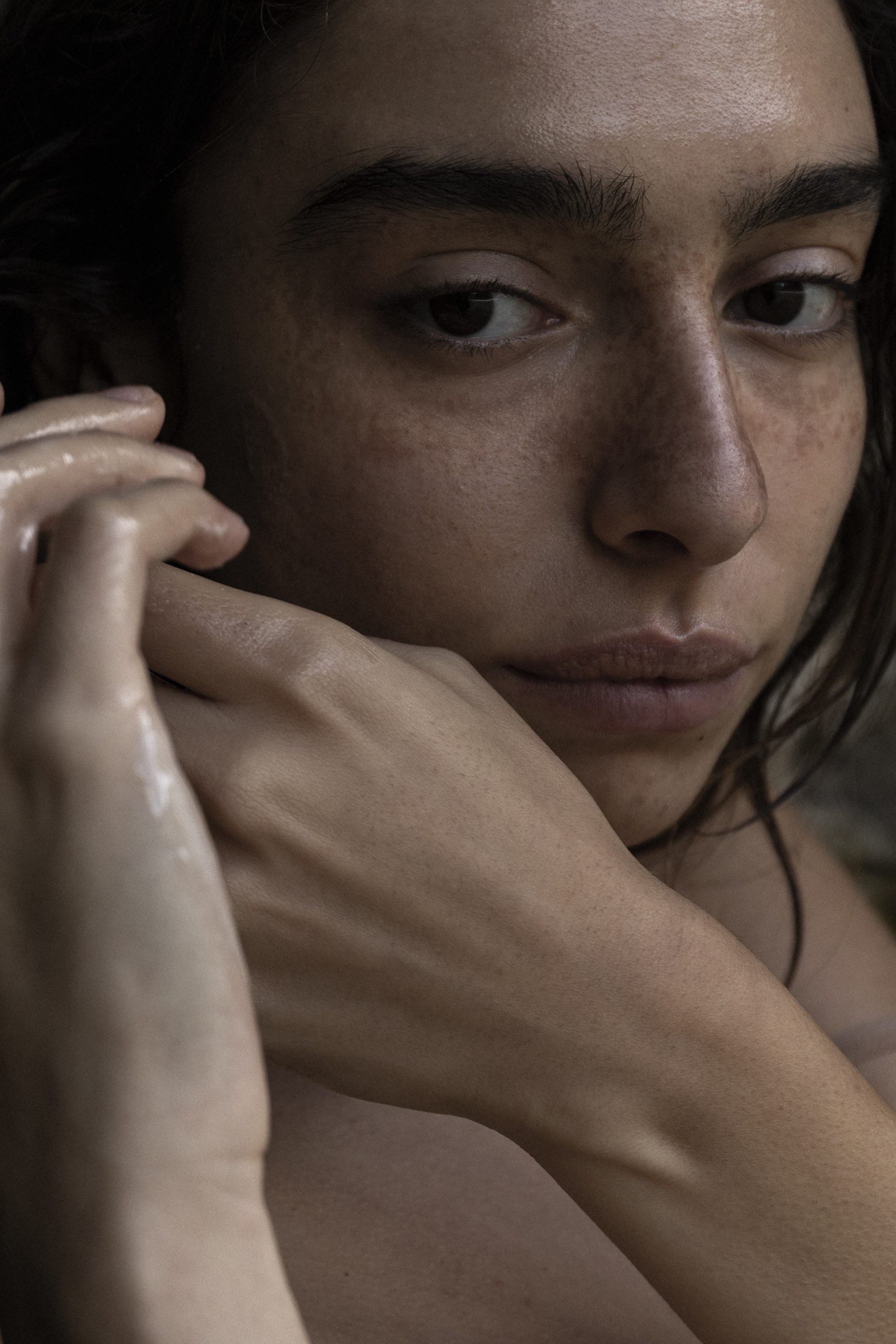
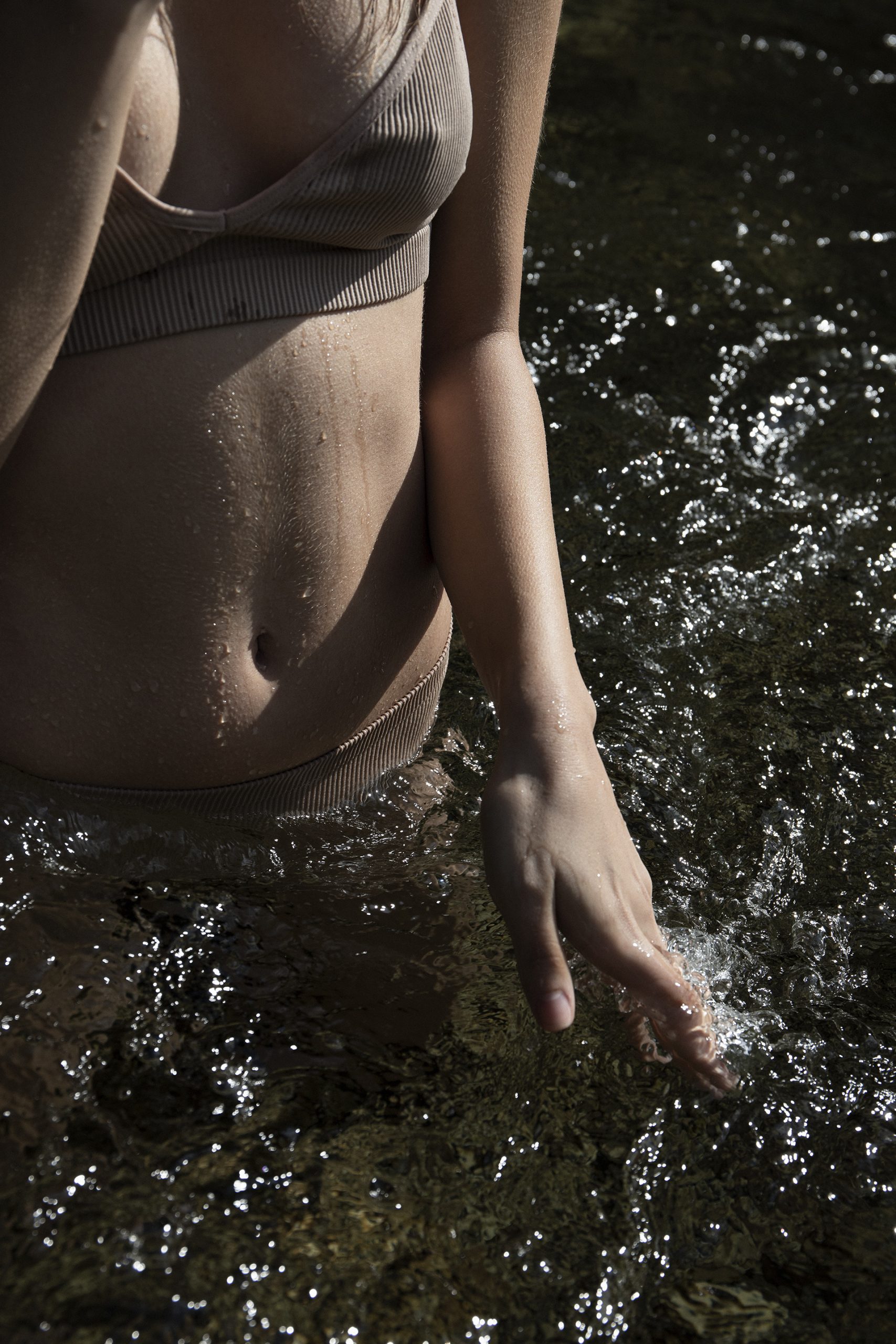
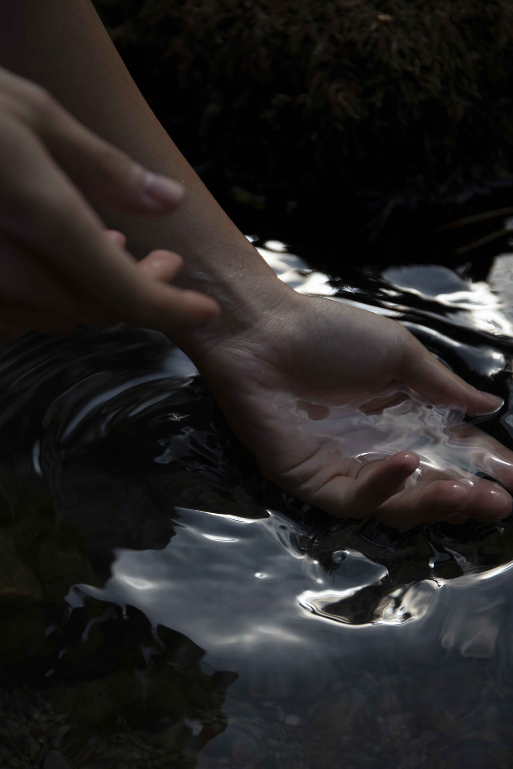
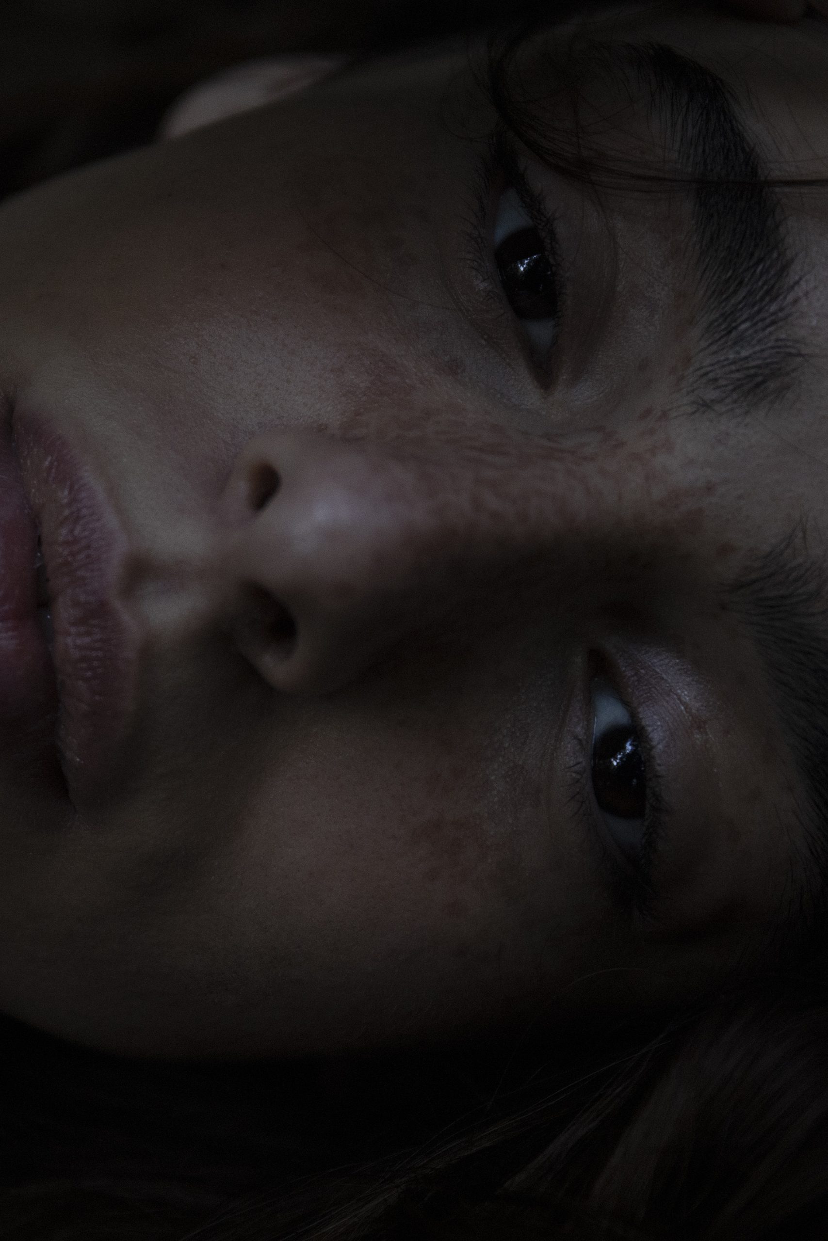
Get lost on a mountain walk. Leave civilisation for a moment. Let the rough natural surrounding lead you closer to your inner nature. Smell and touch—a very primal feeling of comfort and care. In our products, we want to capture the very essence of this experience.
— Elisabeth & Claus Schneider, Founders @Schneider Cosmetics