Actualise Utopia
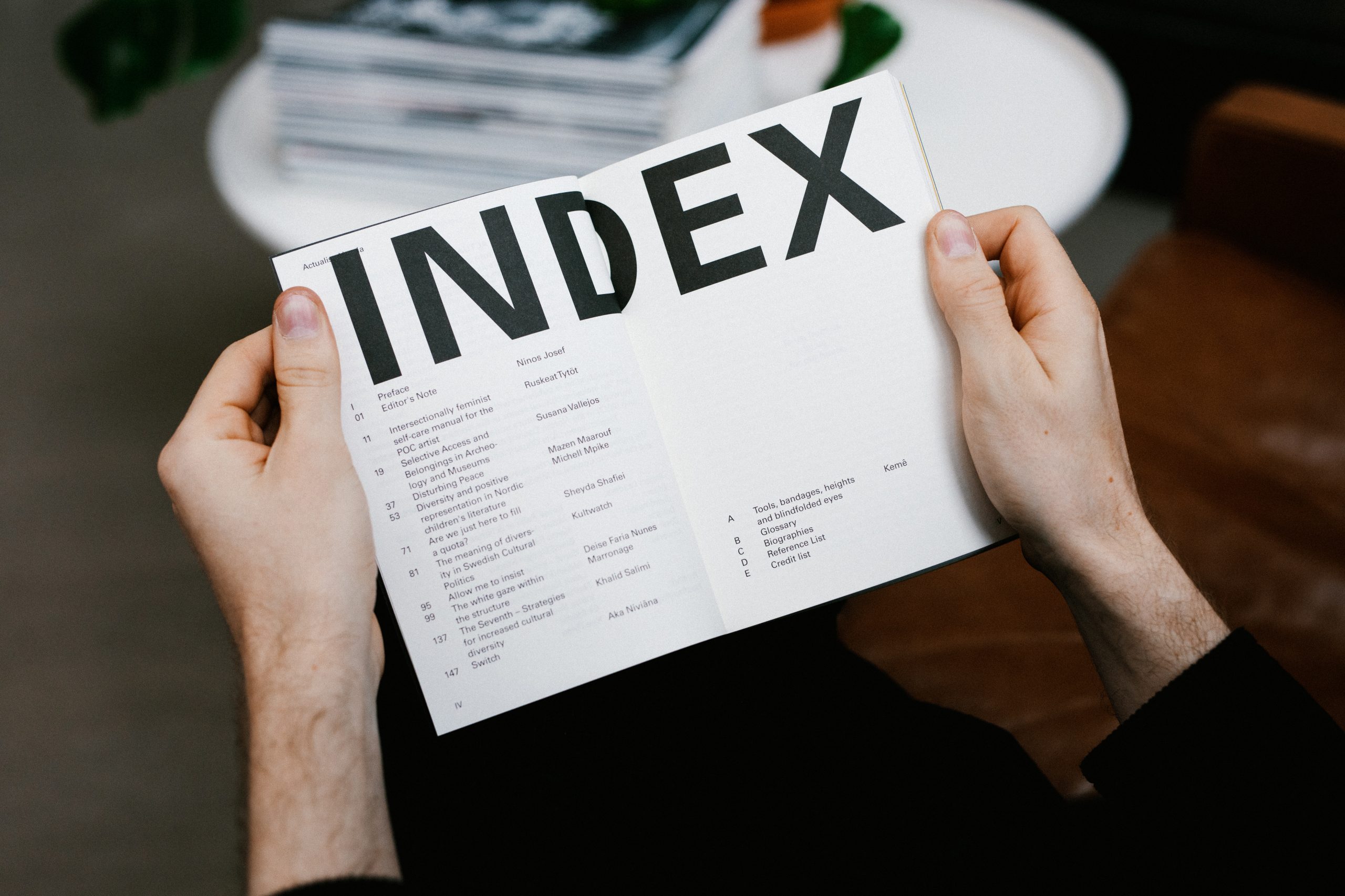
Actualise Utopia is an anthology made to order by the Arts Council Norway. The theme of the anthology is ethnic barriers in Nordic culture and art. In addition to 11 contributions in the form of articles, illustrations, reflections and a separate dictionary for the publication have been ordered.
Category→
Arts & Culture
Work→
Editorial design, art direction
Awards→
TBA
Client→
Arts Council Norway
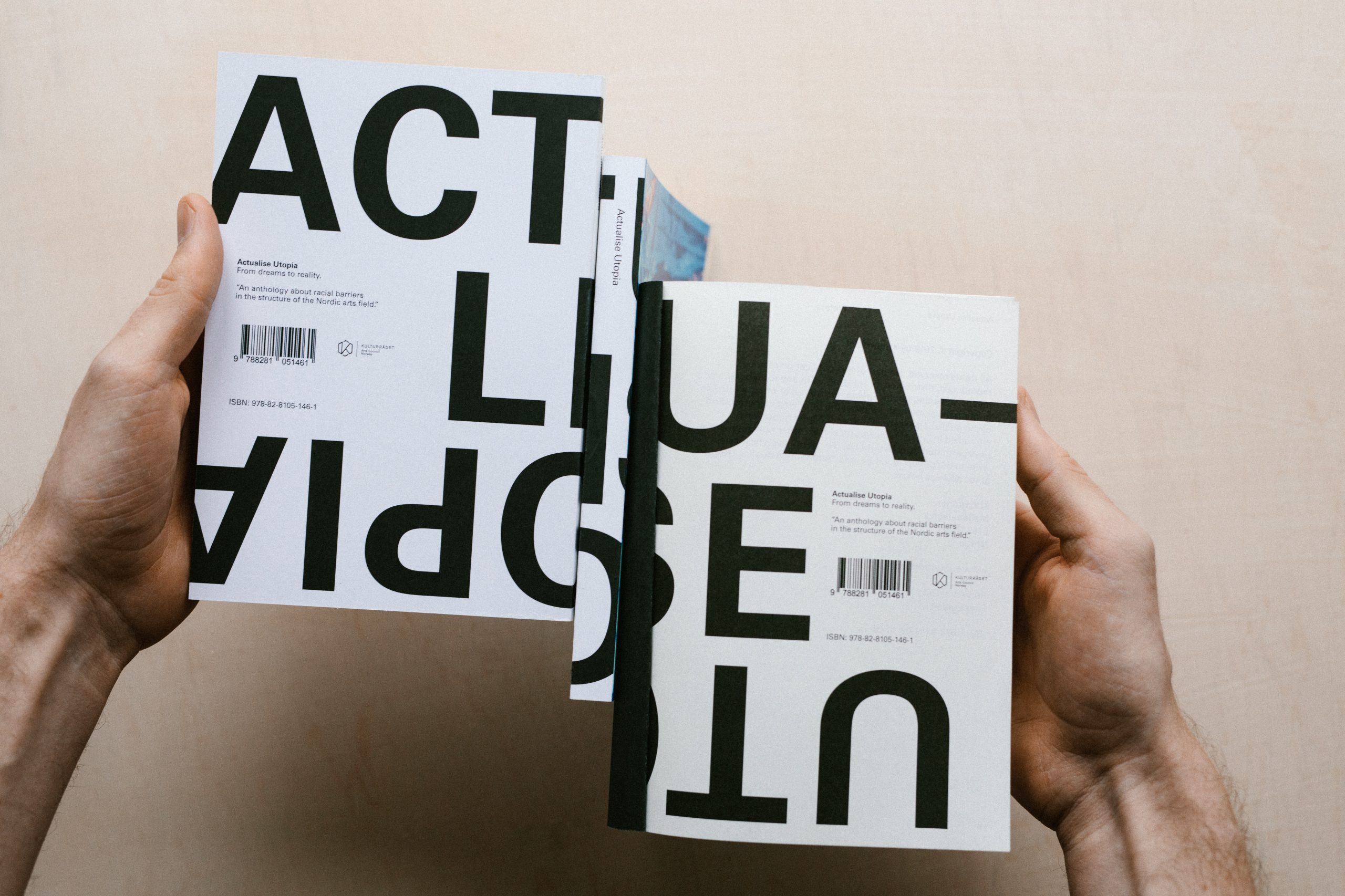
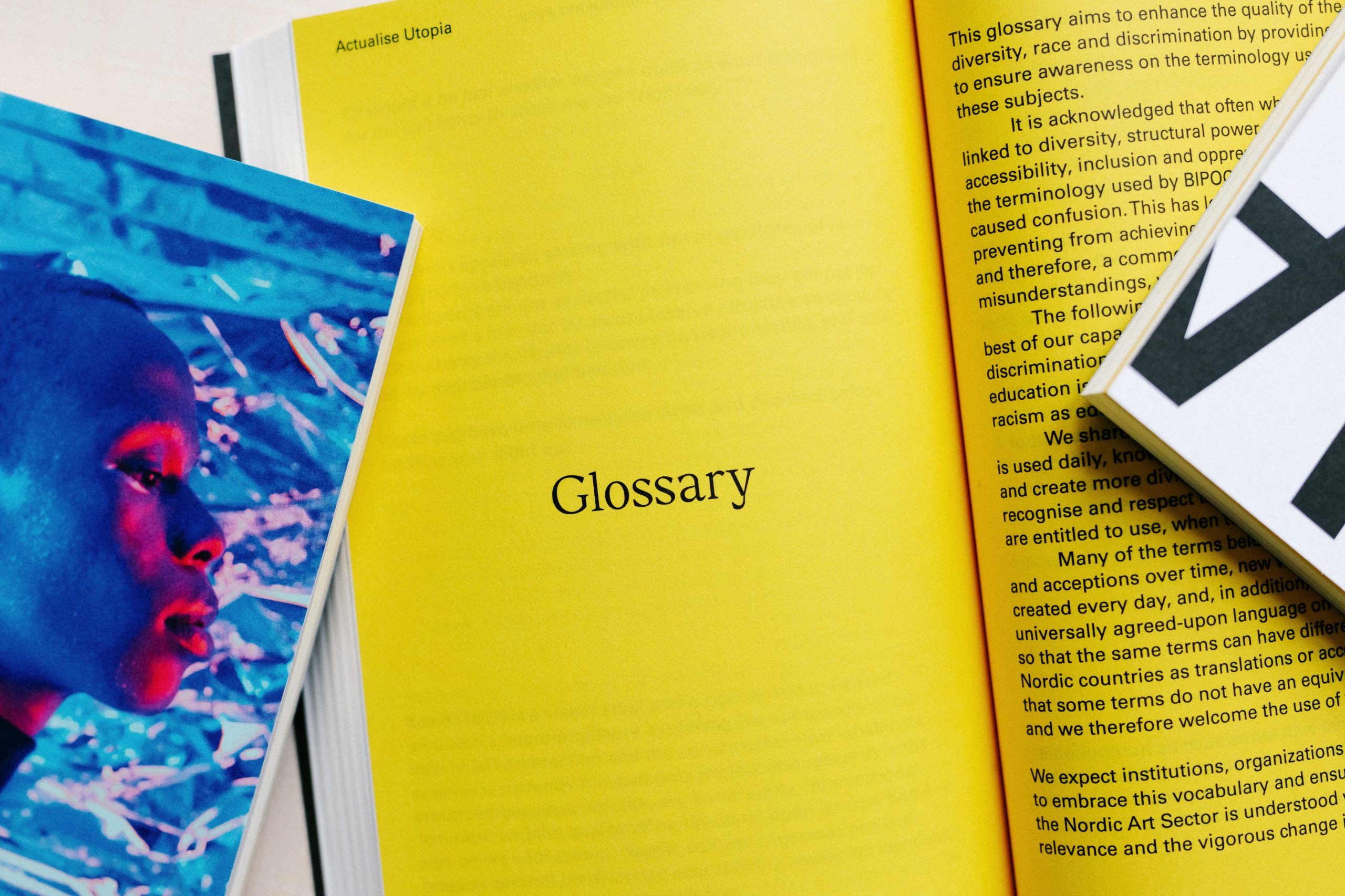
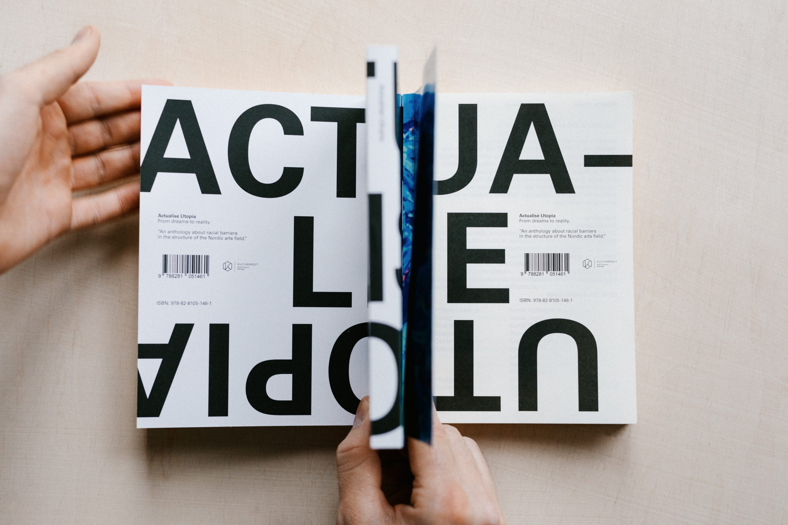
An unconventional cover and visual breaks create respite in an otherwise text-heavy publication. The book is systematically structured to give identity to each contribution, but at the same time provides a comprehensive experience of the publication. Visually, it balances between the informative and expressive, precisely to substantiate the impact the publisher desired.
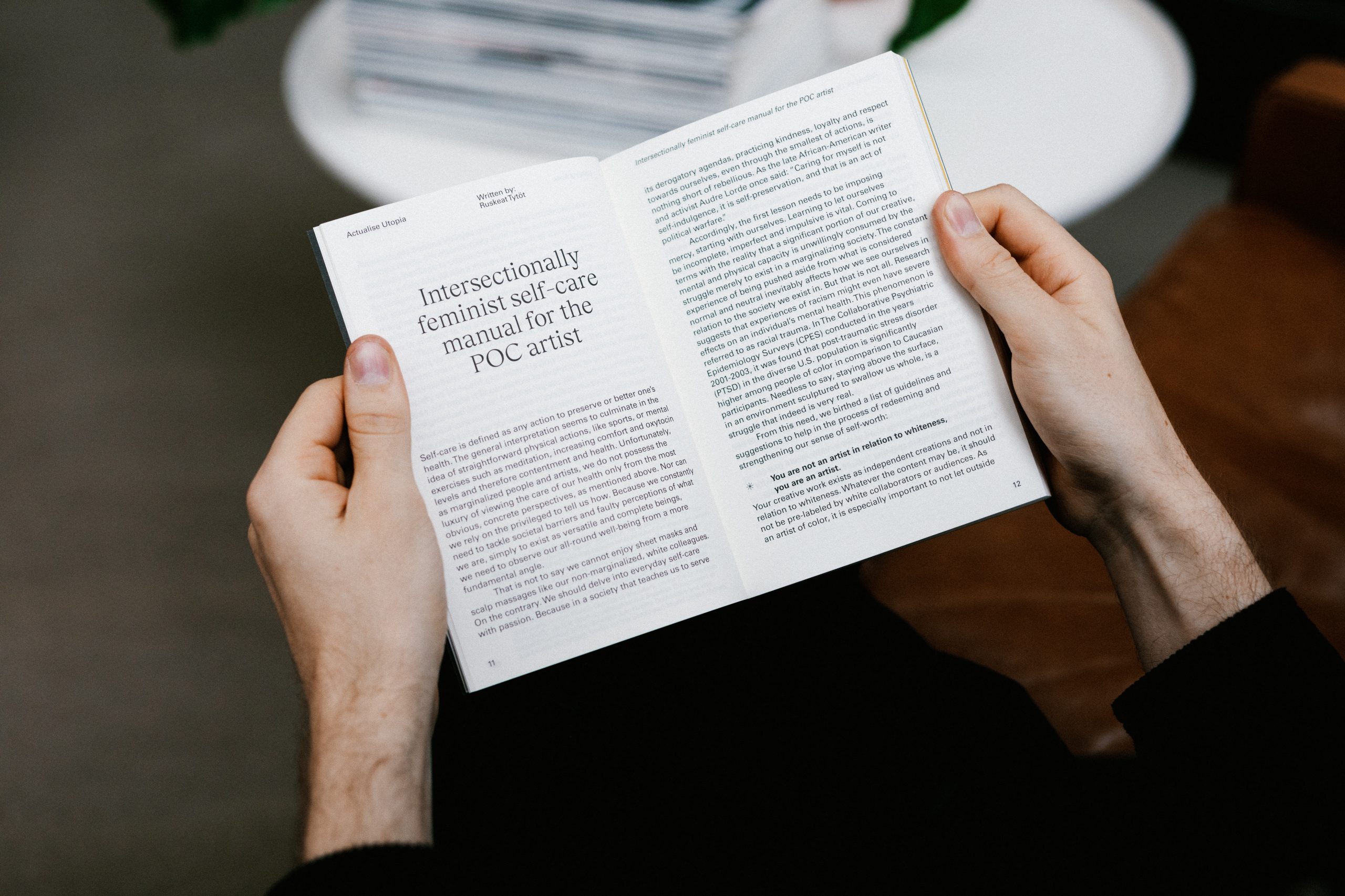
Because we have to be shaken in order to realize that this is a problem - with institutionalised racism and exclusion in the cultural sector - the book's design language is balanced between controlled and activist. After spending 3 years researching and material, Actualise Utopia is the result - an exciting and accessible physical product with an important message.