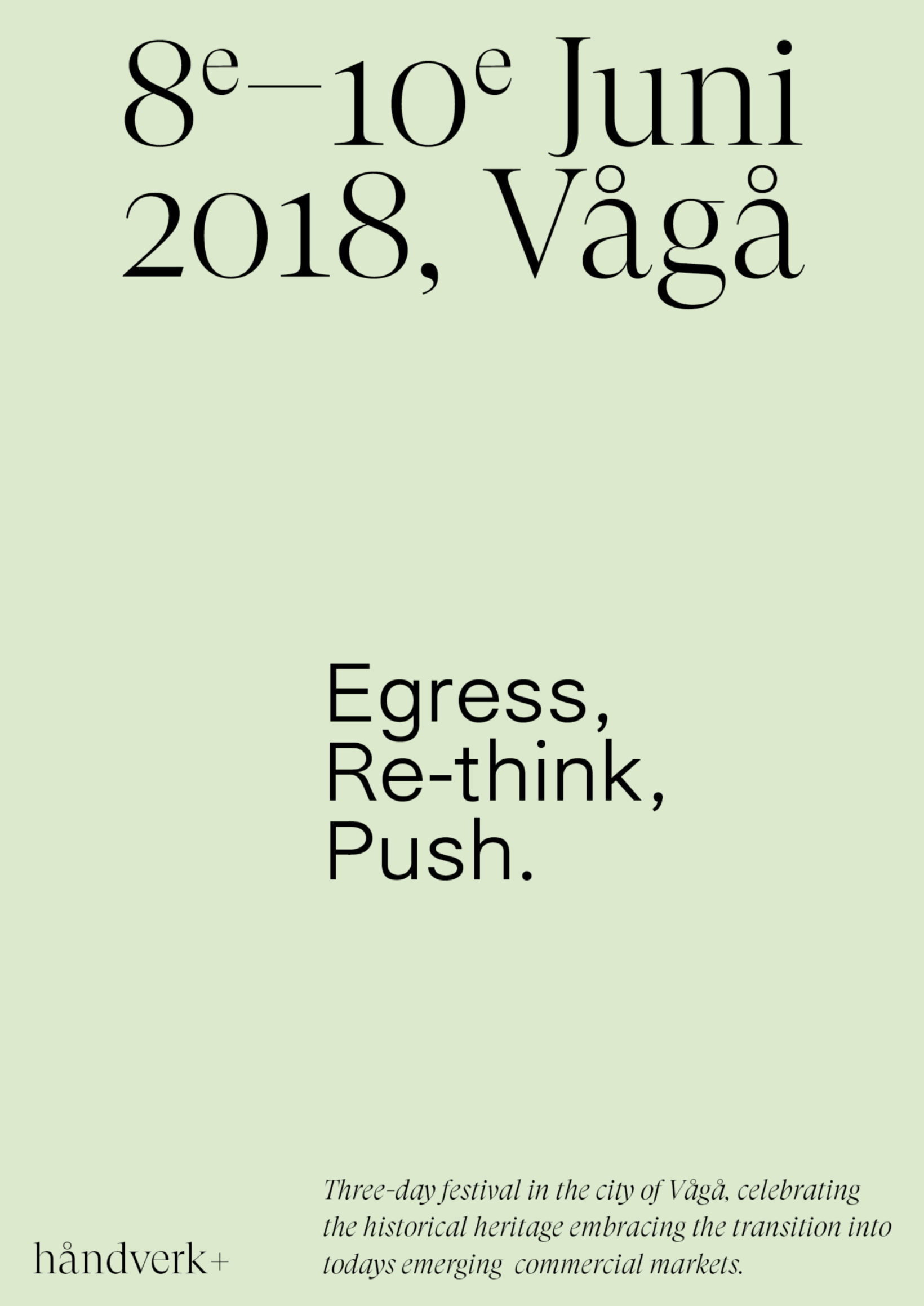
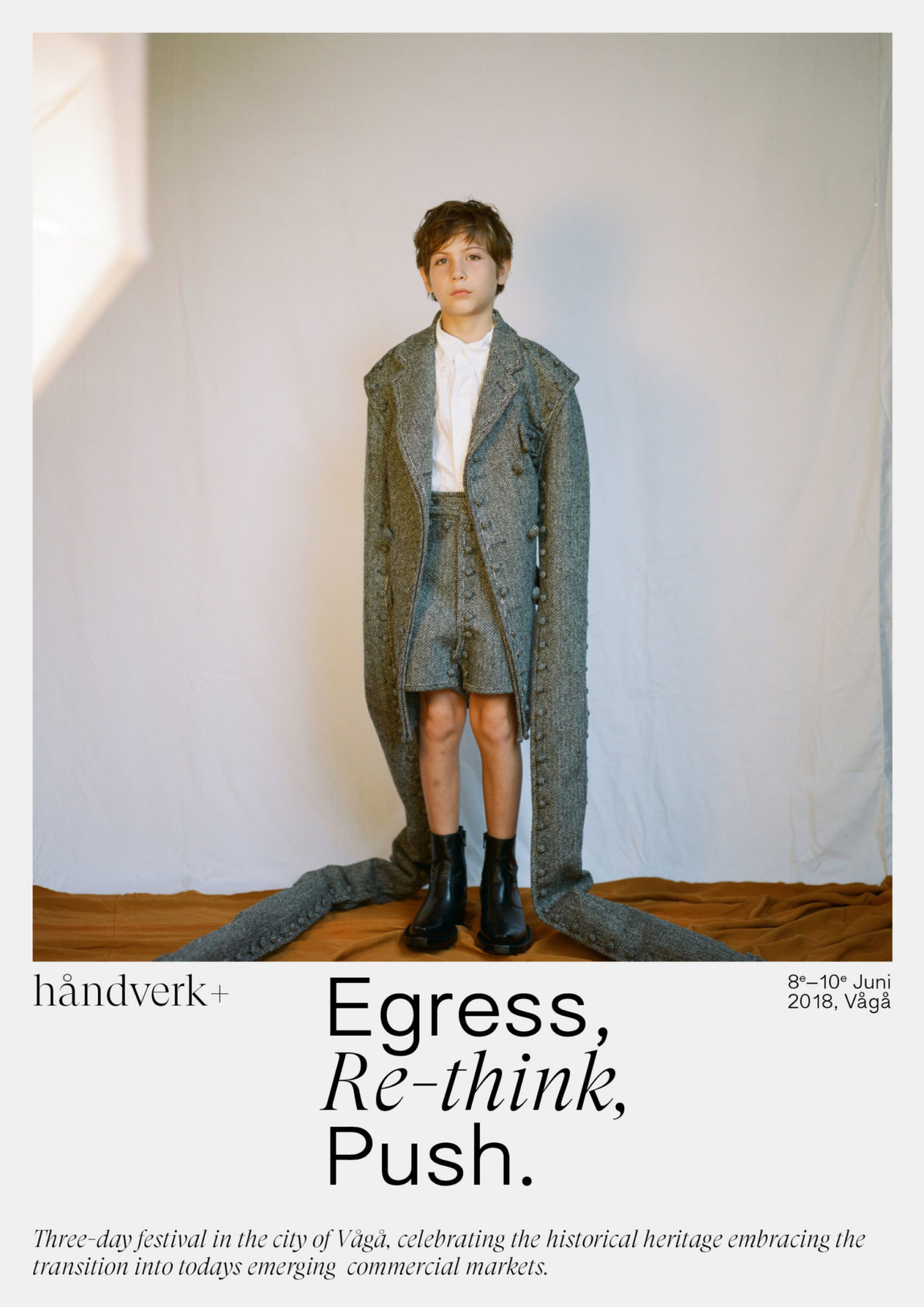
Egress, Re-think, Push
Category→
Arts & Culture
Work→
Visual identity
Awards→
TBA
Client→
Håndverk+
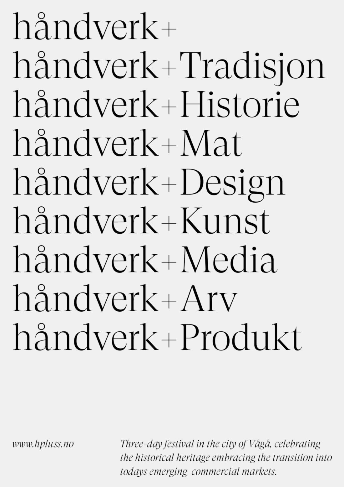
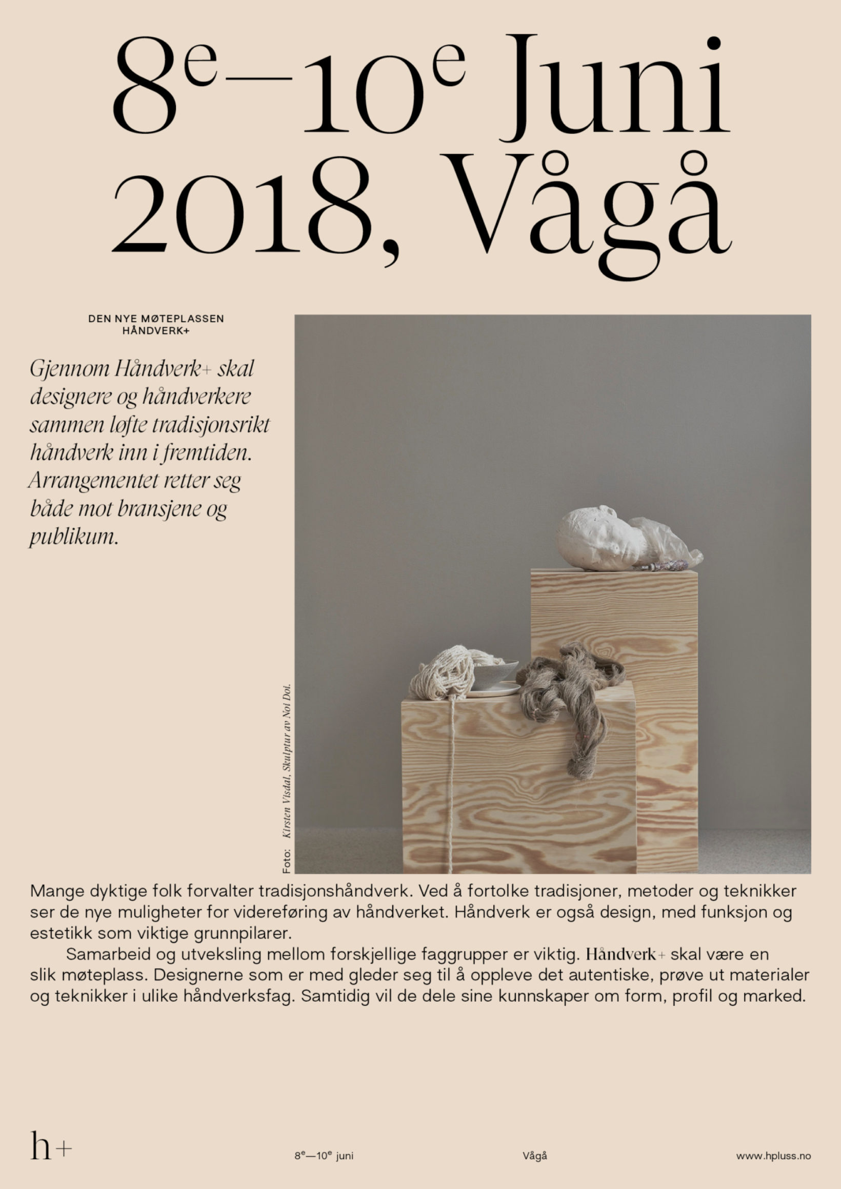
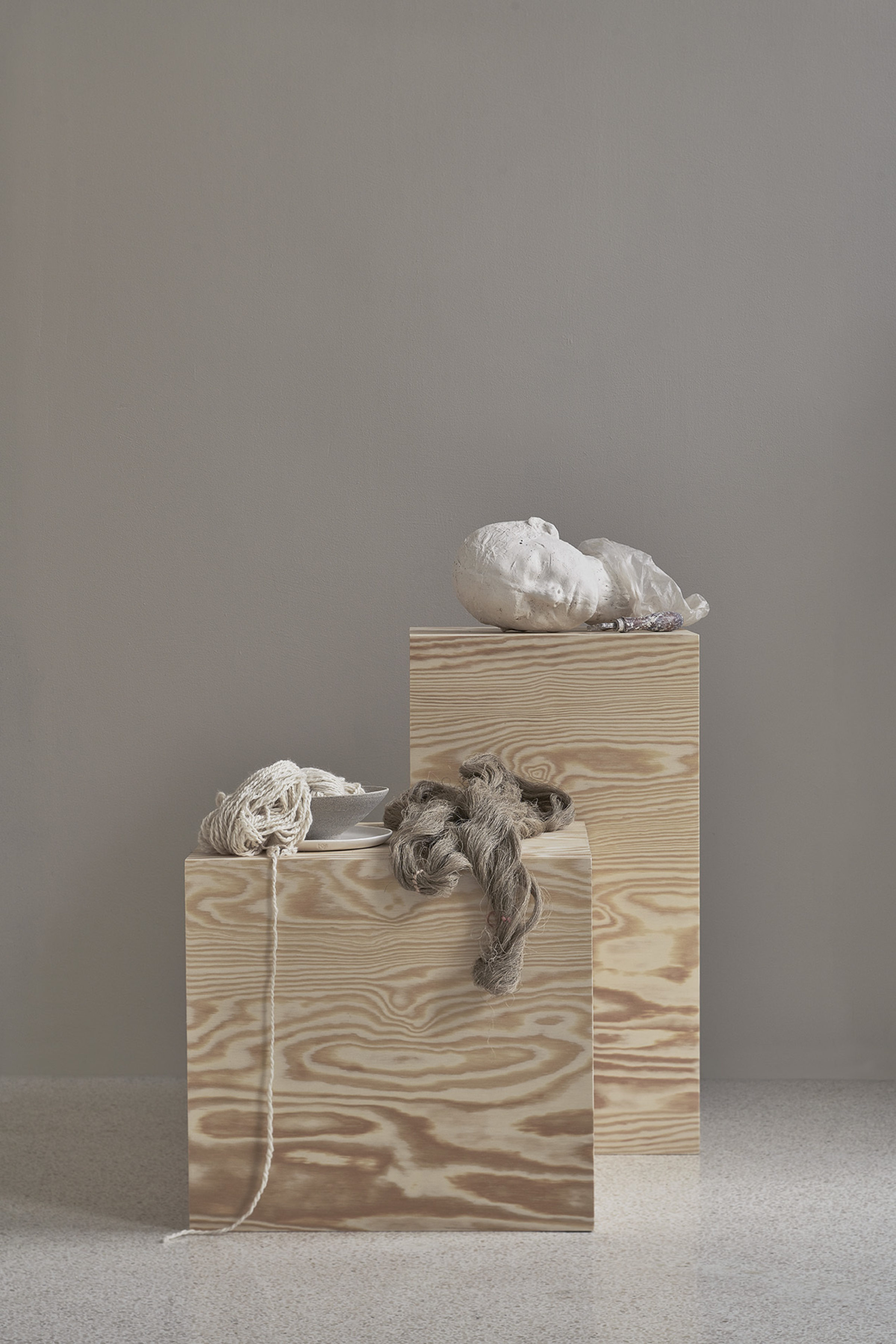
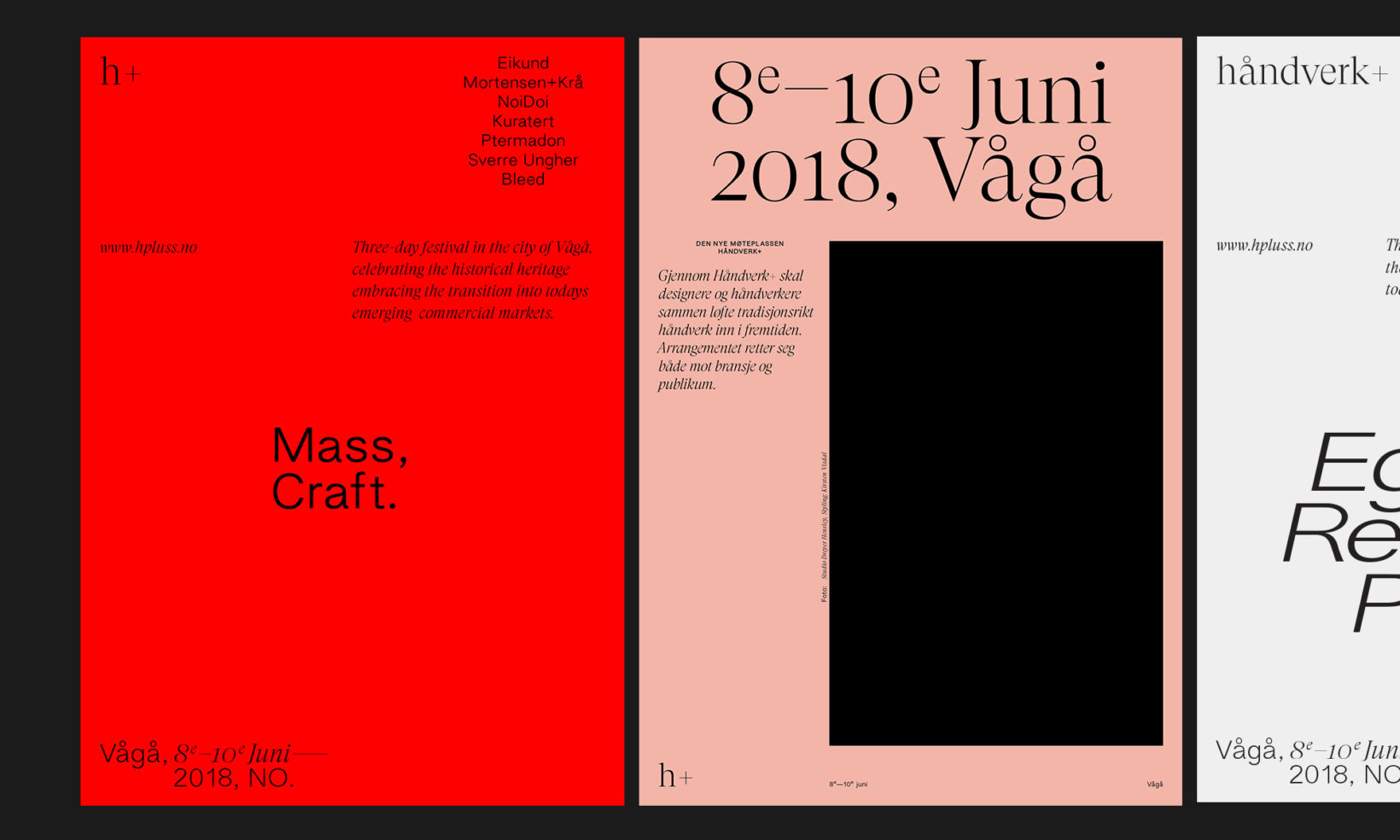
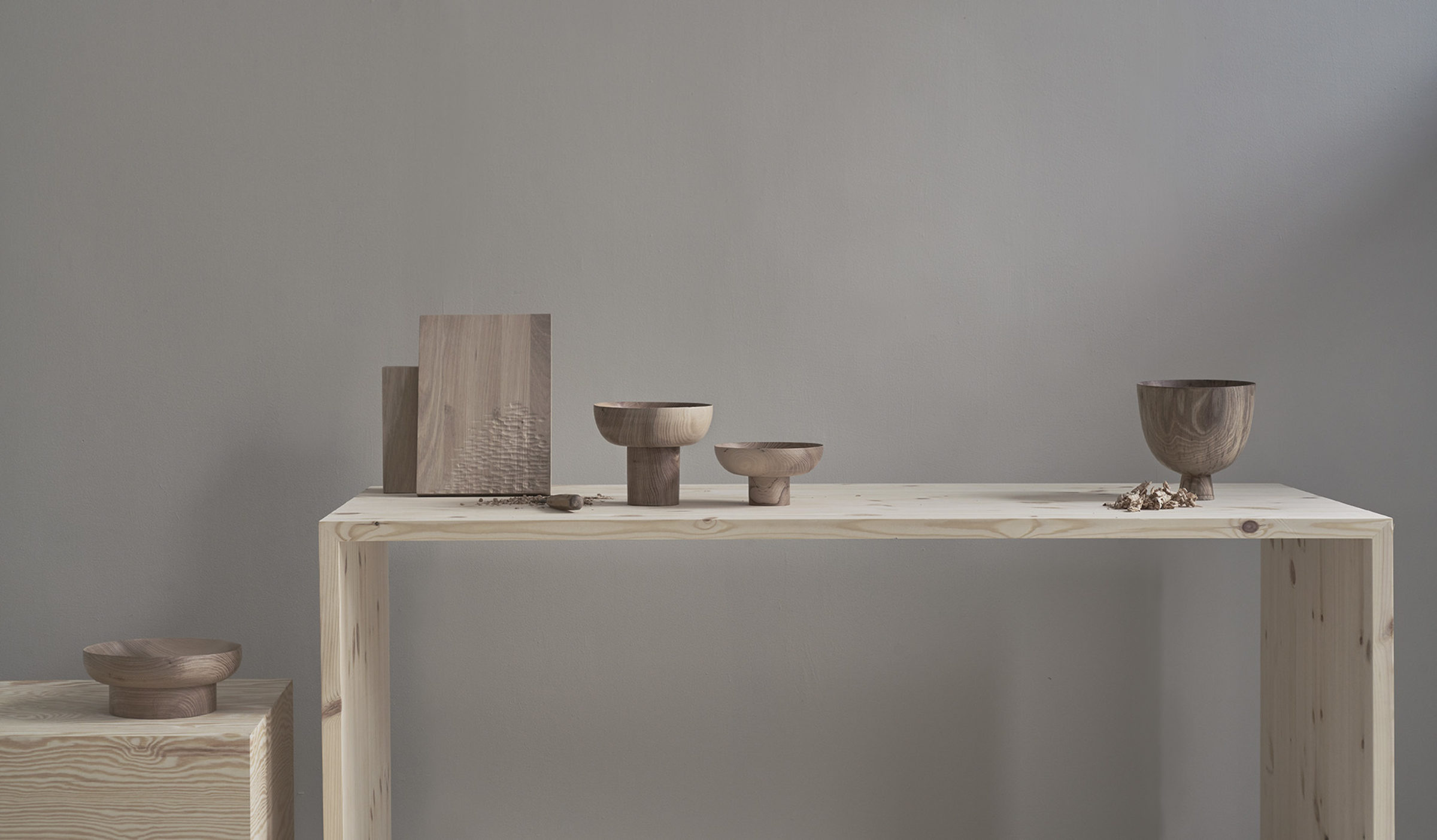
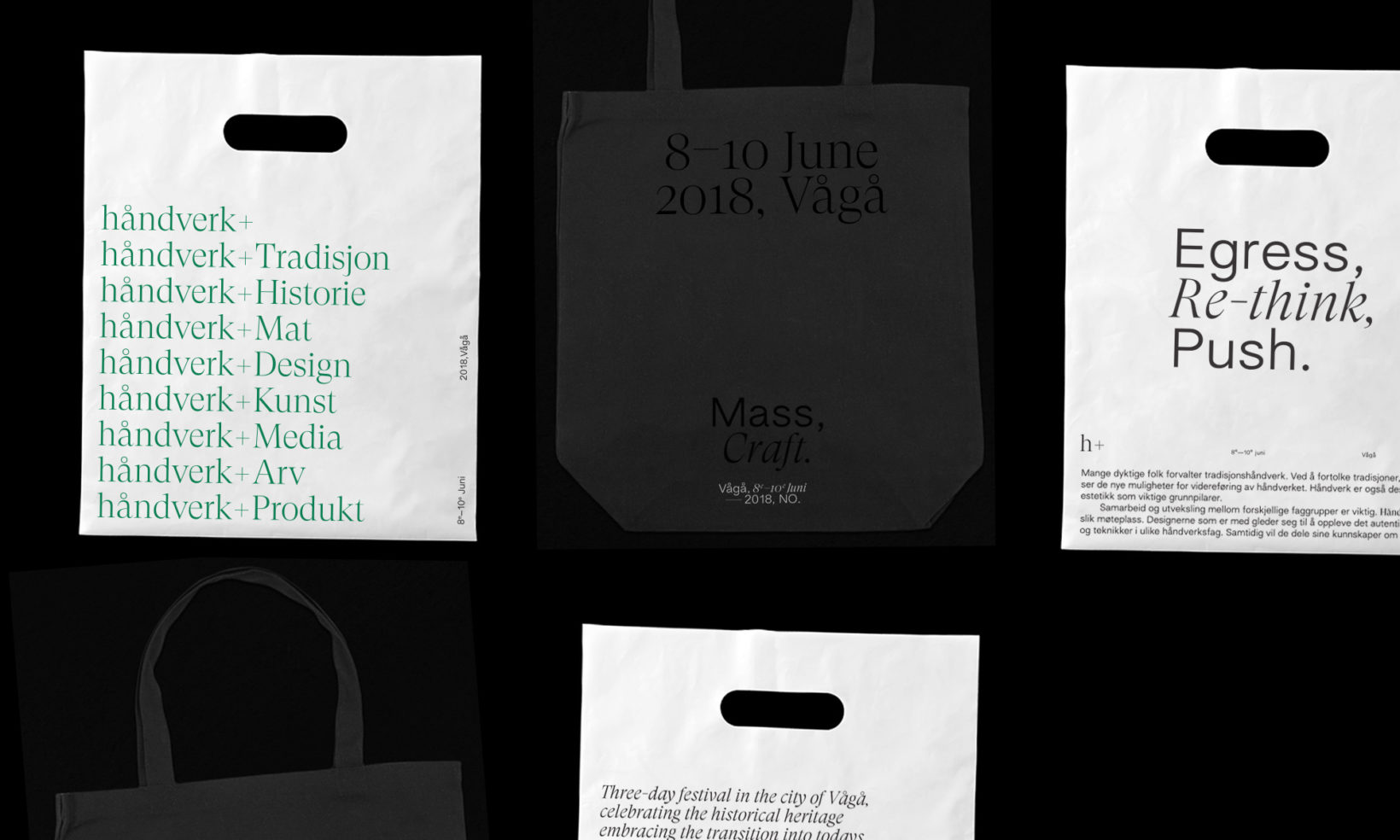
Håndverk+ is a three-day seminar in the city of Vågå. Celebrating traditional craft and heritage, conversing on the topic of craft transitioning into today's emerging mass-markets.
Mission
We were approached to create an identity reflecting the theme of the festival, and framing the contrasting relationship between new and old – past & present. We came up with a flexible system, varying layouts and content with ease and for altering the expression quickly. It enables the identity to grow and expand for future updates, and respond to the content presented for every new event or contributor.
Composite
An interplay between typographic styles and classes creates a tension and a narrative for the message of the festival. The design components consist of a flexible layout system, typographical hierarchy, a varied colour palette and product shots from relevant contributors of the program.