Home Is Where the
Heart Is
The people behind Belèven have extensive experience in the brokerage industry, and for many years have been responsible for several of the largest sales at Tjuvholmen and Aker Brygge in Oslo. After deciding to start their own company, on their own terms, they wanted to challenge the way real estate is done in Norway, and to challenge the industry as a whole.
Category→
Business
Work→
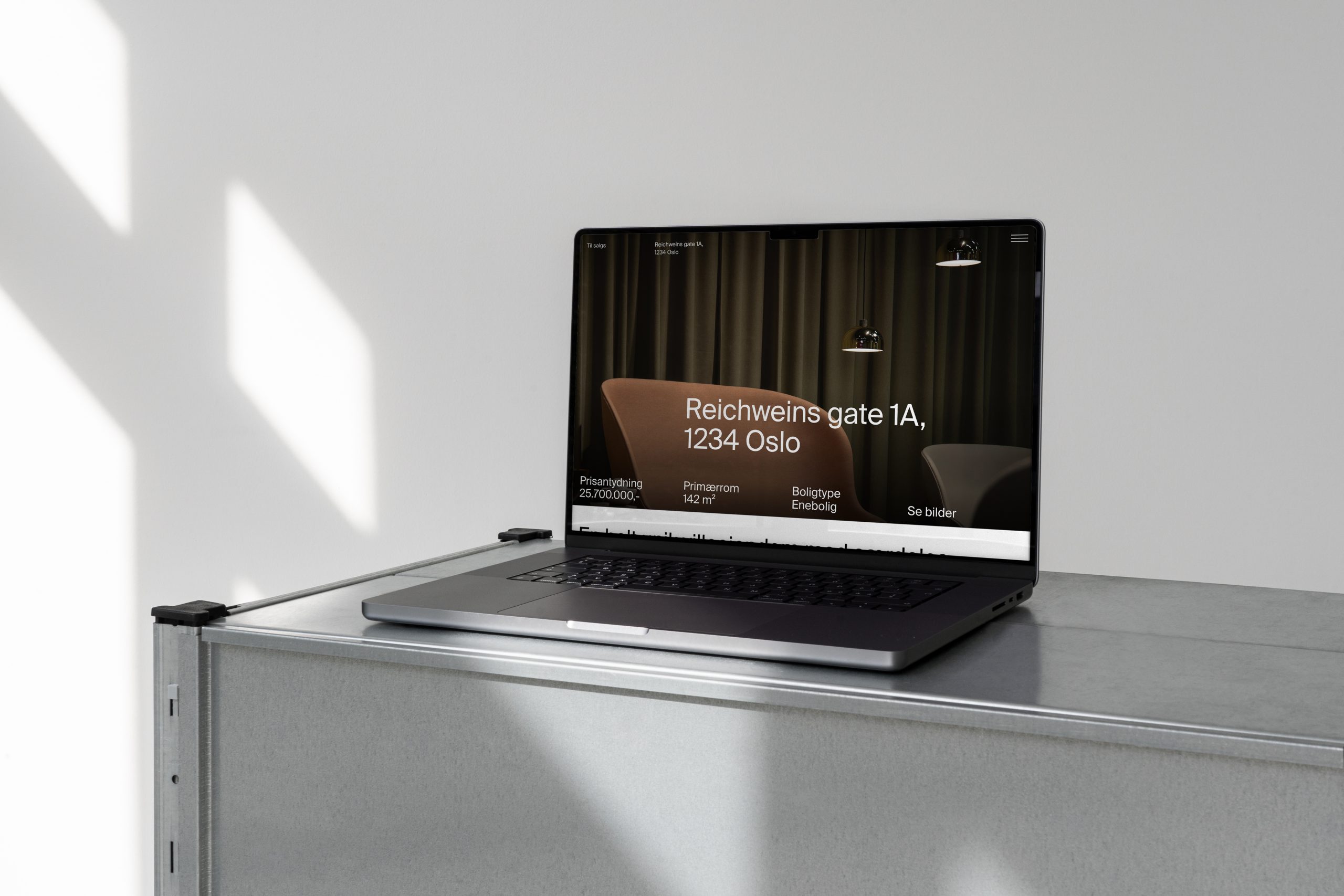
Visual identity, digital design
Awards→
TBA
Client→
Belèven Eiendomsmegling
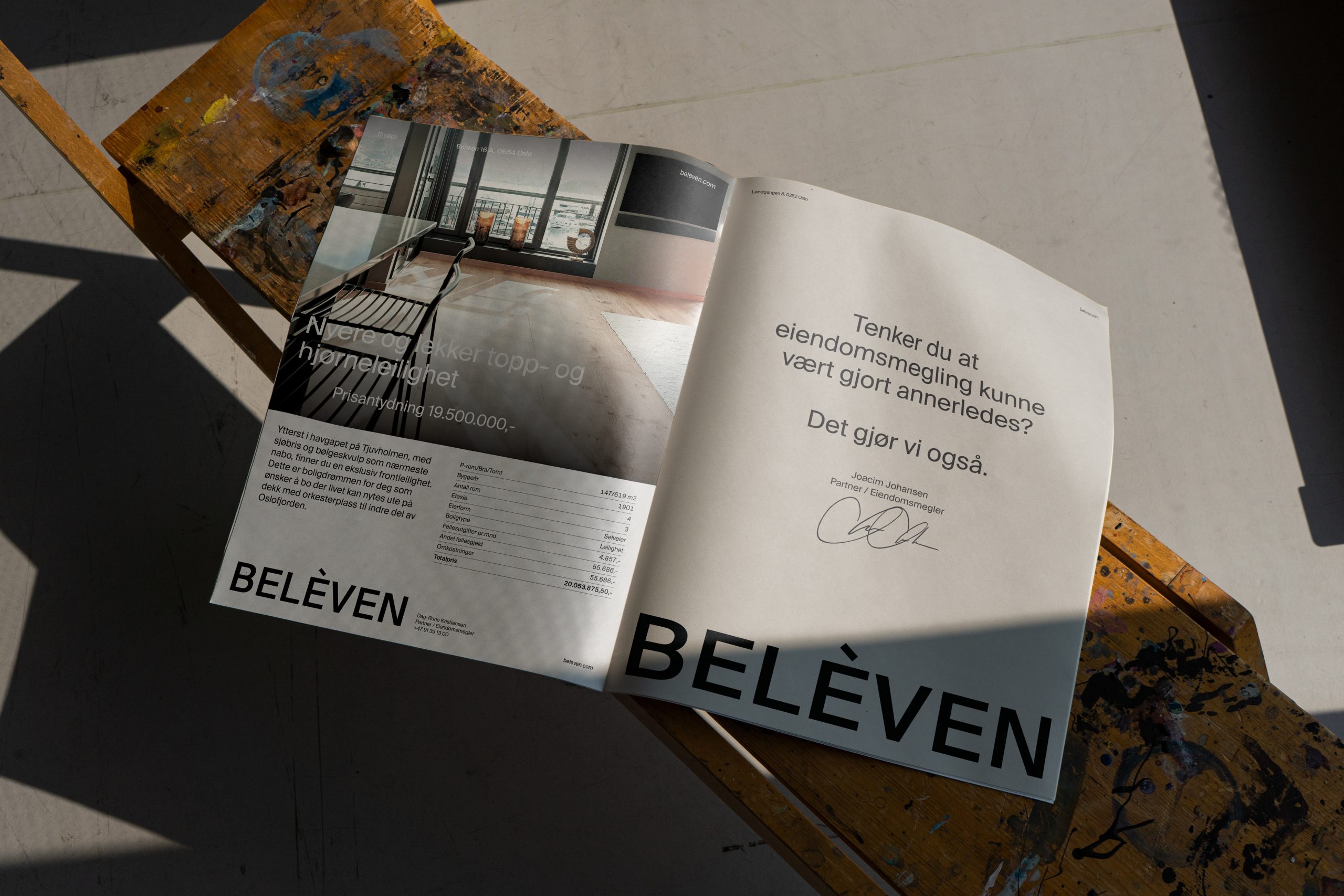
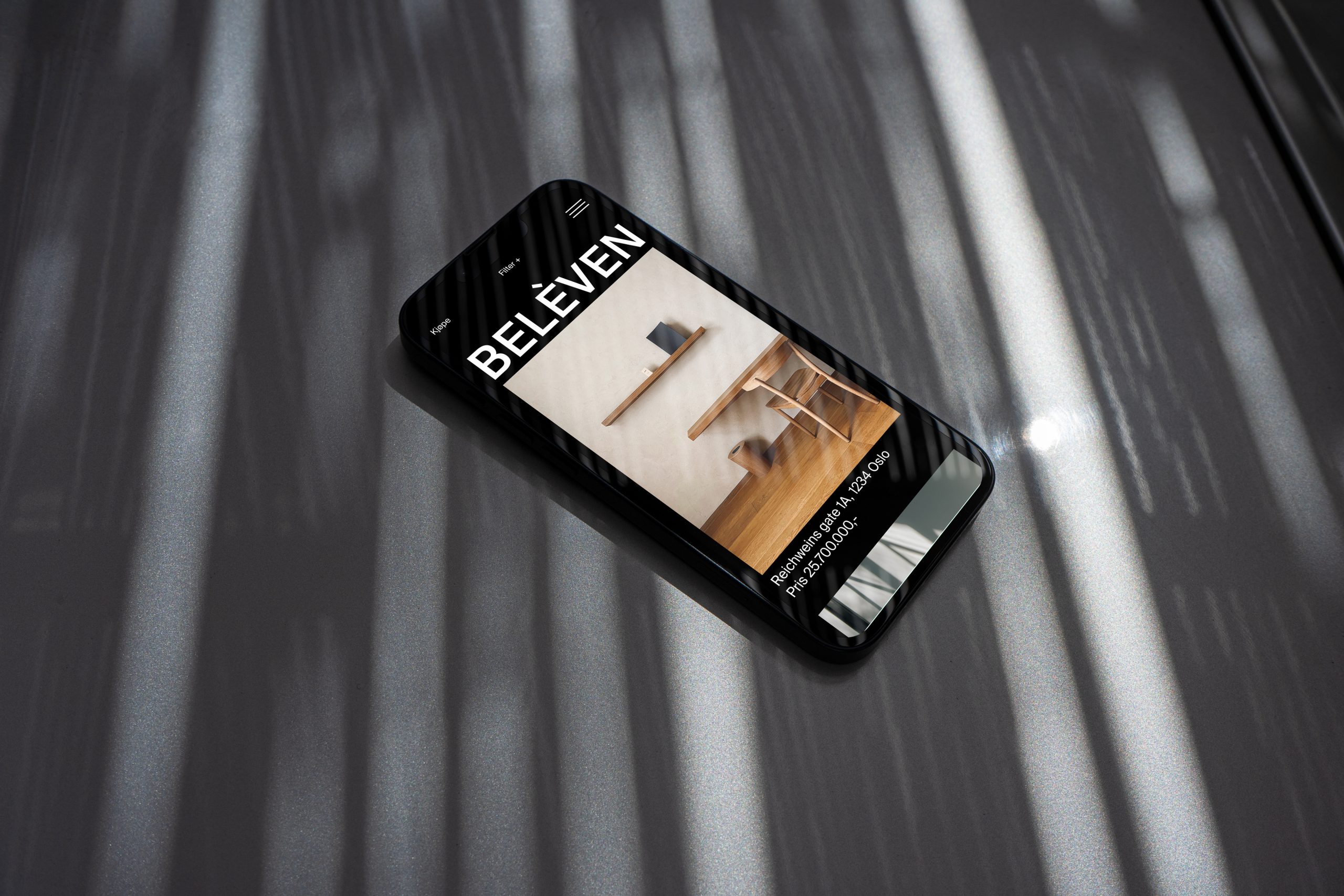
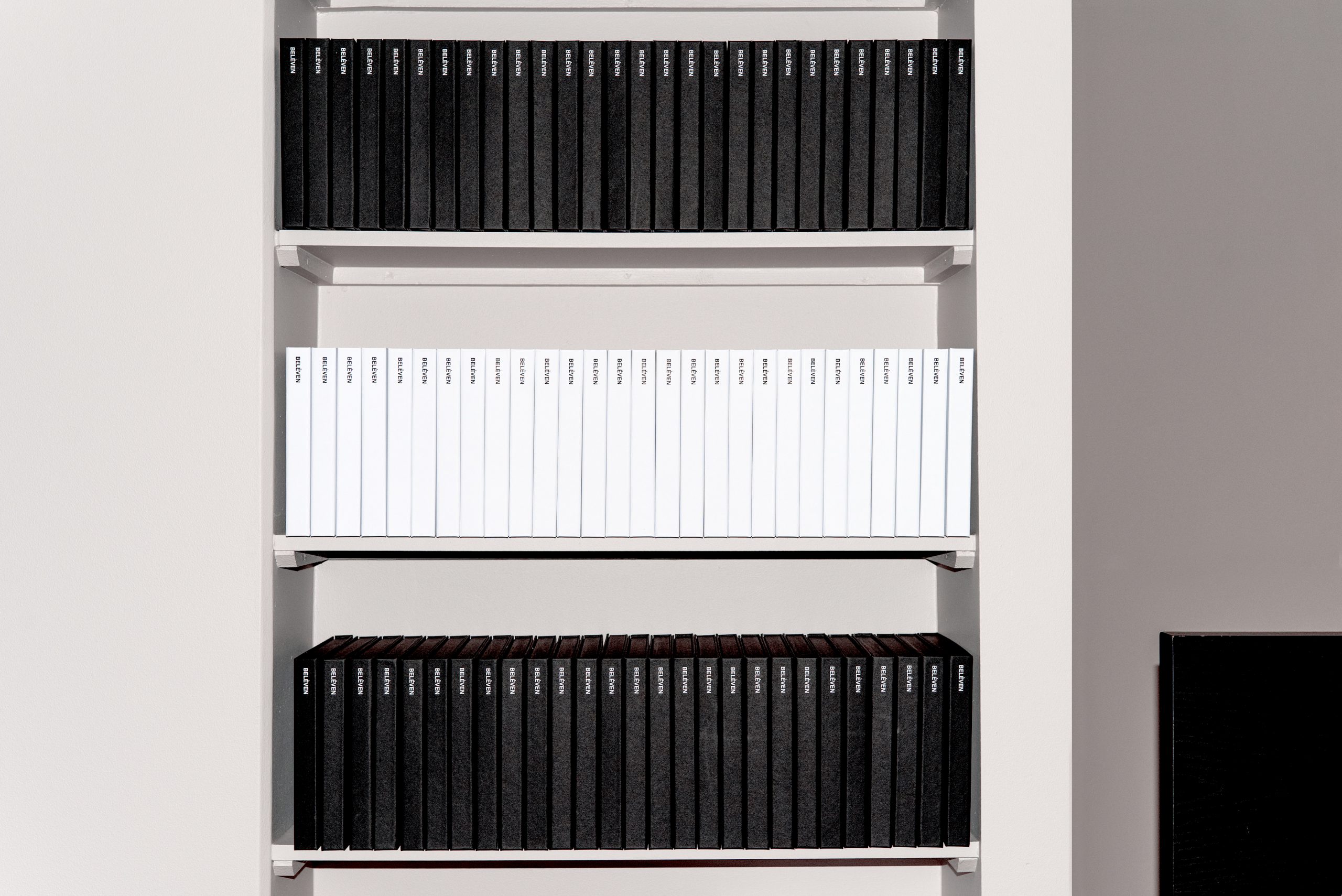
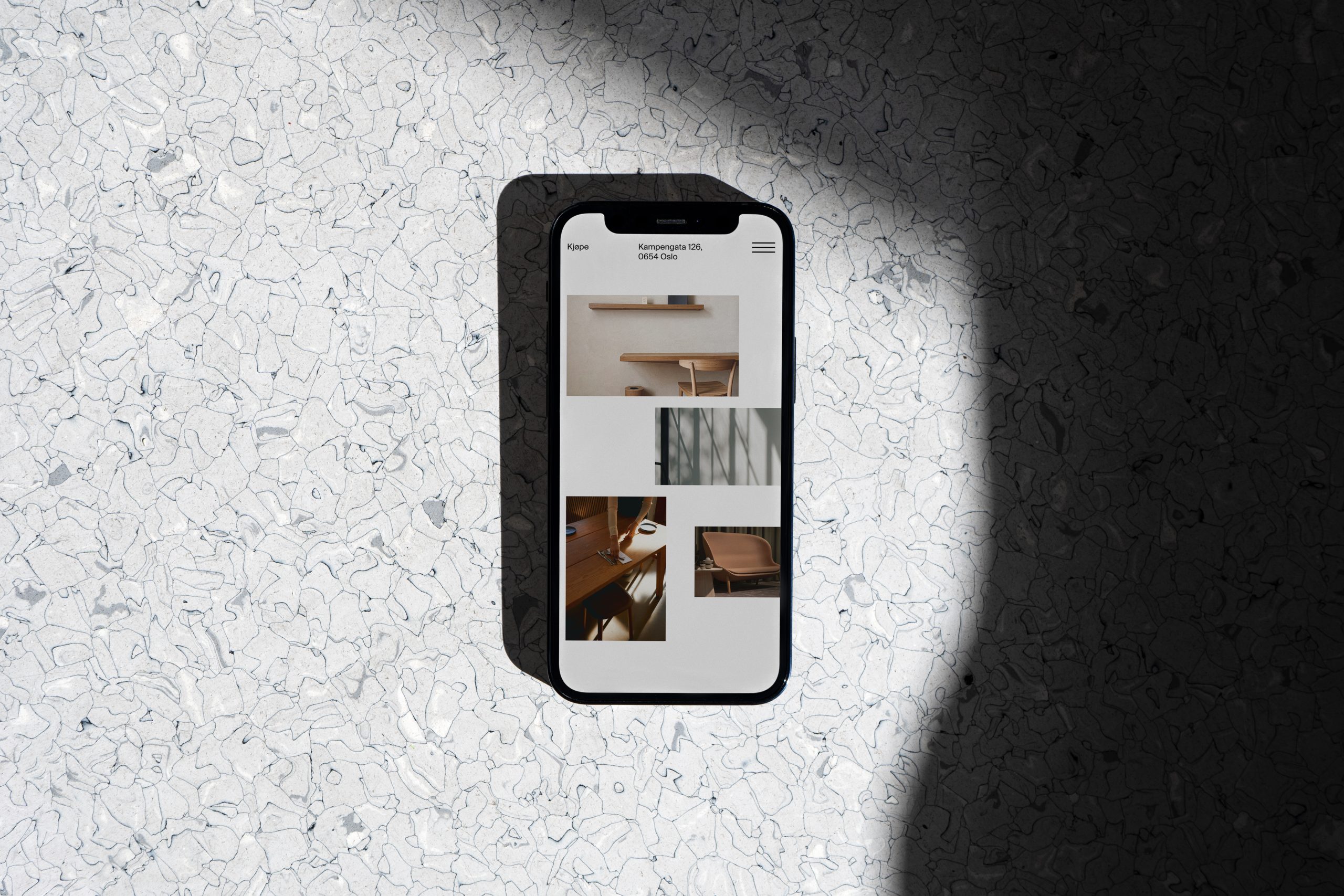
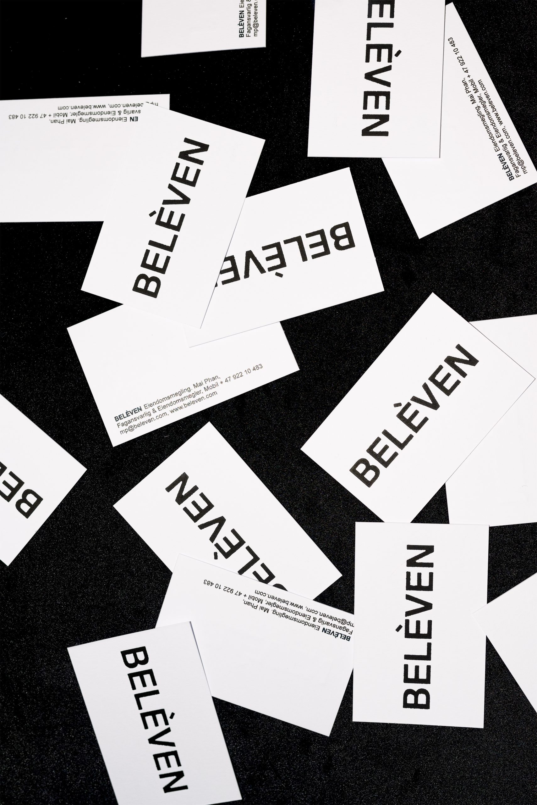
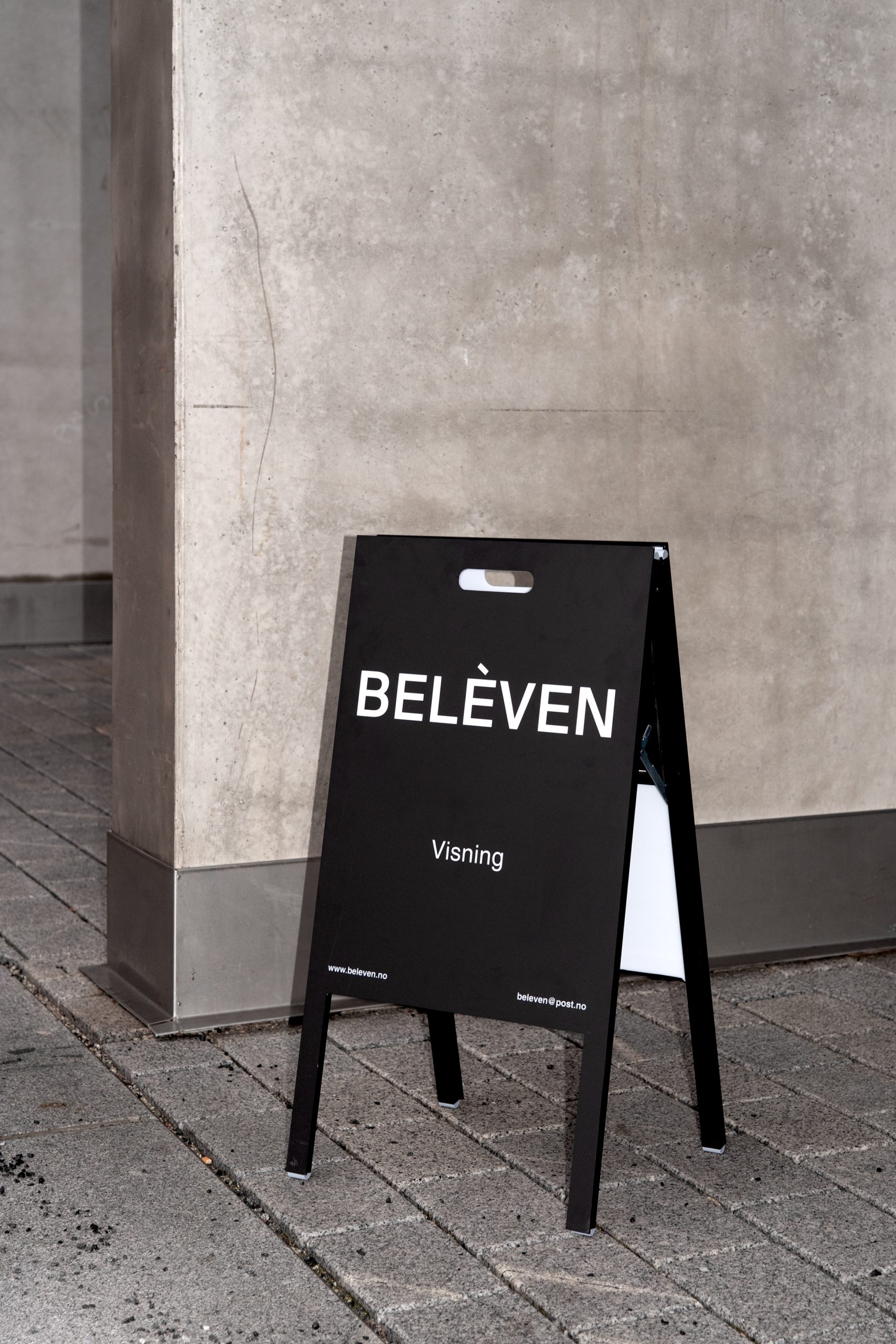
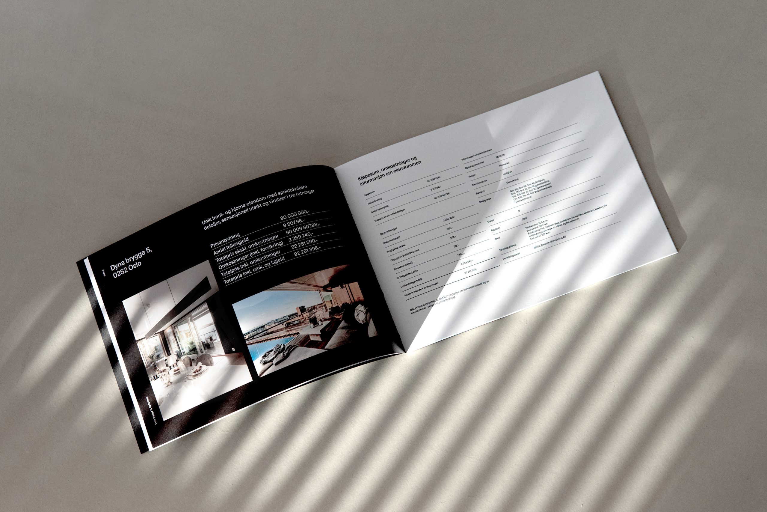
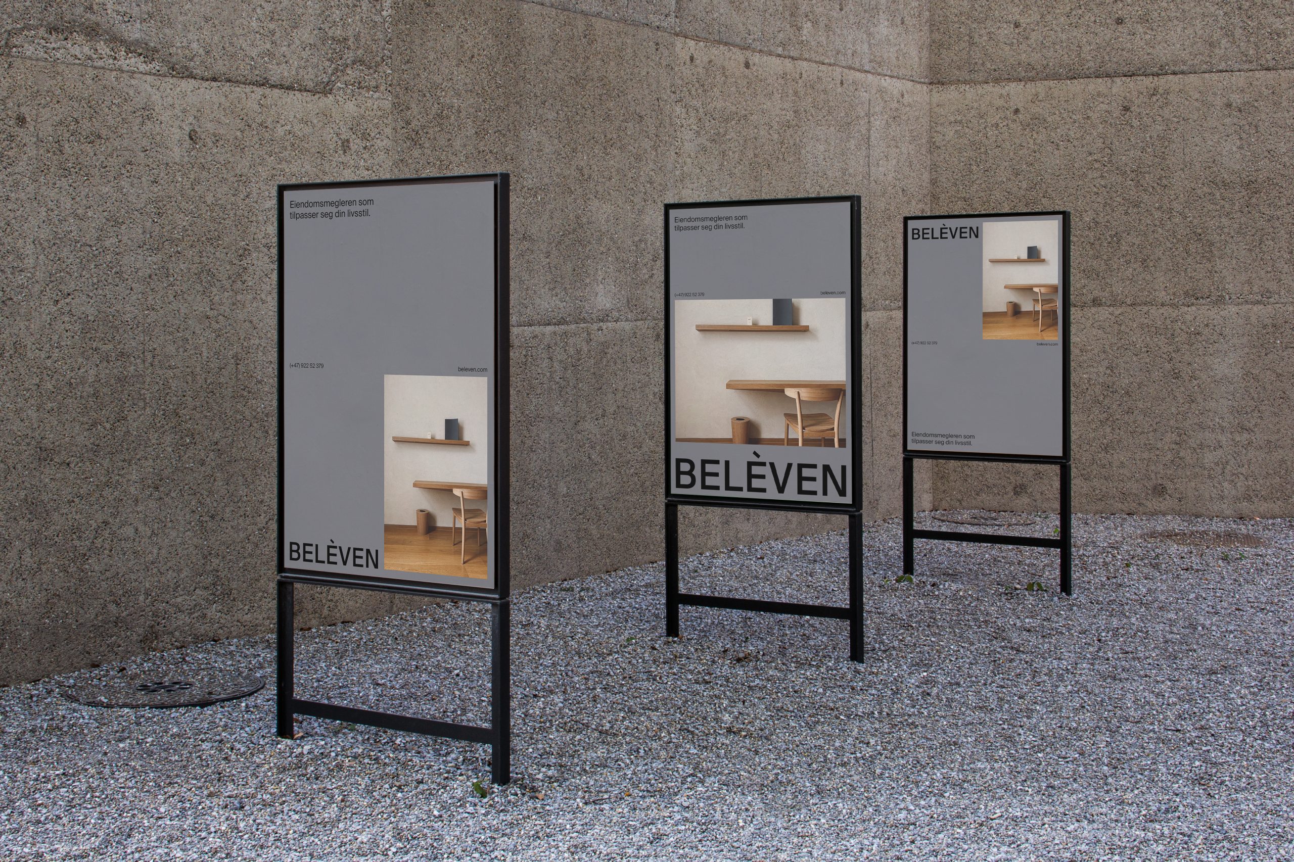
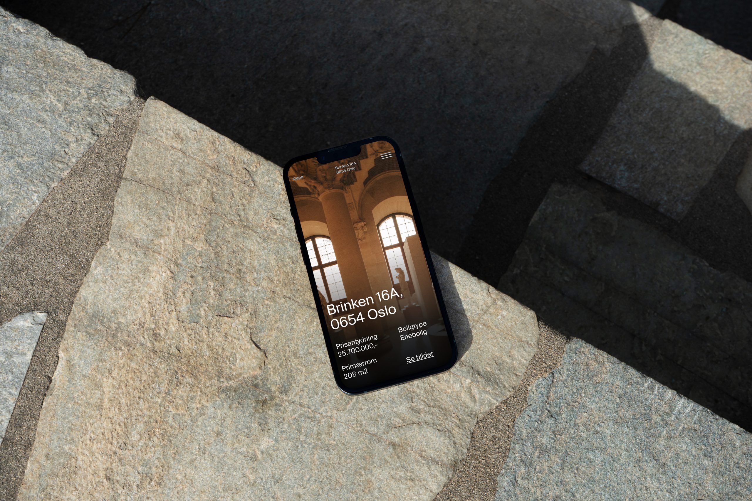
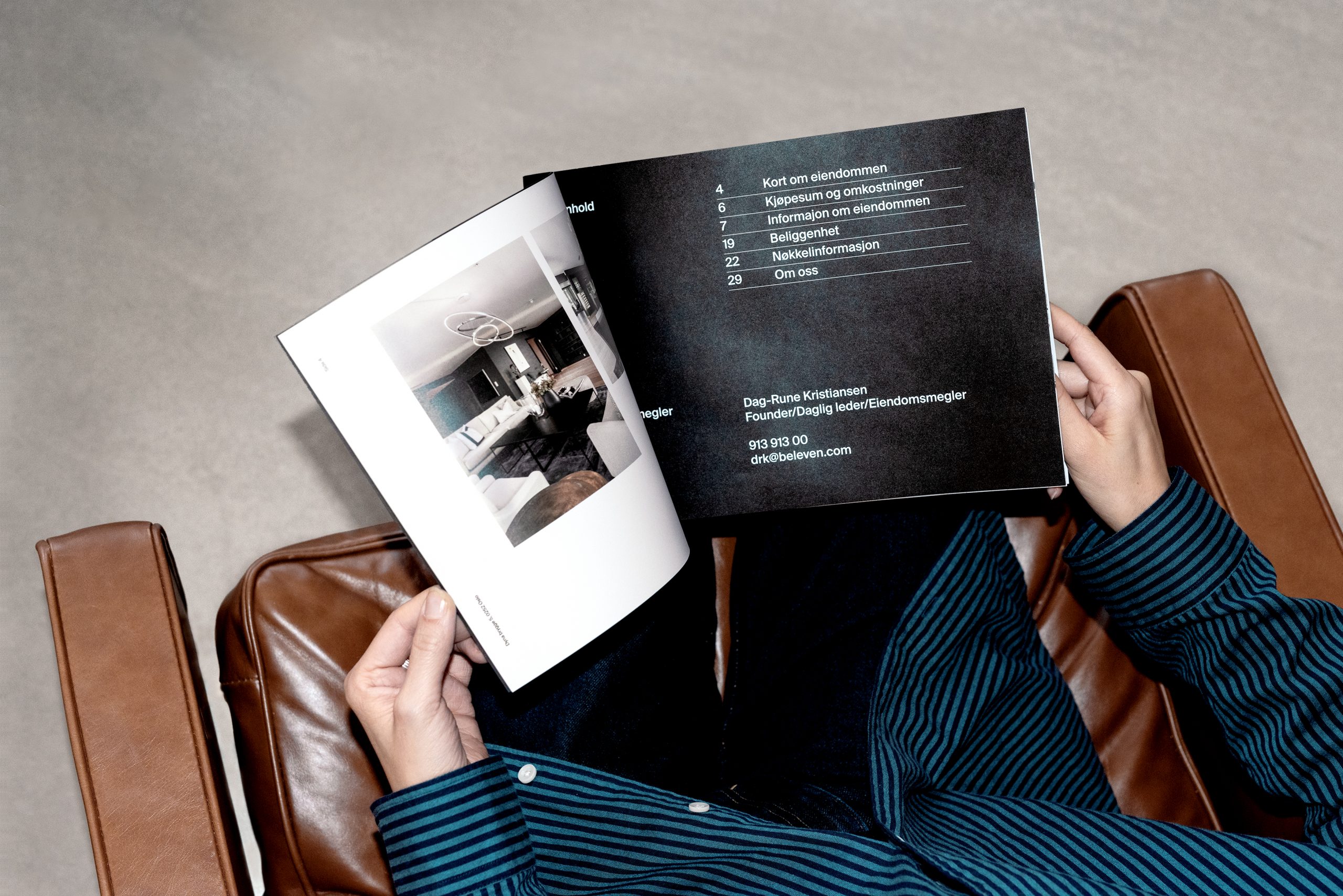
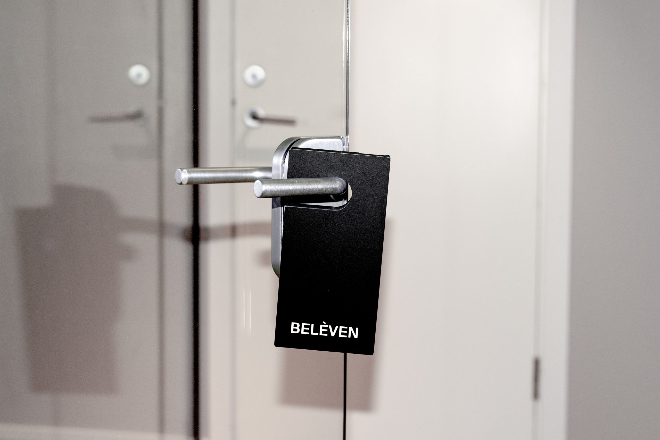
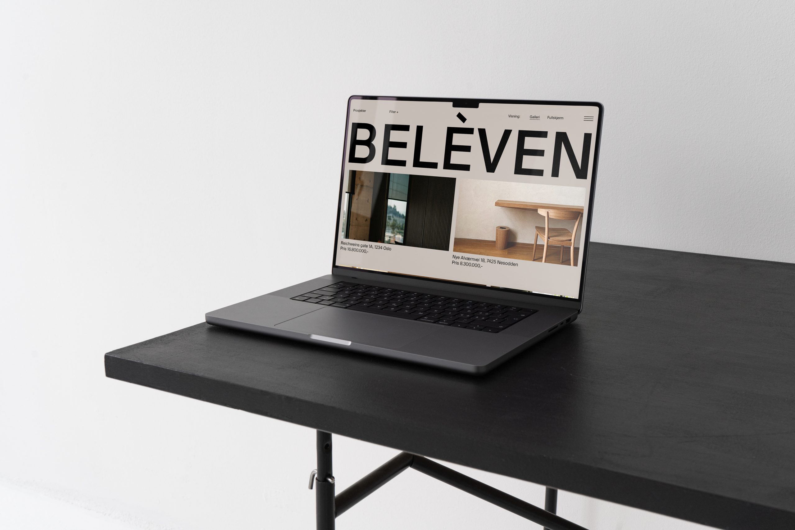
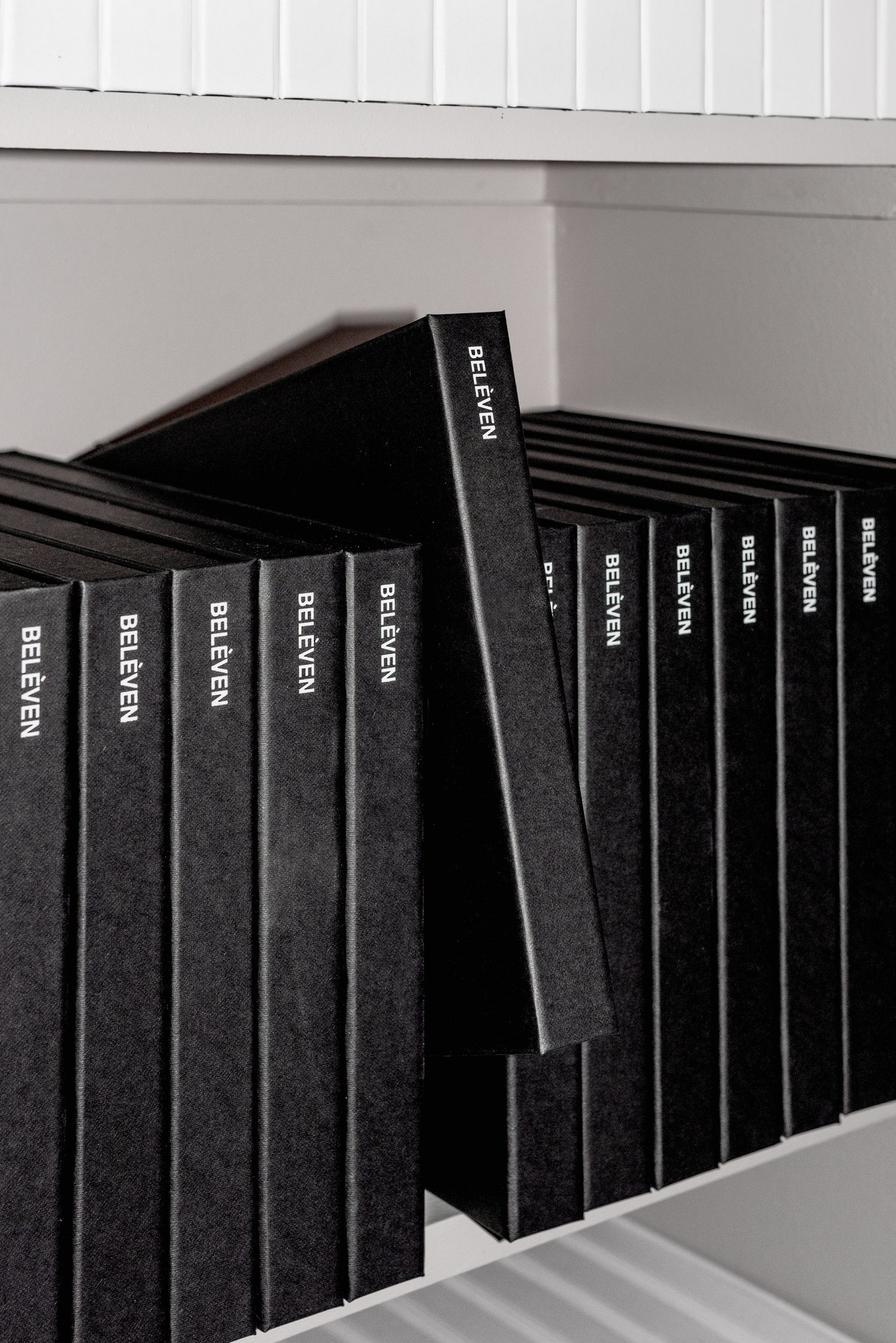
The identity, and the website, highlight the quality-conscious people, and the sales objects, in Belèven through few and solid means, where typography, composition systems and a strong logo create a controlled and recognizable visual expression. The minimalism of the identity also makes demands on the content, and gives weight and pride to the profession.
After launch, Belèven has achieved success, and positioned itself as a different and innovative estate agent, where the customer and the property for sale are in focus.

We wanted to create something different in an otherwise homogeneous and suboptimal industry, where everyone is the same and everyone copies each other. After a fantastically exciting, inclusive and enriching process with Bleed, we now stand with a brand and identity that we feel is on a par with the most exclusive fashion houses in Italy and France. Totally different from our competitors, both nationally and internationally. We are incredibly satisfied and proud of the result.
— Dag-Rune Kristiansen, Manager and Real Estate Agent of Belèven.