Honk if you're happy
HONK is FINN's new initiative in mobility, a market platform that will help people throughout the Nordics to navigate between different providers of car subscription services. We stand behind the name, visual identity, illustrations and web design.
Category→
Technology & Business
Work→
Visual identity, digital design
Awards→
TBA
Client→
Finn
We live in a time where people's mobility habits are changing. The need to dispose of one's own car varies in different phases of life, and car subscriptions have become increasingly popular. FINN has therefore launched the major Nordic venture HONK, which will make it easier to choose the right type of subscription.
In recent months, we have worked closely with Bleed to create a brand that will be able to stand on its own two feet in the Nordics. With Honk, we have created a personality that we hope and believe will be both noticed and liked. Bleed, with all its experience and expertise, has proven to be a partner who has managed to translate all our insight and strategy into a new brand that we are looking forward to taking out in the Nordics
— Hanne Lill Johnsen, marketing manager at FINN
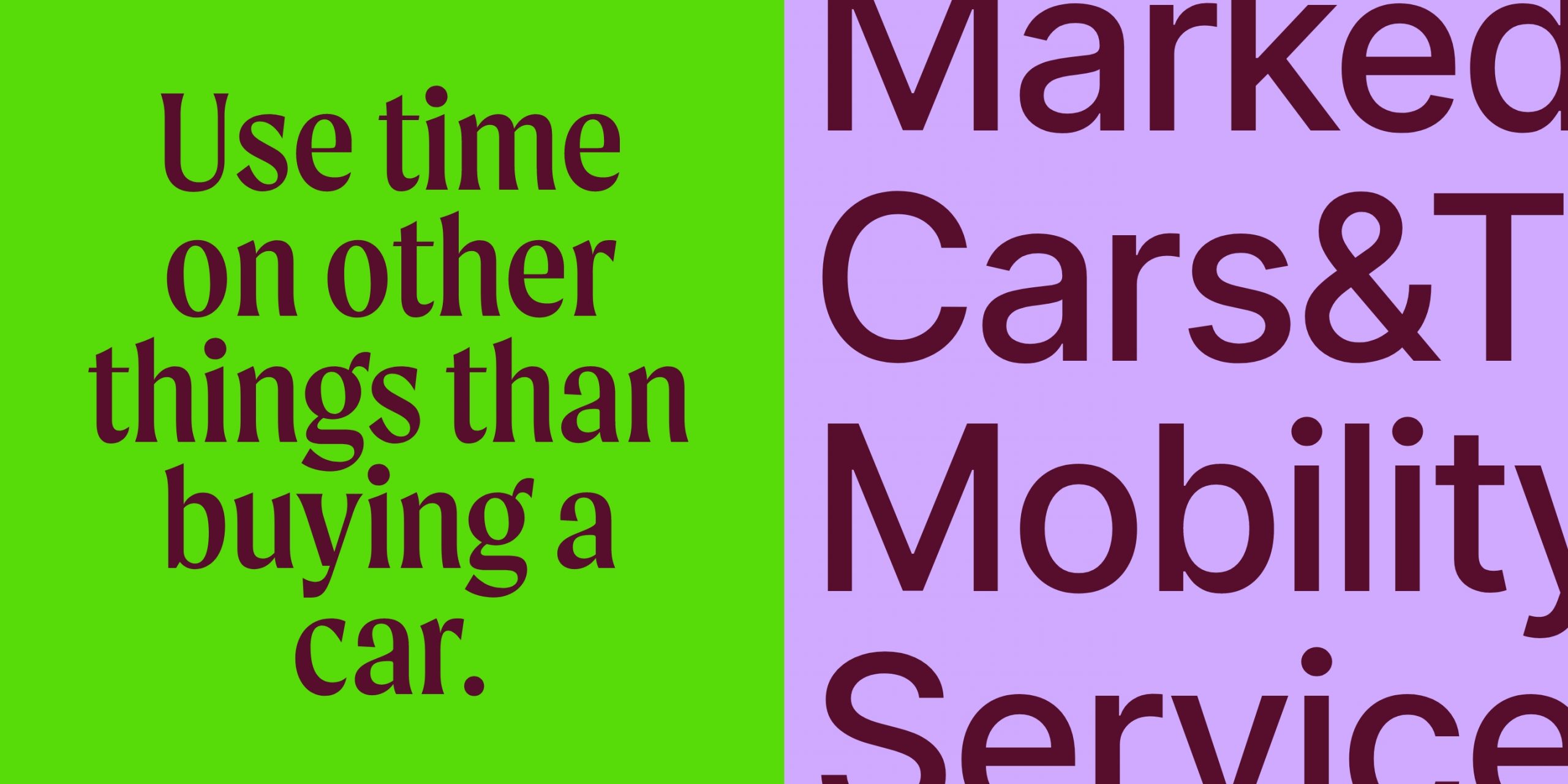
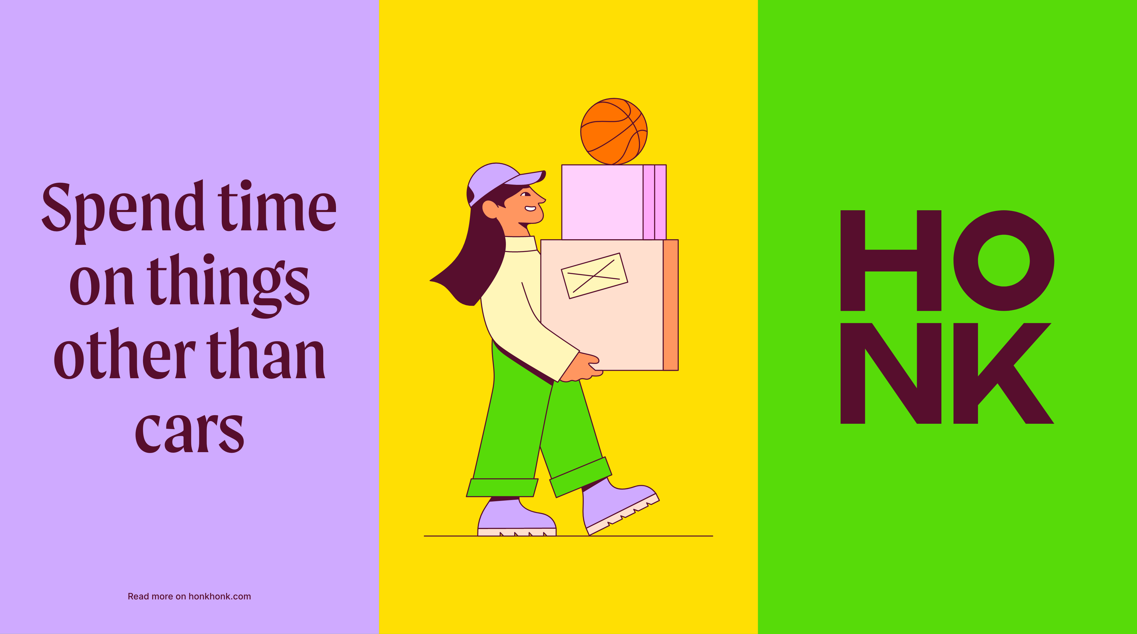
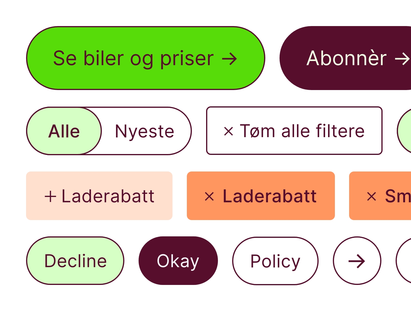
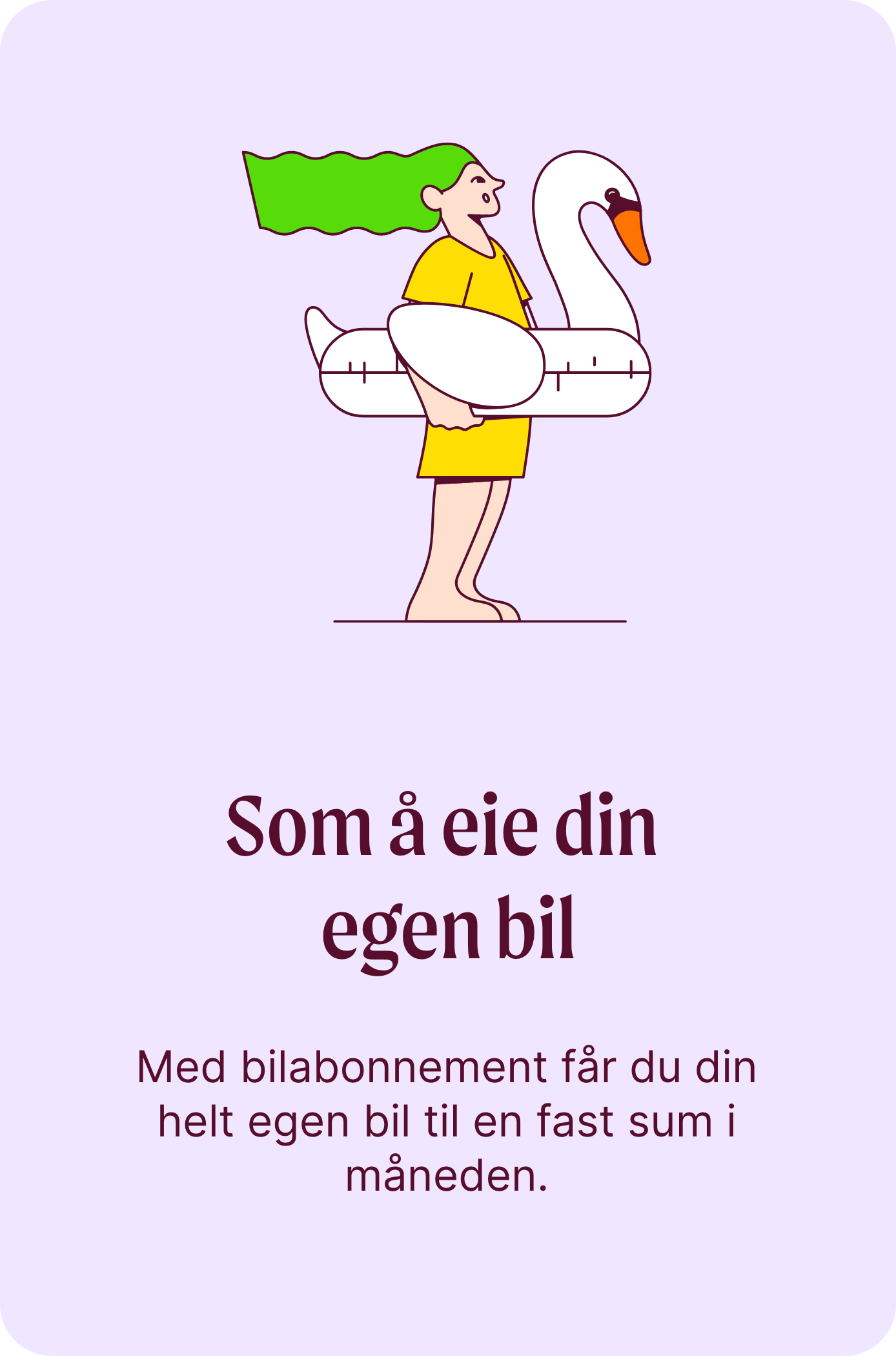
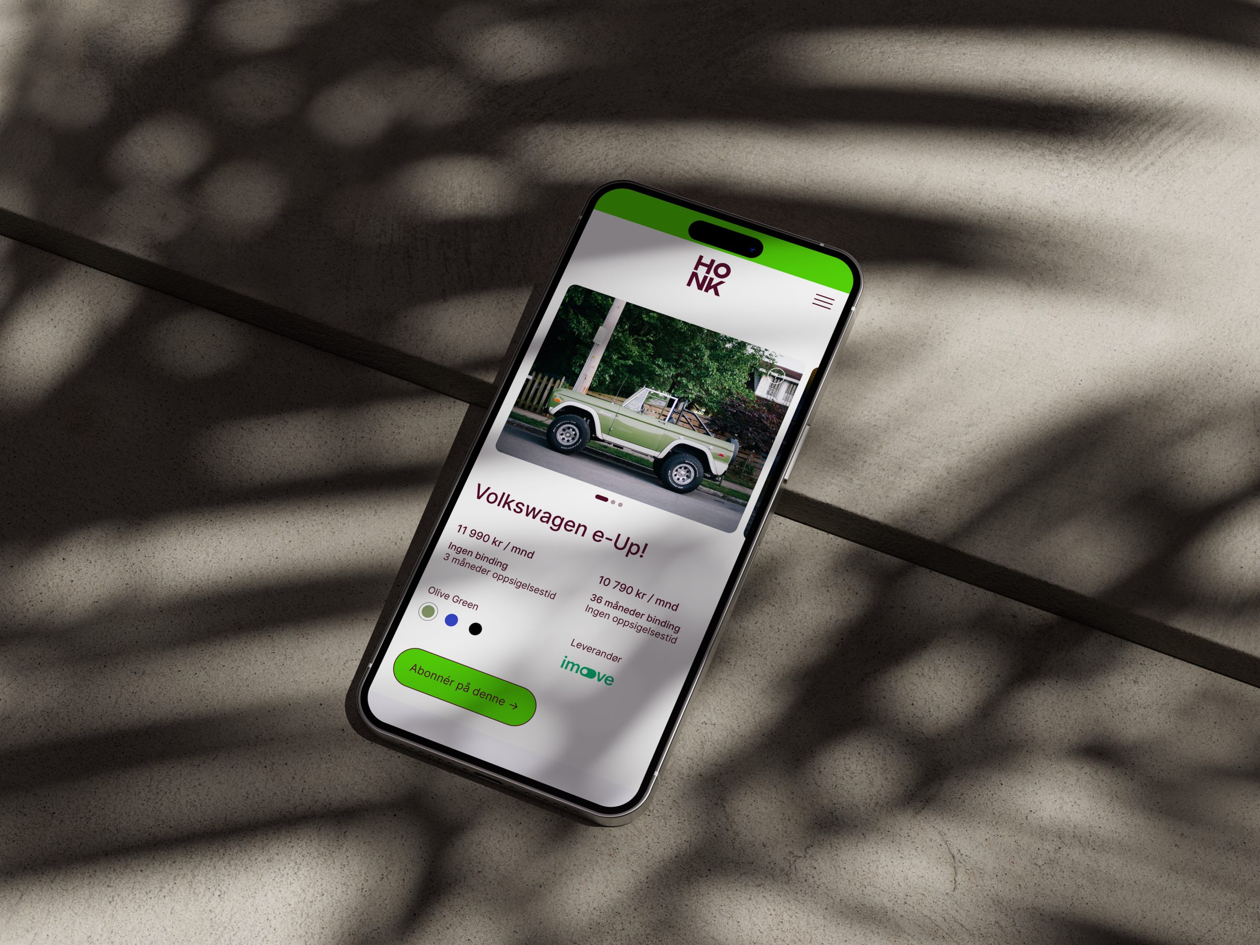
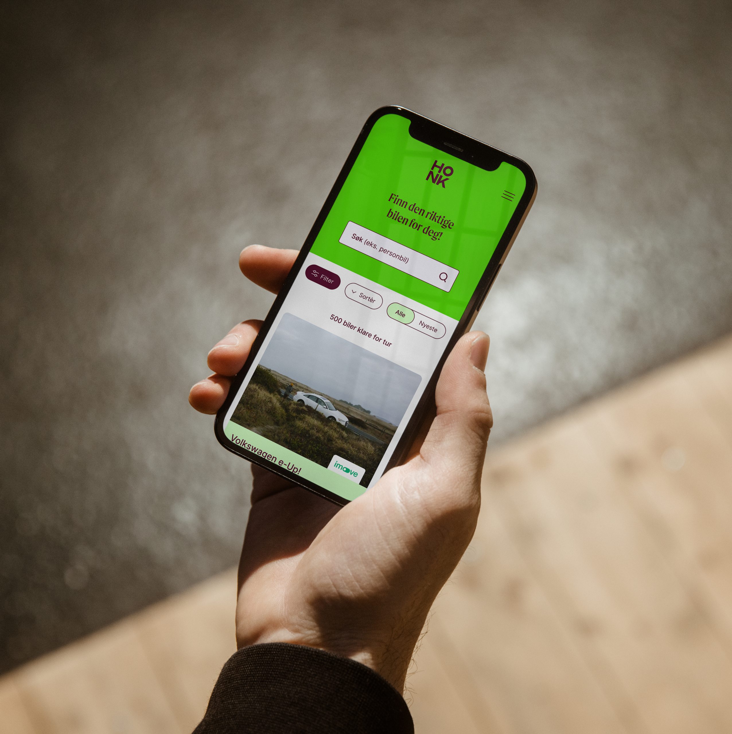
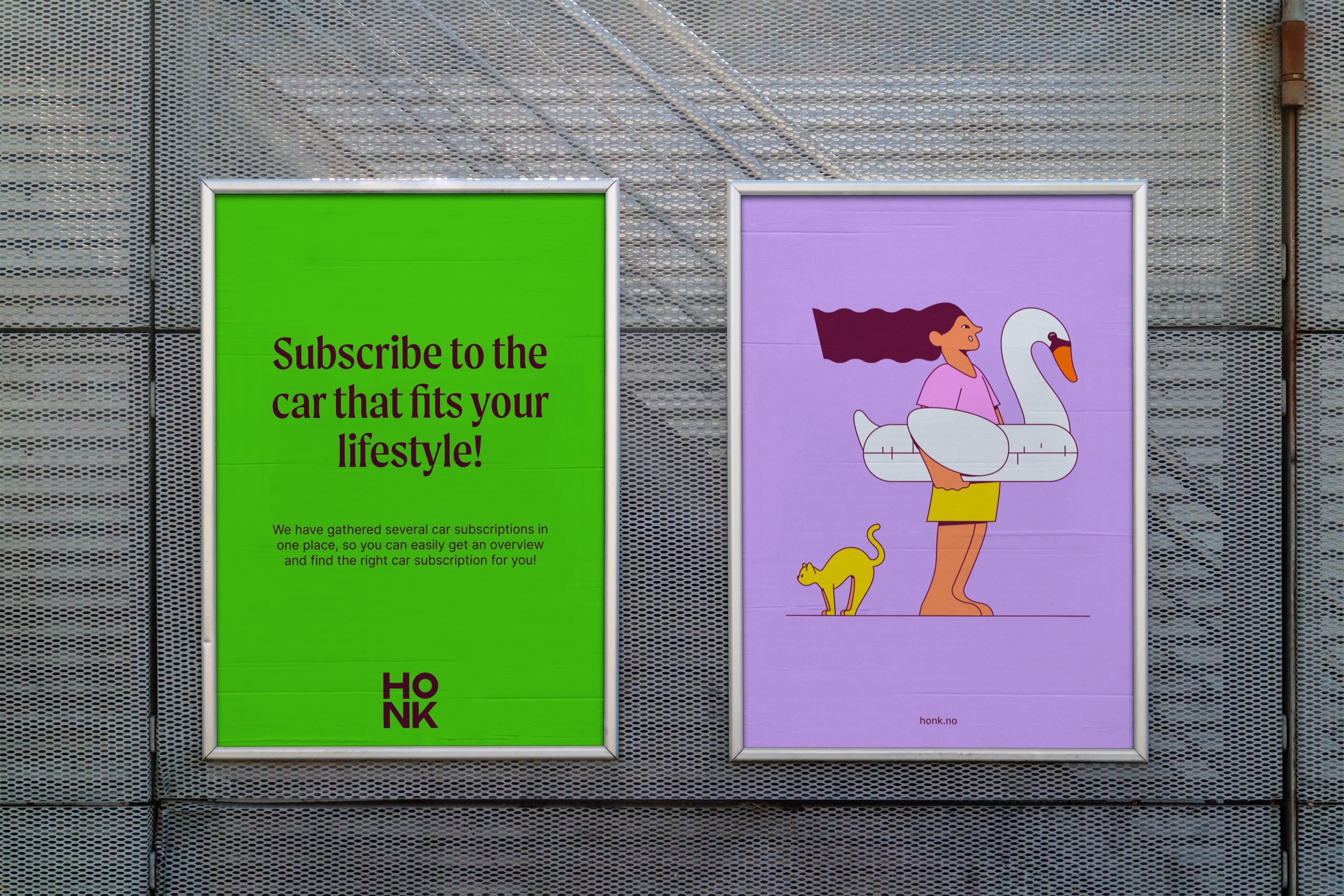
HONK is a playful and friendly brand, which focuses on lifestyle, flexibility and simplicity rather than cars as such. The brand has been developed to stand out clearly in the categories 'car' and 'market place', while the colors and elements should work within FINN's framework. Through the illustration universe, the carefree life without unexpected costs or obligations is emphasized, and places the car's role in the user's life. The logo works alone, but is also clear in the information structure of FINN. In sum, the design system makes it possible to communicate adapted to areas of use, target groups, life situations and seasons, in a simple and intuitive way.